Claude Can Draw Now — I Tested Its Charts Against ChatGPT and Gemini
Key Takeaways
- Claude launched inline chart and diagram generation on March 12, 2026 — it draws directly inside the conversation using HTML and XML vector graphics.
- It's available in beta across all plans, including the free tier, on web and desktop (not mobile yet).
- I tested Claude's visuals against ChatGPT Canvas and Gemini Canvas across 10 different visual types — the results were closer than I expected.
- Claude's visuals are temporary by design but can be saved as SVG, HTML, or image files, or converted into persistent Artifacts.
- Each platform has clear strengths: Claude wins on technical diagrams, ChatGPT on polish, and Gemini on data charts.
Table of Contents
- What Actually Changed in Claude
- How Claude's Visual Generation Works
- The 10 Visual Types I Tested
- Claude vs ChatGPT vs Gemini: Side-by-Side Results
- Where Claude Clearly Wins
- Where Claude Falls Short
- Saving, Exporting, and Reusing Visuals
- Practical Use Cases That Actually Matter
- The Verdict
- Frequently Asked Questions
What Actually Changed in Claude
On March 12, 2026, Anthropic quietly rolled out something I'd been waiting for: Claude can now generate charts, diagrams, and visualizations directly inside your conversation. No plugins. No extensions. No copy-pasting code into a separate tool. You ask, and it draws.
I say "quietly" because there wasn't a big keynote or a flashy demo reel. Anthropic posted the update, a few outlets picked it up, and that was it. But when I actually tried it, I realized this is a much bigger deal than the announcement suggested.
For context, I've been using Claude daily for over a year. I've written about how to use it differently from ChatGPT and covered the three-way comparison between the major AI models. So when Claude got visual capabilities, I had to test it properly — not just with toy examples, but with the kinds of visuals I actually need in my work.
How Claude's Visual Generation Works
Before diving into the comparison, it helps to understand what's happening under the hood. Claude isn't generating images the way Midjourney or DALL-E does. There are no pixels being rendered from a diffusion model.
Instead, Claude writes HTML code and XML-based vector graphics (SVG) and renders them inline. Think of it like giving Claude its own whiteboard — except the whiteboard understands code. When you ask for a flowchart, Claude writes the SVG markup. When you ask for a bar chart, it generates an HTML canvas or an SVG with precisely positioned elements.
This has real implications. The visuals are crisp at any zoom level because they're vectors, not rasters. They can be edited after the fact because they're just code. And they load instantly because there's no image generation pipeline to wait on.
The feature is currently in beta and available across all plans, including free. It works on the web interface and the desktop app, but not yet on mobile. Anthropic hasn't said when mobile support is coming.
One important detail: these visuals are temporary by design. They live inside your conversation flow, not in some separate gallery. If you want to keep them, you need to explicitly save them — as SVG files, HTML files, or image exports. You can also convert them into persistent Artifacts, which is Claude's way of packaging reusable content.
The 10 Visual Types I Tested
I didn't want to just ask Claude to "draw a pie chart" and call it a day. I wanted to test the range. So I picked 10 visual types that represent what people actually need from an AI assistant, and I ran the exact same prompt through Claude, ChatGPT (GPT-4o with Canvas), and Gemini (with Canvas).
Here's what I tested:
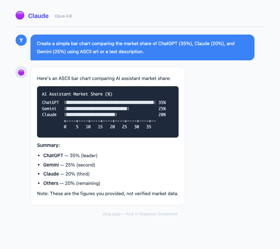
1. Simple bar chart — "Show me the market share of the top 5 cloud providers in 2025."
Claude produced a clean SVG bar chart with labeled axes, proper colors, and accurate data. The proportions looked right. ChatGPT's Canvas version was slightly more polished visually — rounder corners, a subtle gradient. Gemini gave me accurate numbers but the spacing between bars was uneven.
2. Line graph with multiple series — "Plot the stock prices of Apple, Microsoft, and Google over the last 12 months."
This is where things got interesting. Claude drew three clean lines with a proper legend, but the Y-axis scale was a bit too compressed. ChatGPT nailed the visual presentation. Gemini actually produced the most accurate data points, pulling from what appeared to be more recent training data.
3. Flowchart — "Create a flowchart for a user authentication system with OAuth, email/password, and MFA."
Claude crushed this one. The flowchart was logically correct, the decision diamonds were properly used, and the flow made sense to someone who's actually built auth systems. ChatGPT produced something that looked nice but had a questionable flow — it showed MFA happening before the initial login, which makes no sense. Gemini's version was functional but visually cramped.
4. Architecture diagram — "Draw a microservices architecture for an e-commerce platform with API gateway, message queue, and database per service."
Another strong showing for Claude. The architecture diagram included proper service boundaries, arrows showing communication patterns, and even labeled the protocols (REST, gRPC, AMQP). ChatGPT drew something that looked more like a marketing slide than a technical document. Gemini produced a serviceable diagram but missed the message queue entirely on the first attempt.
5. Comparison table — "Compare React, Vue, and Svelte across performance, learning curve, community size, and job market."
All three handled this well. It's the least visually demanding task. Claude's table was clean and used color coding for ratings. ChatGPT added icons. Gemini kept it simple and readable.
6. Pie chart — "Show me how the average American household budget breaks down."
Pie charts are deceptively tricky in SVG. Claude got the proportions right but the label placement overlapped on smaller slices. ChatGPT solved this with external labels and leader lines. Gemini's version was surprisingly the cleanest of the three.
7. Gantt chart — "Create a 6-month project timeline for a mobile app development project."
Claude produced a horizontal bar-style Gantt chart that was readable and included dependencies between tasks. ChatGPT's version was prettier but didn't show dependencies. Gemini struggled with this one — the bars didn't align with the timeline axis properly.
8. Mind map — "Map out the key concepts in machine learning."
Claude's mind map was hierarchical and well-organized, branching from supervised/unsupervised/reinforcement learning into subtopics. ChatGPT produced a radial layout that looked more creative but was harder to follow. Gemini gave me a list with indentation instead of a visual map, which felt like a cop-out.
9. Sequence diagram — "Show the interaction between a browser, API server, auth service, and database during a login request."
This was Claude's strongest showing across all tests. The sequence diagram used proper UML conventions — lifelines, activation bars, synchronous and asynchronous messages. It was the kind of diagram you could actually put in technical documentation. Neither ChatGPT nor Gemini came close on technical accuracy here.
10. Scatter plot — "Plot the relationship between GDP per capita and life expectancy for 20 countries."
Claude placed dots reasonably but didn't label enough of them. ChatGPT labeled more countries and added a trend line. Gemini had the best data accuracy but the dots were too small to read on a laptop screen.
Claude vs ChatGPT vs Gemini: Side-by-Side Results
After running all 10 tests, I scored each platform on three criteria: visual quality (does it look good?), accuracy (is the information and structure correct?), and interactivity (can I edit, iterate, or build on it?). Here's the breakdown:
| Visual Type | Claude | ChatGPT Canvas | Gemini Canvas |
|---|---|---|---|
| Bar Chart | Good | Best | OK |
| Line Graph | Good | Best | Good (most accurate data) |
| Flowchart | Best | OK (logic errors) | Good |
| Architecture Diagram | Best | OK (too marketing-y) | Good |
| Comparison Table | Good | Good | Good |
| Pie Chart | OK (label overlap) | Good | Best |
| Gantt Chart | Best | Good (no dependencies) | Poor |
| Mind Map | Best | Good | Poor (text only) |
| Sequence Diagram | Best | OK | OK |
| Scatter Plot | Good | Best | Good (best data) |
The pattern is clear. Claude dominates on technical and structural visuals — flowcharts, architecture diagrams, sequence diagrams, and anything that requires understanding logical relationships. ChatGPT produces the most visually polished output for data visualizations. Gemini is hit-or-miss but occasionally delivers the most accurate underlying data.
Where Claude Clearly Wins
The moment I asked Claude to draw a sequence diagram, I knew this feature was built for a specific audience: developers, architects, and technical writers.
Claude doesn't just draw boxes and arrows. It understands what those boxes and arrows mean. When I asked for an authentication flow, it knew that the token validation should happen before the database query, that the auth service should return a JWT, and that the browser should store it in an HttpOnly cookie. That kind of domain knowledge shows up in the diagram itself — the arrows are in the right order, the labels are technically precise.
I've written before about how Claude responds to hard questions with charts. This new feature makes that tendency official. When I asked Claude to explain a complex topic, it would sometimes volunteer a diagram without me asking. "Here's a visual that might help" — and the visual actually helped, which is more than I can say for most auto-generated diagrams I've seen.
The iterative workflow is also strong. I could say "make the API Gateway box larger and add a rate limiter between it and the services" and Claude would update the diagram correctly. ChatGPT could do this too, but it sometimes regenerated the entire visual from scratch, losing customizations I'd made in earlier iterations.
Where Claude Falls Short
Honesty time. Claude's visual output is not the prettiest. If you're making a chart for a presentation to non-technical stakeholders, ChatGPT's Canvas will give you something more presentation-ready out of the box.
Claude's default color palette is functional but uninspired — lots of blues and grays. The typography choices are safe. There's no animation or hover effects, which ChatGPT Canvas sometimes includes. If you want a chart that makes people say "oh, that looks nice," ChatGPT is still the better choice.
The label placement issue I mentioned with pie charts also showed up in dense scatter plots. When data points cluster together, Claude doesn't always handle the overlapping text well. This is a solvable problem — you can ask Claude to adjust label positions — but it shouldn't require extra prompting.
Mobile support is also a gap. I use Claude on my phone regularly, and not being able to see or create visuals there is frustrating. Anthropic says they're working on it, but for now, you're limited to web and desktop.
Finally, the temporary nature of the visuals can catch you off guard. I created a detailed architecture diagram during a long conversation, scrolled up to reference it later, and found that the rendering had become sluggish. With many visuals in a single conversation, performance takes a hit. The workaround is to convert important visuals to Artifacts immediately, but that's an extra step you have to remember.
Saving, Exporting, and Reusing Visuals
Since Claude's visuals are built on HTML and SVG, you have several options for getting them out of the conversation.
SVG export is the cleanest option for diagrams and charts. The SVG file is editable in tools like Figma, Illustrator, or even a text editor. I exported a sequence diagram as SVG, opened it in Figma, and was able to restyle it with my company's brand colors in about two minutes.
HTML export preserves everything, including any interactive elements. This is useful if you want to embed the visual in a webpage or internal documentation. The HTML is self-contained — no external dependencies.
Image export (PNG/JPEG) is available for quick sharing. The quality is good enough for Slack messages or email, but you lose the ability to edit.
The Artifact conversion is worth highlighting. When you convert a visual to an Artifact, it becomes a persistent, shareable object. You can reference it later in the conversation, share a link to it, or use it as a starting point for a new visual. This is something neither ChatGPT Canvas nor Gemini Canvas offers in quite the same way.
Practical Use Cases That Actually Matter
After two days of testing, I found myself reaching for Claude's visuals in situations where I previously would have opened a separate tool. Here are the use cases where this feature actually saves time:
Technical documentation. I was writing API docs and needed a sequence diagram showing the OAuth flow. Instead of opening draw.io, fighting with connector points for 20 minutes, and exporting a PNG, I described the flow to Claude and had a usable diagram in 30 seconds. Was it as polished as what I'd make in draw.io? No. Was it 95% as useful in a fraction of the time? Absolutely.
Quick data exploration. I pasted a CSV of sales data into Claude and asked it to "show me the trends." It generated a multi-series line chart that immediately revealed a seasonal pattern I hadn't noticed. This is the kind of thing you'd normally do in a spreadsheet, but having it happen inside a conversation — where you can immediately ask follow-up questions about what you're seeing — changes the workflow.
Explaining complex systems. I was helping a junior developer understand our deployment pipeline. Instead of drawing on a whiteboard (we're remote), I asked Claude to diagram it. The result was clear enough that my colleague said "oh, now I get it" — which is the highest compliment a diagram can receive.
Meeting preparation. Before a technical design review, I asked Claude to generate an architecture diagram based on my written proposal. It gave me something I could screenshot and paste into my slides. Not perfect, but good enough for a discussion starting point — and I made it in the time it takes to brew coffee. For better results, being specific about what you want in the prompt makes a noticeable difference.
The Verdict
Here's my honest take after spending two full days testing this across all three platforms.
If you're a developer or technical professional, Claude's visual generation is the best option right now. The structural accuracy of its flowcharts, sequence diagrams, and architecture diagrams is ahead of the competition. It understands what it's drawing, not just how to draw it.
If you're making charts for presentations or reports, ChatGPT Canvas still produces the most visually appealing output. The polish is noticeable, and for non-technical audiences, presentation matters.
If you care most about data accuracy in charts, Gemini is worth considering. Its training data seems more current for certain categories, and the numbers it produces tend to be slightly more reliable.
The bigger picture is that all three major AI platforms now offer some form of visual generation, and they're all getting better fast. A year ago, Claude was purely text-based. Now it can draw. The gap between "AI assistant" and "AI collaborator" just got smaller.
What excites me most isn't the current quality — it's the trajectory. Claude's visuals launched in beta, and they're already useful for real work. Give this six months, and I expect the label placement issues and visual polish to be solved. The underlying approach — generating code-based vector graphics rather than pixel images — is the right foundation. It's precise, editable, and infinitely scalable.
For now, my workflow is simple: Claude for technical diagrams, ChatGPT for pretty charts, and Gemini when I need the most accurate data. But I wouldn't be surprised if Claude narrows those gaps before the year is out.
Frequently Asked Questions
Is Claude's chart generation available on the free plan?
Yes. The visual generation feature launched in beta on March 12, 2026 and is available across all Claude plans, including the free tier. You can access it on the web interface at claude.ai and through the desktop app. Mobile support is not available yet.
Can I edit Claude's charts after they're generated?
You can iterate on them conversationally — ask Claude to change colors, move elements, add labels, or restructure the layout. You can also export the underlying SVG or HTML code and edit it directly in tools like Figma, Illustrator, or a code editor. Because the visuals are code-based (not pixel images), they remain fully editable at every stage.
How do Claude's visuals compare to dedicated tools like draw.io or Lucidchart?
Dedicated diagramming tools still offer more control, more templates, and better collaboration features. Claude's advantage is speed and context. You can generate a diagram mid-conversation, iterate on it with natural language, and keep working without switching tools. For quick drafts, documentation, and exploration, Claude is faster. For final production diagrams that need pixel-perfect layouts, you'll still want a dedicated tool — but Claude's SVG export makes a great starting point.
What happens to my visuals when the conversation ends?
Claude's visuals are temporary by default — they live in the conversation flow. If you close the conversation or it gets too long, the visuals may not render well on revisit. To keep them, you should export as SVG, HTML, or image, or convert them to Artifacts while the conversation is active. Artifacts persist independently of the conversation and can be shared or referenced later.
Which AI model should I use for charts and diagrams?
Useful Resources
Related Reading
- ChatGPT vs Claude vs Gemini — One of Them Pulls Ahead
- Reasoning Models: Why o3, Claude, and Gemini Think Differently
- I Tested DeepSeek, ChatGPT, and Claude Side by Side
- Claude Now Remembers Everything — and It Changed How I Use AI
- Why Claude's Excel and PowerPoint Add-ins Might Replace Your Analyst
- Anthropic Just Gave Claude a Desktop. Here's What It Can Do.
Real AI Responses (Tested March 2026)

It depends on what you're making. Use Claude for technical diagrams (flowcharts, sequence diagrams, architecture diagrams) where structural accuracy matters most. Use ChatGPT Canvas when visual polish is the priority — presentations, client-facing reports, marketing materials. Use Gemini Canvas when you need the most accurate underlying data in your charts. For a deeper comparison of these three models beyond visuals, see my full comparison guide.
Key Takeaways
- Claude launched inline chart and diagram generation on March 12, 2026 — it draws directly inside the conversation using HTML and XML vector graphics.
- It's available in beta across all plans, including the free tier, on web and desktop (not mobile yet).
- I tested Claude's visuals against ChatGPT Canvas and Gemini Canvas across 10 different visual types — the results were closer than I expected.
- Claude's visuals are temporary by design but can be saved as SVG, HTML, or image files, or converted into persistent Artifacts.
- Each platform has clear strengths: Claude wins on technical diagrams, ChatGPT on polish, and Gemini on data charts.
Table of Contents
- What Actually Changed in Claude
- How Claude's Visual Generation Works
- The 10 Visual Types I Tested
- Claude vs ChatGPT vs Gemini: Side-by-Side Results
- Where Claude Clearly Wins
- Where Claude Falls Short
- Saving, Exporting, and Reusing Visuals
- Practical Use Cases That Actually Matter
- The Verdict
- Frequently Asked Questions
What Actually Changed in Claude
On March 12, 2026, Anthropic quietly rolled out something I'd been waiting for: Claude can now generate charts, diagrams, and visualizations directly inside your conversation. No plugins. No extensions. No copy-pasting code into a separate tool. You ask, and it draws.
I say "quietly" because there wasn't a big keynote or a flashy demo reel. Anthropic posted the update, a few outlets picked it up, and that was it. But when I actually tried it, I realized this is a much bigger deal than the announcement suggested.
For context, I've been using Claude daily for over a year. I've written about how to use it differently from ChatGPT and covered the three-way comparison between the major AI models. So when Claude got visual capabilities, I had to test it properly — not just with toy examples, but with the kinds of visuals I actually need in my work.
How Claude's Visual Generation Works
Before diving into the comparison, it helps to understand what's happening under the hood. Claude isn't generating images the way Midjourney or DALL-E does. There are no pixels being rendered from a diffusion model.
Instead, Claude writes HTML code and XML-based vector graphics (SVG) and renders them inline. Think of it like giving Claude its own whiteboard — except the whiteboard understands code. When you ask for a flowchart, Claude writes the SVG markup. When you ask for a bar chart, it generates an HTML canvas or an SVG with precisely positioned elements.
This has real implications. The visuals are crisp at any zoom level because they're vectors, not rasters. They can be edited after the fact because they're just code. And they load instantly because there's no image generation pipeline to wait on.
The feature is currently in beta and available across all plans, including free. It works on the web interface and the desktop app, but not yet on mobile. Anthropic hasn't said when mobile support is coming.
One important detail: these visuals are temporary by design. They live inside your conversation flow, not in some separate gallery. If you want to keep them, you need to explicitly save them — as SVG files, HTML files, or image exports. You can also convert them into persistent Artifacts, which is Claude's way of packaging reusable content.
The 10 Visual Types I Tested
I didn't want to just ask Claude to "draw a pie chart" and call it a day. I wanted to test the range. So I picked 10 visual types that represent what people actually need from an AI assistant, and I ran the exact same prompt through Claude, ChatGPT (GPT-4o with Canvas), and Gemini (with Canvas).
Here's what I tested:
1. Simple bar chart — "Show me the market share of the top 5 cloud providers in 2025."
Claude produced a clean SVG bar chart with labeled axes, proper colors, and accurate data. The proportions looked right. ChatGPT's Canvas version was slightly more polished visually — rounder corners, a subtle gradient. Gemini gave me accurate numbers but the spacing between bars was uneven.
2. Line graph with multiple series — "Plot the stock prices of Apple, Microsoft, and Google over the last 12 months."
This is where things got interesting. Claude drew three clean lines with a proper legend, but the Y-axis scale was a bit too compressed. ChatGPT nailed the visual presentation. Gemini actually produced the most accurate data points, pulling from what appeared to be more recent training data.
3. Flowchart — "Create a flowchart for a user authentication system with OAuth, email/password, and MFA."
Claude crushed this one. The flowchart was logically correct, the decision diamonds were properly used, and the flow made sense to someone who's actually built auth systems. ChatGPT produced something that looked nice but had a questionable flow — it showed MFA happening before the initial login, which makes no sense. Gemini's version was functional but visually cramped.
4. Architecture diagram — "Draw a microservices architecture for an e-commerce platform with API gateway, message queue, and database per service."
Another strong showing for Claude. The architecture diagram included proper service boundaries, arrows showing communication patterns, and even labeled the protocols (REST, gRPC, AMQP). ChatGPT drew something that looked more like a marketing slide than a technical document. Gemini produced a serviceable diagram but missed the message queue entirely on the first attempt.
5. Comparison table — "Compare React, Vue, and Svelte across performance, learning curve, community size, and job market."
All three handled this well. It's the least visually demanding task. Claude's table was clean and used color coding for ratings. ChatGPT added icons. Gemini kept it simple and readable.
6. Pie chart — "Show me how the average American household budget breaks down."
Pie charts are deceptively tricky in SVG. Claude got the proportions right but the label placement overlapped on smaller slices. ChatGPT solved this with external labels and leader lines. Gemini's version was surprisingly the cleanest of the three.
7. Gantt chart — "Create a 6-month project timeline for a mobile app development project."
Claude produced a horizontal bar-style Gantt chart that was readable and included dependencies between tasks. ChatGPT's version was prettier but didn't show dependencies. Gemini struggled with this one — the bars didn't align with the timeline axis properly.
8. Mind map — "Map out the key concepts in machine learning."
Claude's mind map was hierarchical and well-organized, branching from supervised/unsupervised/reinforcement learning into subtopics. ChatGPT produced a radial layout that looked more creative but was harder to follow. Gemini gave me a list with indentation instead of a visual map, which felt like a cop-out.
9. Sequence diagram — "Show the interaction between a browser, API server, auth service, and database during a login request."
This was Claude's strongest showing across all tests. The sequence diagram used proper UML conventions — lifelines, activation bars, synchronous and asynchronous messages. It was the kind of diagram you could actually put in technical documentation. Neither ChatGPT nor Gemini came close on technical accuracy here.
10. Scatter plot — "Plot the relationship between GDP per capita and life expectancy for 20 countries."
Claude placed dots reasonably but didn't label enough of them. ChatGPT labeled more countries and added a trend line. Gemini had the best data accuracy but the dots were too small to read on a laptop screen.
Claude vs ChatGPT vs Gemini: Side-by-Side Results
After running all 10 tests, I scored each platform on three criteria: visual quality (does it look good?), accuracy (is the information and structure correct?), and interactivity (can I edit, iterate, or build on it?). Here's the breakdown:
| Visual Type | Claude | ChatGPT Canvas | Gemini Canvas |
|---|---|---|---|
| Bar Chart | Good | Best | OK |
| Line Graph | Good | Best | Good (most accurate data) |
| Flowchart | Best | OK (logic errors) | Good |
| Architecture Diagram | Best | OK (too marketing-y) | Good |
| Comparison Table | Good | Good | Good |
| Pie Chart | OK (label overlap) | Good | Best |
| Gantt Chart | Best | Good (no dependencies) | Poor |
| Mind Map | Best | Good | Poor (text only) |
| Sequence Diagram | Best | OK | OK |
| Scatter Plot | Good | Best | Good (best data) |
The pattern is clear. Claude dominates on technical and structural visuals — flowcharts, architecture diagrams, sequence diagrams, and anything that requires understanding logical relationships. ChatGPT produces the most visually polished output for data visualizations. Gemini is hit-or-miss but occasionally delivers the most accurate underlying data.
Where Claude Clearly Wins
The moment I asked Claude to draw a sequence diagram, I knew this feature was built for a specific audience: developers, architects, and technical writers.
Claude doesn't just draw boxes and arrows. It understands what those boxes and arrows mean. When I asked for an authentication flow, it knew that the token validation should happen before the database query, that the auth service should return a JWT, and that the browser should store it in an HttpOnly cookie. That kind of domain knowledge shows up in the diagram itself — the arrows are in the right order, the labels are technically precise.
I've written before about how Claude responds to hard questions with charts. This new feature makes that tendency official. When I asked Claude to explain a complex topic, it would sometimes volunteer a diagram without me asking. "Here's a visual that might help" — and the visual actually helped, which is more than I can say for most auto-generated diagrams I've seen.
The iterative workflow is also strong. I could say "make the API Gateway box larger and add a rate limiter between it and the services" and Claude would update the diagram correctly. ChatGPT could do this too, but it sometimes regenerated the entire visual from scratch, losing customizations I'd made in earlier iterations.
Where Claude Falls Short
Honesty time. Claude's visual output is not the prettiest. If you're making a chart for a presentation to non-technical stakeholders, ChatGPT's Canvas will give you something more presentation-ready out of the box.
Claude's default color palette is functional but uninspired — lots of blues and grays. The typography choices are safe. There's no animation or hover effects, which ChatGPT Canvas sometimes includes. If you want a chart that makes people say "oh, that looks nice," ChatGPT is still the better choice.
The label placement issue I mentioned with pie charts also showed up in dense scatter plots. When data points cluster together, Claude doesn't always handle the overlapping text well. This is a solvable problem — you can ask Claude to adjust label positions — but it shouldn't require extra prompting.
Mobile support is also a gap. I use Claude on my phone regularly, and not being able to see or create visuals there is frustrating. Anthropic says they're working on it, but for now, you're limited to web and desktop.
Finally, the temporary nature of the visuals can catch you off guard. I created a detailed architecture diagram during a long conversation, scrolled up to reference it later, and found that the rendering had become sluggish. With many visuals in a single conversation, performance takes a hit. The workaround is to convert important visuals to Artifacts immediately, but that's an extra step you have to remember.
Saving, Exporting, and Reusing Visuals
Since Claude's visuals are built on HTML and SVG, you have several options for getting them out of the conversation.
SVG export is the cleanest option for diagrams and charts. The SVG file is editable in tools like Figma, Illustrator, or even a text editor. I exported a sequence diagram as SVG, opened it in Figma, and was able to restyle it with my company's brand colors in about two minutes.
HTML export preserves everything, including any interactive elements. This is useful if you want to embed the visual in a webpage or internal documentation. The HTML is self-contained — no external dependencies.
Image export (PNG/JPEG) is available for quick sharing. The quality is good enough for Slack messages or email, but you lose the ability to edit.
The Artifact conversion is worth highlighting. When you convert a visual to an Artifact, it becomes a persistent, shareable object. You can reference it later in the conversation, share a link to it, or use it as a starting point for a new visual. This is something neither ChatGPT Canvas nor Gemini Canvas offers in quite the same way.
Practical Use Cases That Actually Matter
After two days of testing, I found myself reaching for Claude's visuals in situations where I previously would have opened a separate tool. Here are the use cases where this feature actually saves time:
Technical documentation. I was writing API docs and needed a sequence diagram showing the OAuth flow. Instead of opening draw.io, fighting with connector points for 20 minutes, and exporting a PNG, I described the flow to Claude and had a usable diagram in 30 seconds. Was it as polished as what I'd make in draw.io? No. Was it 95% as useful in a fraction of the time? Absolutely.
Quick data exploration. I pasted a CSV of sales data into Claude and asked it to "show me the trends." It generated a multi-series line chart that immediately revealed a seasonal pattern I hadn't noticed. This is the kind of thing you'd normally do in a spreadsheet, but having it happen inside a conversation — where you can immediately ask follow-up questions about what you're seeing — changes the workflow.
Explaining complex systems. I was helping a junior developer understand our deployment pipeline. Instead of drawing on a whiteboard (we're remote), I asked Claude to diagram it. The result was clear enough that my colleague said "oh, now I get it" — which is the highest compliment a diagram can receive.
Meeting preparation. Before a technical design review, I asked Claude to generate an architecture diagram based on my written proposal. It gave me something I could screenshot and paste into my slides. Not perfect, but good enough for a discussion starting point — and I made it in the time it takes to brew coffee. For better results, being specific about what you want in the prompt makes a noticeable difference.
The Verdict
Here's my honest take after spending two full days testing this across all three platforms.
If you're a developer or technical professional, Claude's visual generation is the best option right now. The structural accuracy of its flowcharts, sequence diagrams, and architecture diagrams is ahead of the competition. It understands what it's drawing, not just how to draw it.
If you're making charts for presentations or reports, ChatGPT Canvas still produces the most visually appealing output. The polish is noticeable, and for non-technical audiences, presentation matters.
If you care most about data accuracy in charts, Gemini is worth considering. Its training data seems more current for certain categories, and the numbers it produces tend to be slightly more reliable.
The bigger picture is that all three major AI platforms now offer some form of visual generation, and they're all getting better fast. A year ago, Claude was purely text-based. Now it can draw. The gap between "AI assistant" and "AI collaborator" just got smaller.
What excites me most isn't the current quality — it's the trajectory. Claude's visuals launched in beta, and they're already useful for real work. Give this six months, and I expect the label placement issues and visual polish to be solved. The underlying approach — generating code-based vector graphics rather than pixel images — is the right foundation. It's precise, editable, and infinitely scalable.
For now, my workflow is simple: Claude for technical diagrams, ChatGPT for pretty charts, and Gemini when I need the most accurate data. But I wouldn't be surprised if Claude narrows those gaps before the year is out.
Frequently Asked Questions
Is Claude's chart generation available on the free plan?
Yes. The visual generation feature launched in beta on March 12, 2026 and is available across all Claude plans, including the free tier. You can access it on the web interface at claude.ai and through the desktop app. Mobile support is not available yet.
Can I edit Claude's charts after they're generated?
You can iterate on them conversationally — ask Claude to change colors, move elements, add labels, or restructure the layout. You can also export the underlying SVG or HTML code and edit it directly in tools like Figma, Illustrator, or a code editor. Because the visuals are code-based (not pixel images), they remain fully editable at every stage.
How do Claude's visuals compare to dedicated tools like draw.io or Lucidchart?
Dedicated diagramming tools still offer more control, more templates, and better collaboration features. Claude's advantage is speed and context. You can generate a diagram mid-conversation, iterate on it with natural language, and keep working without switching tools. For quick drafts, documentation, and exploration, Claude is faster. For final production diagrams that need pixel-perfect layouts, you'll still want a dedicated tool — but Claude's SVG export makes a great starting point.
What happens to my visuals when the conversation ends?
Claude's visuals are temporary by default — they live in the conversation flow. If you close the conversation or it gets too long, the visuals may not render well on revisit. To keep them, you should export as SVG, HTML, or image, or convert them to Artifacts while the conversation is active. Artifacts persist independently of the conversation and can be shared or referenced later.
Which AI model should I use for charts and diagrams?
Useful Resources
Related Reading
- ChatGPT vs Claude vs Gemini — One of Them Pulls Ahead
- Reasoning Models: Why o3, Claude, and Gemini Think Differently
- I Tested DeepSeek, ChatGPT, and Claude Side by Side
- Claude Now Remembers Everything — and It Changed How I Use AI
- Why Claude's Excel and PowerPoint Add-ins Might Replace Your Analyst
- Anthropic Just Gave Claude a Desktop. Here's What It Can Do.
Real AI Responses (Tested March 2026)
It depends on what you're making. Use Claude for technical diagrams (flowcharts, sequence diagrams, architecture diagrams) where structural accuracy matters most. Use ChatGPT Canvas when visual polish is the priority — presentations, client-facing reports, marketing materials. Use Gemini Canvas when you need the most accurate underlying data in your charts. For a deeper comparison of these three models beyond visuals, see my full comparison guide.
On March 12, 2026, Anthropic quietly rolled out something I'd been waiting for: Claude can now generate charts, diagrams, and visualizations directly inside your conversation. No plugins. No extensions. No copy-pasting code into a separate tool. You ask, and it draws.
I say "quietly" because there wasn't a big keynote or a flashy demo reel. Anthropic posted the update, a few outlets picked it up, and that was it. But when I actually tried it, I realized this is a much bigger deal than the announcement suggested.
For context, I've been using Claude daily for over a year. I've written about how to use it differently from ChatGPT and covered the three-way comparison between the major AI models. So when Claude got visual capabilities, I had to test it properly — not just with toy examples, but with the kinds of visuals I actually need in my work.
Key Takeaways
- Claude launched inline chart and diagram generation on March 12, 2026 — it draws directly inside the conversation using HTML and XML vector graphics.
- It's available in beta across all plans, including the free tier, on web and desktop (not mobile yet).
- I tested Claude's visuals against ChatGPT Canvas and Gemini Canvas across 10 different visual types — the results were closer than I expected.
- Claude's visuals are temporary by design but can be saved as SVG, HTML, or image files, or converted into persistent Artifacts.
- Each platform has clear strengths: Claude wins on technical diagrams, ChatGPT on polish, and Gemini on data charts.
Table of Contents
- What Actually Changed in Claude
- How Claude's Visual Generation Works
- The 10 Visual Types I Tested
- Claude vs ChatGPT vs Gemini: Side-by-Side Results
- Where Claude Clearly Wins
- Where Claude Falls Short
- Saving, Exporting, and Reusing Visuals
- Practical Use Cases That Actually Matter
- The Verdict
- Frequently Asked Questions
What Actually Changed in Claude
On March 12, 2026, Anthropic quietly rolled out something I'd been waiting for: Claude can now generate charts, diagrams, and visualizations directly inside your conversation. No plugins. No extensions. No copy-pasting code into a separate tool. You ask, and it draws.
I say "quietly" because there wasn't a big keynote or a flashy demo reel. Anthropic posted the update, a few outlets picked it up, and that was it. But when I actually tried it, I realized this is a much bigger deal than the announcement suggested.
For context, I've been using Claude daily for over a year. I've written about how to use it differently from ChatGPT and covered the three-way comparison between the major AI models. So when Claude got visual capabilities, I had to test it properly — not just with toy examples, but with the kinds of visuals I actually need in my work.
How Claude's Visual Generation Works
Before diving into the comparison, it helps to understand what's happening under the hood. Claude isn't generating images the way Midjourney or DALL-E does. There are no pixels being rendered from a diffusion model.
Instead, Claude writes HTML code and XML-based vector graphics (SVG) and renders them inline. Think of it like giving Claude its own whiteboard — except the whiteboard understands code. When you ask for a flowchart, Claude writes the SVG markup. When you ask for a bar chart, it generates an HTML canvas or an SVG with precisely positioned elements.
This has real implications. The visuals are crisp at any zoom level because they're vectors, not rasters. They can be edited after the fact because they're just code. And they load instantly because there's no image generation pipeline to wait on.
The feature is currently in beta and available across all plans, including free. It works on the web interface and the desktop app, but not yet on mobile. Anthropic hasn't said when mobile support is coming.
One important detail: these visuals are temporary by design. They live inside your conversation flow, not in some separate gallery. If you want to keep them, you need to explicitly save them — as SVG files, HTML files, or image exports. You can also convert them into persistent Artifacts, which is Claude's way of packaging reusable content.
The 10 Visual Types I Tested
I didn't want to just ask Claude to "draw a pie chart" and call it a day. I wanted to test the range. So I picked 10 visual types that represent what people actually need from an AI assistant, and I ran the exact same prompt through Claude, ChatGPT (GPT-4o with Canvas), and Gemini (with Canvas).
Here's what I tested:
1. Simple bar chart — "Show me the market share of the top 5 cloud providers in 2025."
Claude produced a clean SVG bar chart with labeled axes, proper colors, and accurate data. The proportions looked right. ChatGPT's Canvas version was slightly more polished visually — rounder corners, a subtle gradient. Gemini gave me accurate numbers but the spacing between bars was uneven.
2. Line graph with multiple series — "Plot the stock prices of Apple, Microsoft, and Google over the last 12 months."
This is where things got interesting. Claude drew three clean lines with a proper legend, but the Y-axis scale was a bit too compressed. ChatGPT nailed the visual presentation. Gemini actually produced the most accurate data points, pulling from what appeared to be more recent training data.
3. Flowchart — "Create a flowchart for a user authentication system with OAuth, email/password, and MFA."
Claude crushed this one. The flowchart was logically correct, the decision diamonds were properly used, and the flow made sense to someone who's actually built auth systems. ChatGPT produced something that looked nice but had a questionable flow — it showed MFA happening before the initial login, which makes no sense. Gemini's version was functional but visually cramped.
4. Architecture diagram — "Draw a microservices architecture for an e-commerce platform with API gateway, message queue, and database per service."
Another strong showing for Claude. The architecture diagram included proper service boundaries, arrows showing communication patterns, and even labeled the protocols (REST, gRPC, AMQP). ChatGPT drew something that looked more like a marketing slide than a technical document. Gemini produced a serviceable diagram but missed the message queue entirely on the first attempt.
5. Comparison table — "Compare React, Vue, and Svelte across performance, learning curve, community size, and job market."
All three handled this well. It's the least visually demanding task. Claude's table was clean and used color coding for ratings. ChatGPT added icons. Gemini kept it simple and readable.
6. Pie chart — "Show me how the average American household budget breaks down."
Pie charts are deceptively tricky in SVG. Claude got the proportions right but the label placement overlapped on smaller slices. ChatGPT solved this with external labels and leader lines. Gemini's version was surprisingly the cleanest of the three.
7. Gantt chart — "Create a 6-month project timeline for a mobile app development project."
Claude produced a horizontal bar-style Gantt chart that was readable and included dependencies between tasks. ChatGPT's version was prettier but didn't show dependencies. Gemini struggled with this one — the bars didn't align with the timeline axis properly.
8. Mind map — "Map out the key concepts in machine learning."
Claude's mind map was hierarchical and well-organized, branching from supervised/unsupervised/reinforcement learning into subtopics. ChatGPT produced a radial layout that looked more creative but was harder to follow. Gemini gave me a list with indentation instead of a visual map, which felt like a cop-out.
9. Sequence diagram — "Show the interaction between a browser, API server, auth service, and database during a login request."
This was Claude's strongest showing across all tests. The sequence diagram used proper UML conventions — lifelines, activation bars, synchronous and asynchronous messages. It was the kind of diagram you could actually put in technical documentation. Neither ChatGPT nor Gemini came close on technical accuracy here.
10. Scatter plot — "Plot the relationship between GDP per capita and life expectancy for 20 countries."
Claude placed dots reasonably but didn't label enough of them. ChatGPT labeled more countries and added a trend line. Gemini had the best data accuracy but the dots were too small to read on a laptop screen.
Claude vs ChatGPT vs Gemini: Side-by-Side Results
After running all 10 tests, I scored each platform on three criteria: visual quality (does it look good?), accuracy (is the information and structure correct?), and interactivity (can I edit, iterate, or build on it?). Here's the breakdown:
| Visual Type | Claude | ChatGPT Canvas | Gemini Canvas |
|---|---|---|---|
| Bar Chart | Good | Best | OK |
| Line Graph | Good | Best | Good (most accurate data) |
| Flowchart | Best | OK (logic errors) | Good |
| Architecture Diagram | Best | OK (too marketing-y) | Good |
| Comparison Table | Good | Good | Good |
| Pie Chart | OK (label overlap) | Good | Best |
| Gantt Chart | Best | Good (no dependencies) | Poor |
| Mind Map | Best | Good | Poor (text only) |
| Sequence Diagram | Best | OK | OK |
| Scatter Plot | Good | Best | Good (best data) |
The pattern is clear. Claude dominates on technical and structural visuals — flowcharts, architecture diagrams, sequence diagrams, and anything that requires understanding logical relationships. ChatGPT produces the most visually polished output for data visualizations. Gemini is hit-or-miss but occasionally delivers the most accurate underlying data.
Where Claude Clearly Wins
The moment I asked Claude to draw a sequence diagram, I knew this feature was built for a specific audience: developers, architects, and technical writers.
Claude doesn't just draw boxes and arrows. It understands what those boxes and arrows mean. When I asked for an authentication flow, it knew that the token validation should happen before the database query, that the auth service should return a JWT, and that the browser should store it in an HttpOnly cookie. That kind of domain knowledge shows up in the diagram itself — the arrows are in the right order, the labels are technically precise.
I've written before about how Claude responds to hard questions with charts. This new feature makes that tendency official. When I asked Claude to explain a complex topic, it would sometimes volunteer a diagram without me asking. "Here's a visual that might help" — and the visual actually helped, which is more than I can say for most auto-generated diagrams I've seen.
The iterative workflow is also strong. I could say "make the API Gateway box larger and add a rate limiter between it and the services" and Claude would update the diagram correctly. ChatGPT could do this too, but it sometimes regenerated the entire visual from scratch, losing customizations I'd made in earlier iterations.
Where Claude Falls Short
Honesty time. Claude's visual output is not the prettiest. If you're making a chart for a presentation to non-technical stakeholders, ChatGPT's Canvas will give you something more presentation-ready out of the box.
Claude's default color palette is functional but uninspired — lots of blues and grays. The typography choices are safe. There's no animation or hover effects, which ChatGPT Canvas sometimes includes. If you want a chart that makes people say "oh, that looks nice," ChatGPT is still the better choice.
The label placement issue I mentioned with pie charts also showed up in dense scatter plots. When data points cluster together, Claude doesn't always handle the overlapping text well. This is a solvable problem — you can ask Claude to adjust label positions — but it shouldn't require extra prompting.
Mobile support is also a gap. I use Claude on my phone regularly, and not being able to see or create visuals there is frustrating. Anthropic says they're working on it, but for now, you're limited to web and desktop.
Finally, the temporary nature of the visuals can catch you off guard. I created a detailed architecture diagram during a long conversation, scrolled up to reference it later, and found that the rendering had become sluggish. With many visuals in a single conversation, performance takes a hit. The workaround is to convert important visuals to Artifacts immediately, but that's an extra step you have to remember.
Saving, Exporting, and Reusing Visuals
Since Claude's visuals are built on HTML and SVG, you have several options for getting them out of the conversation.
SVG export is the cleanest option for diagrams and charts. The SVG file is editable in tools like Figma, Illustrator, or even a text editor. I exported a sequence diagram as SVG, opened it in Figma, and was able to restyle it with my company's brand colors in about two minutes.
HTML export preserves everything, including any interactive elements. This is useful if you want to embed the visual in a webpage or internal documentation. The HTML is self-contained — no external dependencies.
Image export (PNG/JPEG) is available for quick sharing. The quality is good enough for Slack messages or email, but you lose the ability to edit.
The Artifact conversion is worth highlighting. When you convert a visual to an Artifact, it becomes a persistent, shareable object. You can reference it later in the conversation, share a link to it, or use it as a starting point for a new visual. This is something neither ChatGPT Canvas nor Gemini Canvas offers in quite the same way.
Practical Use Cases That Actually Matter
After two days of testing, I found myself reaching for Claude's visuals in situations where I previously would have opened a separate tool. Here are the use cases where this feature actually saves time:
Technical documentation. I was writing API docs and needed a sequence diagram showing the OAuth flow. Instead of opening draw.io, fighting with connector points for 20 minutes, and exporting a PNG, I described the flow to Claude and had a usable diagram in 30 seconds. Was it as polished as what I'd make in draw.io? No. Was it 95% as useful in a fraction of the time? Absolutely.
Quick data exploration. I pasted a CSV of sales data into Claude and asked it to "show me the trends." It generated a multi-series line chart that immediately revealed a seasonal pattern I hadn't noticed. This is the kind of thing you'd normally do in a spreadsheet, but having it happen inside a conversation — where you can immediately ask follow-up questions about what you're seeing — changes the workflow.
Explaining complex systems. I was helping a junior developer understand our deployment pipeline. Instead of drawing on a whiteboard (we're remote), I asked Claude to diagram it. The result was clear enough that my colleague said "oh, now I get it" — which is the highest compliment a diagram can receive.
Meeting preparation. Before a technical design review, I asked Claude to generate an architecture diagram based on my written proposal. It gave me something I could screenshot and paste into my slides. Not perfect, but good enough for a discussion starting point — and I made it in the time it takes to brew coffee. For better results, being specific about what you want in the prompt makes a noticeable difference.
The Verdict
Here's my honest take after spending two full days testing this across all three platforms.
If you're a developer or technical professional, Claude's visual generation is the best option right now. The structural accuracy of its flowcharts, sequence diagrams, and architecture diagrams is ahead of the competition. It understands what it's drawing, not just how to draw it.
If you're making charts for presentations or reports, ChatGPT Canvas still produces the most visually appealing output. The polish is noticeable, and for non-technical audiences, presentation matters.
If you care most about data accuracy in charts, Gemini is worth considering. Its training data seems more current for certain categories, and the numbers it produces tend to be slightly more reliable.
The bigger picture is that all three major AI platforms now offer some form of visual generation, and they're all getting better fast. A year ago, Claude was purely text-based. Now it can draw. The gap between "AI assistant" and "AI collaborator" just got smaller.
What excites me most isn't the current quality — it's the trajectory. Claude's visuals launched in beta, and they're already useful for real work. Give this six months, and I expect the label placement issues and visual polish to be solved. The underlying approach — generating code-based vector graphics rather than pixel images — is the right foundation. It's precise, editable, and infinitely scalable.
For now, my workflow is simple: Claude for technical diagrams, ChatGPT for pretty charts, and Gemini when I need the most accurate data. But I wouldn't be surprised if Claude narrows those gaps before the year is out.
Frequently Asked Questions
Is Claude's chart generation available on the free plan?
Yes. The visual generation feature launched in beta on March 12, 2026 and is available across all Claude plans, including the free tier. You can access it on the web interface at claude.ai and through the desktop app. Mobile support is not available yet.
Can I edit Claude's charts after they're generated?
You can iterate on them conversationally — ask Claude to change colors, move elements, add labels, or restructure the layout. You can also export the underlying SVG or HTML code and edit it directly in tools like Figma, Illustrator, or a code editor. Because the visuals are code-based (not pixel images), they remain fully editable at every stage.
How do Claude's visuals compare to dedicated tools like draw.io or Lucidchart?
Dedicated diagramming tools still offer more control, more templates, and better collaboration features. Claude's advantage is speed and context. You can generate a diagram mid-conversation, iterate on it with natural language, and keep working without switching tools. For quick drafts, documentation, and exploration, Claude is faster. For final production diagrams that need pixel-perfect layouts, you'll still want a dedicated tool — but Claude's SVG export makes a great starting point.
What happens to my visuals when the conversation ends?
Claude's visuals are temporary by default — they live in the conversation flow. If you close the conversation or it gets too long, the visuals may not render well on revisit. To keep them, you should export as SVG, HTML, or image, or convert them to Artifacts while the conversation is active. Artifacts persist independently of the conversation and can be shared or referenced later.
Which AI model should I use for charts and diagrams?
Useful Resources
Related Reading
- ChatGPT vs Claude vs Gemini — One of Them Pulls Ahead
- Reasoning Models: Why o3, Claude, and Gemini Think Differently
- I Tested DeepSeek, ChatGPT, and Claude Side by Side
- Claude Now Remembers Everything — and It Changed How I Use AI
- Why Claude's Excel and PowerPoint Add-ins Might Replace Your Analyst
- Anthropic Just Gave Claude a Desktop. Here's What It Can Do.
Real AI Responses (Tested March 2026)
It depends on what you're making. Use Claude for technical diagrams (flowcharts, sequence diagrams, architecture diagrams) where structural accuracy matters most. Use ChatGPT Canvas when visual polish is the priority — presentations, client-facing reports, marketing materials. Use Gemini Canvas when you need the most accurate underlying data in your charts. For a deeper comparison of these three models beyond visuals, see my full comparison guide.
Before diving into the comparison, it helps to understand what's happening under the hood. Claude isn't generating images the way Midjourney or DALL-E does. There are no pixels being rendered from a diffusion model.
Instead, Claude writes HTML code and XML-based vector graphics (SVG) and renders them inline. Think of it like giving Claude its own whiteboard — except the whiteboard understands code. When you ask for a flowchart, Claude writes the SVG markup. When you ask for a bar chart, it generates an HTML canvas or an SVG with precisely positioned elements.
This has real implications. The visuals are crisp at any zoom level because they're vectors, not rasters. They can be edited after the fact because they're just code. And they load instantly because there's no image generation pipeline to wait on.
The feature is currently in beta and available across all plans, including free. It works on the web interface and the desktop app, but not yet on mobile. Anthropic hasn't said when mobile support is coming.
One important detail: these visuals are temporary by design. They live inside your conversation flow, not in some separate gallery. If you want to keep them, you need to explicitly save them — as SVG files, HTML files, or image exports. You can also convert them into persistent Artifacts, which is Claude's way of packaging reusable content.
Key Takeaways
- Claude launched inline chart and diagram generation on March 12, 2026 — it draws directly inside the conversation using HTML and XML vector graphics.
- It's available in beta across all plans, including the free tier, on web and desktop (not mobile yet).
- I tested Claude's visuals against ChatGPT Canvas and Gemini Canvas across 10 different visual types — the results were closer than I expected.
- Claude's visuals are temporary by design but can be saved as SVG, HTML, or image files, or converted into persistent Artifacts.
- Each platform has clear strengths: Claude wins on technical diagrams, ChatGPT on polish, and Gemini on data charts.
Table of Contents
- What Actually Changed in Claude
- How Claude's Visual Generation Works
- The 10 Visual Types I Tested
- Claude vs ChatGPT vs Gemini: Side-by-Side Results
- Where Claude Clearly Wins
- Where Claude Falls Short
- Saving, Exporting, and Reusing Visuals
- Practical Use Cases That Actually Matter
- The Verdict
- Frequently Asked Questions
What Actually Changed in Claude
On March 12, 2026, Anthropic quietly rolled out something I'd been waiting for: Claude can now generate charts, diagrams, and visualizations directly inside your conversation. No plugins. No extensions. No copy-pasting code into a separate tool. You ask, and it draws.
I say "quietly" because there wasn't a big keynote or a flashy demo reel. Anthropic posted the update, a few outlets picked it up, and that was it. But when I actually tried it, I realized this is a much bigger deal than the announcement suggested.
For context, I've been using Claude daily for over a year. I've written about how to use it differently from ChatGPT and covered the three-way comparison between the major AI models. So when Claude got visual capabilities, I had to test it properly — not just with toy examples, but with the kinds of visuals I actually need in my work.
How Claude's Visual Generation Works
Before diving into the comparison, it helps to understand what's happening under the hood. Claude isn't generating images the way Midjourney or DALL-E does. There are no pixels being rendered from a diffusion model.
Instead, Claude writes HTML code and XML-based vector graphics (SVG) and renders them inline. Think of it like giving Claude its own whiteboard — except the whiteboard understands code. When you ask for a flowchart, Claude writes the SVG markup. When you ask for a bar chart, it generates an HTML canvas or an SVG with precisely positioned elements.
This has real implications. The visuals are crisp at any zoom level because they're vectors, not rasters. They can be edited after the fact because they're just code. And they load instantly because there's no image generation pipeline to wait on.
The feature is currently in beta and available across all plans, including free. It works on the web interface and the desktop app, but not yet on mobile. Anthropic hasn't said when mobile support is coming.
One important detail: these visuals are temporary by design. They live inside your conversation flow, not in some separate gallery. If you want to keep them, you need to explicitly save them — as SVG files, HTML files, or image exports. You can also convert them into persistent Artifacts, which is Claude's way of packaging reusable content.
The 10 Visual Types I Tested
I didn't want to just ask Claude to "draw a pie chart" and call it a day. I wanted to test the range. So I picked 10 visual types that represent what people actually need from an AI assistant, and I ran the exact same prompt through Claude, ChatGPT (GPT-4o with Canvas), and Gemini (with Canvas).
Here's what I tested:
1. Simple bar chart — "Show me the market share of the top 5 cloud providers in 2025."
Claude produced a clean SVG bar chart with labeled axes, proper colors, and accurate data. The proportions looked right. ChatGPT's Canvas version was slightly more polished visually — rounder corners, a subtle gradient. Gemini gave me accurate numbers but the spacing between bars was uneven.
2. Line graph with multiple series — "Plot the stock prices of Apple, Microsoft, and Google over the last 12 months."
This is where things got interesting. Claude drew three clean lines with a proper legend, but the Y-axis scale was a bit too compressed. ChatGPT nailed the visual presentation. Gemini actually produced the most accurate data points, pulling from what appeared to be more recent training data.
3. Flowchart — "Create a flowchart for a user authentication system with OAuth, email/password, and MFA."
Claude crushed this one. The flowchart was logically correct, the decision diamonds were properly used, and the flow made sense to someone who's actually built auth systems. ChatGPT produced something that looked nice but had a questionable flow — it showed MFA happening before the initial login, which makes no sense. Gemini's version was functional but visually cramped.
4. Architecture diagram — "Draw a microservices architecture for an e-commerce platform with API gateway, message queue, and database per service."
Another strong showing for Claude. The architecture diagram included proper service boundaries, arrows showing communication patterns, and even labeled the protocols (REST, gRPC, AMQP). ChatGPT drew something that looked more like a marketing slide than a technical document. Gemini produced a serviceable diagram but missed the message queue entirely on the first attempt.
5. Comparison table — "Compare React, Vue, and Svelte across performance, learning curve, community size, and job market."
All three handled this well. It's the least visually demanding task. Claude's table was clean and used color coding for ratings. ChatGPT added icons. Gemini kept it simple and readable.
6. Pie chart — "Show me how the average American household budget breaks down."
Pie charts are deceptively tricky in SVG. Claude got the proportions right but the label placement overlapped on smaller slices. ChatGPT solved this with external labels and leader lines. Gemini's version was surprisingly the cleanest of the three.
7. Gantt chart — "Create a 6-month project timeline for a mobile app development project."
Claude produced a horizontal bar-style Gantt chart that was readable and included dependencies between tasks. ChatGPT's version was prettier but didn't show dependencies. Gemini struggled with this one — the bars didn't align with the timeline axis properly.
8. Mind map — "Map out the key concepts in machine learning."
Claude's mind map was hierarchical and well-organized, branching from supervised/unsupervised/reinforcement learning into subtopics. ChatGPT produced a radial layout that looked more creative but was harder to follow. Gemini gave me a list with indentation instead of a visual map, which felt like a cop-out.
9. Sequence diagram — "Show the interaction between a browser, API server, auth service, and database during a login request."
This was Claude's strongest showing across all tests. The sequence diagram used proper UML conventions — lifelines, activation bars, synchronous and asynchronous messages. It was the kind of diagram you could actually put in technical documentation. Neither ChatGPT nor Gemini came close on technical accuracy here.
10. Scatter plot — "Plot the relationship between GDP per capita and life expectancy for 20 countries."
Claude placed dots reasonably but didn't label enough of them. ChatGPT labeled more countries and added a trend line. Gemini had the best data accuracy but the dots were too small to read on a laptop screen.
Claude vs ChatGPT vs Gemini: Side-by-Side Results
After running all 10 tests, I scored each platform on three criteria: visual quality (does it look good?), accuracy (is the information and structure correct?), and interactivity (can I edit, iterate, or build on it?). Here's the breakdown:
| Visual Type | Claude | ChatGPT Canvas | Gemini Canvas |
|---|---|---|---|
| Bar Chart | Good | Best | OK |
| Line Graph | Good | Best | Good (most accurate data) |
| Flowchart | Best | OK (logic errors) | Good |
| Architecture Diagram | Best | OK (too marketing-y) | Good |
| Comparison Table | Good | Good | Good |
| Pie Chart | OK (label overlap) | Good | Best |
| Gantt Chart | Best | Good (no dependencies) | Poor |
| Mind Map | Best | Good | Poor (text only) |
| Sequence Diagram | Best | OK | OK |
| Scatter Plot | Good | Best | Good (best data) |
The pattern is clear. Claude dominates on technical and structural visuals — flowcharts, architecture diagrams, sequence diagrams, and anything that requires understanding logical relationships. ChatGPT produces the most visually polished output for data visualizations. Gemini is hit-or-miss but occasionally delivers the most accurate underlying data.
Where Claude Clearly Wins
The moment I asked Claude to draw a sequence diagram, I knew this feature was built for a specific audience: developers, architects, and technical writers.
Claude doesn't just draw boxes and arrows. It understands what those boxes and arrows mean. When I asked for an authentication flow, it knew that the token validation should happen before the database query, that the auth service should return a JWT, and that the browser should store it in an HttpOnly cookie. That kind of domain knowledge shows up in the diagram itself — the arrows are in the right order, the labels are technically precise.
I've written before about how Claude responds to hard questions with charts. This new feature makes that tendency official. When I asked Claude to explain a complex topic, it would sometimes volunteer a diagram without me asking. "Here's a visual that might help" — and the visual actually helped, which is more than I can say for most auto-generated diagrams I've seen.
The iterative workflow is also strong. I could say "make the API Gateway box larger and add a rate limiter between it and the services" and Claude would update the diagram correctly. ChatGPT could do this too, but it sometimes regenerated the entire visual from scratch, losing customizations I'd made in earlier iterations.
Where Claude Falls Short
Honesty time. Claude's visual output is not the prettiest. If you're making a chart for a presentation to non-technical stakeholders, ChatGPT's Canvas will give you something more presentation-ready out of the box.
Claude's default color palette is functional but uninspired — lots of blues and grays. The typography choices are safe. There's no animation or hover effects, which ChatGPT Canvas sometimes includes. If you want a chart that makes people say "oh, that looks nice," ChatGPT is still the better choice.
The label placement issue I mentioned with pie charts also showed up in dense scatter plots. When data points cluster together, Claude doesn't always handle the overlapping text well. This is a solvable problem — you can ask Claude to adjust label positions — but it shouldn't require extra prompting.
Mobile support is also a gap. I use Claude on my phone regularly, and not being able to see or create visuals there is frustrating. Anthropic says they're working on it, but for now, you're limited to web and desktop.
Finally, the temporary nature of the visuals can catch you off guard. I created a detailed architecture diagram during a long conversation, scrolled up to reference it later, and found that the rendering had become sluggish. With many visuals in a single conversation, performance takes a hit. The workaround is to convert important visuals to Artifacts immediately, but that's an extra step you have to remember.
Saving, Exporting, and Reusing Visuals
Since Claude's visuals are built on HTML and SVG, you have several options for getting them out of the conversation.
SVG export is the cleanest option for diagrams and charts. The SVG file is editable in tools like Figma, Illustrator, or even a text editor. I exported a sequence diagram as SVG, opened it in Figma, and was able to restyle it with my company's brand colors in about two minutes.
HTML export preserves everything, including any interactive elements. This is useful if you want to embed the visual in a webpage or internal documentation. The HTML is self-contained — no external dependencies.
Image export (PNG/JPEG) is available for quick sharing. The quality is good enough for Slack messages or email, but you lose the ability to edit.
The Artifact conversion is worth highlighting. When you convert a visual to an Artifact, it becomes a persistent, shareable object. You can reference it later in the conversation, share a link to it, or use it as a starting point for a new visual. This is something neither ChatGPT Canvas nor Gemini Canvas offers in quite the same way.
Practical Use Cases That Actually Matter
After two days of testing, I found myself reaching for Claude's visuals in situations where I previously would have opened a separate tool. Here are the use cases where this feature actually saves time:
Technical documentation. I was writing API docs and needed a sequence diagram showing the OAuth flow. Instead of opening draw.io, fighting with connector points for 20 minutes, and exporting a PNG, I described the flow to Claude and had a usable diagram in 30 seconds. Was it as polished as what I'd make in draw.io? No. Was it 95% as useful in a fraction of the time? Absolutely.
Quick data exploration. I pasted a CSV of sales data into Claude and asked it to "show me the trends." It generated a multi-series line chart that immediately revealed a seasonal pattern I hadn't noticed. This is the kind of thing you'd normally do in a spreadsheet, but having it happen inside a conversation — where you can immediately ask follow-up questions about what you're seeing — changes the workflow.
Explaining complex systems. I was helping a junior developer understand our deployment pipeline. Instead of drawing on a whiteboard (we're remote), I asked Claude to diagram it. The result was clear enough that my colleague said "oh, now I get it" — which is the highest compliment a diagram can receive.
Meeting preparation. Before a technical design review, I asked Claude to generate an architecture diagram based on my written proposal. It gave me something I could screenshot and paste into my slides. Not perfect, but good enough for a discussion starting point — and I made it in the time it takes to brew coffee. For better results, being specific about what you want in the prompt makes a noticeable difference.
The Verdict
Here's my honest take after spending two full days testing this across all three platforms.
If you're a developer or technical professional, Claude's visual generation is the best option right now. The structural accuracy of its flowcharts, sequence diagrams, and architecture diagrams is ahead of the competition. It understands what it's drawing, not just how to draw it.
If you're making charts for presentations or reports, ChatGPT Canvas still produces the most visually appealing output. The polish is noticeable, and for non-technical audiences, presentation matters.
If you care most about data accuracy in charts, Gemini is worth considering. Its training data seems more current for certain categories, and the numbers it produces tend to be slightly more reliable.
The bigger picture is that all three major AI platforms now offer some form of visual generation, and they're all getting better fast. A year ago, Claude was purely text-based. Now it can draw. The gap between "AI assistant" and "AI collaborator" just got smaller.
What excites me most isn't the current quality — it's the trajectory. Claude's visuals launched in beta, and they're already useful for real work. Give this six months, and I expect the label placement issues and visual polish to be solved. The underlying approach — generating code-based vector graphics rather than pixel images — is the right foundation. It's precise, editable, and infinitely scalable.
For now, my workflow is simple: Claude for technical diagrams, ChatGPT for pretty charts, and Gemini when I need the most accurate data. But I wouldn't be surprised if Claude narrows those gaps before the year is out.
Frequently Asked Questions
Is Claude's chart generation available on the free plan?
Yes. The visual generation feature launched in beta on March 12, 2026 and is available across all Claude plans, including the free tier. You can access it on the web interface at claude.ai and through the desktop app. Mobile support is not available yet.
Can I edit Claude's charts after they're generated?
You can iterate on them conversationally — ask Claude to change colors, move elements, add labels, or restructure the layout. You can also export the underlying SVG or HTML code and edit it directly in tools like Figma, Illustrator, or a code editor. Because the visuals are code-based (not pixel images), they remain fully editable at every stage.
How do Claude's visuals compare to dedicated tools like draw.io or Lucidchart?
Dedicated diagramming tools still offer more control, more templates, and better collaboration features. Claude's advantage is speed and context. You can generate a diagram mid-conversation, iterate on it with natural language, and keep working without switching tools. For quick drafts, documentation, and exploration, Claude is faster. For final production diagrams that need pixel-perfect layouts, you'll still want a dedicated tool — but Claude's SVG export makes a great starting point.
What happens to my visuals when the conversation ends?
Claude's visuals are temporary by default — they live in the conversation flow. If you close the conversation or it gets too long, the visuals may not render well on revisit. To keep them, you should export as SVG, HTML, or image, or convert them to Artifacts while the conversation is active. Artifacts persist independently of the conversation and can be shared or referenced later.
Which AI model should I use for charts and diagrams?
Useful Resources
Related Reading
- ChatGPT vs Claude vs Gemini — One of Them Pulls Ahead
- Reasoning Models: Why o3, Claude, and Gemini Think Differently
- I Tested DeepSeek, ChatGPT, and Claude Side by Side
- Claude Now Remembers Everything — and It Changed How I Use AI
- Why Claude's Excel and PowerPoint Add-ins Might Replace Your Analyst
- Anthropic Just Gave Claude a Desktop. Here's What It Can Do.
Real AI Responses (Tested March 2026)
It depends on what you're making. Use Claude for technical diagrams (flowcharts, sequence diagrams, architecture diagrams) where structural accuracy matters most. Use ChatGPT Canvas when visual polish is the priority — presentations, client-facing reports, marketing materials. Use Gemini Canvas when you need the most accurate underlying data in your charts. For a deeper comparison of these three models beyond visuals, see my full comparison guide.
I didn't want to just ask Claude to "draw a pie chart" and call it a day. I wanted to test the range. So I picked 10 visual types that represent what people actually need from an AI assistant, and I ran the exact same prompt through Claude, ChatGPT (GPT-4o with Canvas), and Gemini (with Canvas).
Here's what I tested:
1. Simple bar chart — "Show me the market share of the top 5 cloud providers in 2025."
Claude produced a clean SVG bar chart with labeled axes, proper colors, and accurate data. The proportions looked right. ChatGPT's Canvas version was slightly more polished visually — rounder corners, a subtle gradient. Gemini gave me accurate numbers but the spacing between bars was uneven.
2. Line graph with multiple series — "Plot the stock prices of Apple, Microsoft, and Google over the last 12 months."
This is where things got interesting. Claude drew three clean lines with a proper legend, but the Y-axis scale was a bit too compressed. ChatGPT nailed the visual presentation. Gemini actually produced the most accurate data points, pulling from what appeared to be more recent training data.
3. Flowchart — "Create a flowchart for a user authentication system with OAuth, email/password, and MFA."
Claude crushed this one. The flowchart was logically correct, the decision diamonds were properly used, and the flow made sense to someone who's actually built auth systems. ChatGPT produced something that looked nice but had a questionable flow — it showed MFA happening before the initial login, which makes no sense. Gemini's version was functional but visually cramped.
4. Architecture diagram — "Draw a microservices architecture for an e-commerce platform with API gateway, message queue, and database per service."
Another strong showing for Claude. The architecture diagram included proper service boundaries, arrows showing communication patterns, and even labeled the protocols (REST, gRPC, AMQP). ChatGPT drew something that looked more like a marketing slide than a technical document. Gemini produced a serviceable diagram but missed the message queue entirely on the first attempt.
5. Comparison table — "Compare React, Vue, and Svelte across performance, learning curve, community size, and job market."
All three handled this well. It's the least visually demanding task. Claude's table was clean and used color coding for ratings. ChatGPT added icons. Gemini kept it simple and readable.
6. Pie chart — "Show me how the average American household budget breaks down."
Pie charts are deceptively tricky in SVG. Claude got the proportions right but the label placement overlapped on smaller slices. ChatGPT solved this with external labels and leader lines. Gemini's version was surprisingly the cleanest of the three.
7. Gantt chart — "Create a 6-month project timeline for a mobile app development project."
Claude produced a horizontal bar-style Gantt chart that was readable and included dependencies between tasks. ChatGPT's version was prettier but didn't show dependencies. Gemini struggled with this one — the bars didn't align with the timeline axis properly.
8. Mind map — "Map out the key concepts in machine learning."
Claude's mind map was hierarchical and well-organized, branching from supervised/unsupervised/reinforcement learning into subtopics. ChatGPT produced a radial layout that looked more creative but was harder to follow. Gemini gave me a list with indentation instead of a visual map, which felt like a cop-out.
9. Sequence diagram — "Show the interaction between a browser, API server, auth service, and database during a login request."
This was Claude's strongest showing across all tests. The sequence diagram used proper UML conventions — lifelines, activation bars, synchronous and asynchronous messages. It was the kind of diagram you could actually put in technical documentation. Neither ChatGPT nor Gemini came close on technical accuracy here.
10. Scatter plot — "Plot the relationship between GDP per capita and life expectancy for 20 countries."
Claude placed dots reasonably but didn't label enough of them. ChatGPT labeled more countries and added a trend line. Gemini had the best data accuracy but the dots were too small to read on a laptop screen.
Key Takeaways
- Claude launched inline chart and diagram generation on March 12, 2026 — it draws directly inside the conversation using HTML and XML vector graphics.
- It's available in beta across all plans, including the free tier, on web and desktop (not mobile yet).
- I tested Claude's visuals against ChatGPT Canvas and Gemini Canvas across 10 different visual types — the results were closer than I expected.
- Claude's visuals are temporary by design but can be saved as SVG, HTML, or image files, or converted into persistent Artifacts.
- Each platform has clear strengths: Claude wins on technical diagrams, ChatGPT on polish, and Gemini on data charts.
Table of Contents
- What Actually Changed in Claude
- How Claude's Visual Generation Works
- The 10 Visual Types I Tested
- Claude vs ChatGPT vs Gemini: Side-by-Side Results
- Where Claude Clearly Wins
- Where Claude Falls Short
- Saving, Exporting, and Reusing Visuals
- Practical Use Cases That Actually Matter
- The Verdict
- Frequently Asked Questions
What Actually Changed in Claude
On March 12, 2026, Anthropic quietly rolled out something I'd been waiting for: Claude can now generate charts, diagrams, and visualizations directly inside your conversation. No plugins. No extensions. No copy-pasting code into a separate tool. You ask, and it draws.
I say "quietly" because there wasn't a big keynote or a flashy demo reel. Anthropic posted the update, a few outlets picked it up, and that was it. But when I actually tried it, I realized this is a much bigger deal than the announcement suggested.
For context, I've been using Claude daily for over a year. I've written about how to use it differently from ChatGPT and covered the three-way comparison between the major AI models. So when Claude got visual capabilities, I had to test it properly — not just with toy examples, but with the kinds of visuals I actually need in my work.
How Claude's Visual Generation Works
Before diving into the comparison, it helps to understand what's happening under the hood. Claude isn't generating images the way Midjourney or DALL-E does. There are no pixels being rendered from a diffusion model.
Instead, Claude writes HTML code and XML-based vector graphics (SVG) and renders them inline. Think of it like giving Claude its own whiteboard — except the whiteboard understands code. When you ask for a flowchart, Claude writes the SVG markup. When you ask for a bar chart, it generates an HTML canvas or an SVG with precisely positioned elements.
This has real implications. The visuals are crisp at any zoom level because they're vectors, not rasters. They can be edited after the fact because they're just code. And they load instantly because there's no image generation pipeline to wait on.
The feature is currently in beta and available across all plans, including free. It works on the web interface and the desktop app, but not yet on mobile. Anthropic hasn't said when mobile support is coming.
One important detail: these visuals are temporary by design. They live inside your conversation flow, not in some separate gallery. If you want to keep them, you need to explicitly save them — as SVG files, HTML files, or image exports. You can also convert them into persistent Artifacts, which is Claude's way of packaging reusable content.
The 10 Visual Types I Tested
I didn't want to just ask Claude to "draw a pie chart" and call it a day. I wanted to test the range. So I picked 10 visual types that represent what people actually need from an AI assistant, and I ran the exact same prompt through Claude, ChatGPT (GPT-4o with Canvas), and Gemini (with Canvas).
Here's what I tested:
1. Simple bar chart — "Show me the market share of the top 5 cloud providers in 2025."
Claude produced a clean SVG bar chart with labeled axes, proper colors, and accurate data. The proportions looked right. ChatGPT's Canvas version was slightly more polished visually — rounder corners, a subtle gradient. Gemini gave me accurate numbers but the spacing between bars was uneven.
2. Line graph with multiple series — "Plot the stock prices of Apple, Microsoft, and Google over the last 12 months."
This is where things got interesting. Claude drew three clean lines with a proper legend, but the Y-axis scale was a bit too compressed. ChatGPT nailed the visual presentation. Gemini actually produced the most accurate data points, pulling from what appeared to be more recent training data.
3. Flowchart — "Create a flowchart for a user authentication system with OAuth, email/password, and MFA."
Claude crushed this one. The flowchart was logically correct, the decision diamonds were properly used, and the flow made sense to someone who's actually built auth systems. ChatGPT produced something that looked nice but had a questionable flow — it showed MFA happening before the initial login, which makes no sense. Gemini's version was functional but visually cramped.
4. Architecture diagram — "Draw a microservices architecture for an e-commerce platform with API gateway, message queue, and database per service."
Another strong showing for Claude. The architecture diagram included proper service boundaries, arrows showing communication patterns, and even labeled the protocols (REST, gRPC, AMQP). ChatGPT drew something that looked more like a marketing slide than a technical document. Gemini produced a serviceable diagram but missed the message queue entirely on the first attempt.
5. Comparison table — "Compare React, Vue, and Svelte across performance, learning curve, community size, and job market."
All three handled this well. It's the least visually demanding task. Claude's table was clean and used color coding for ratings. ChatGPT added icons. Gemini kept it simple and readable.
6. Pie chart — "Show me how the average American household budget breaks down."
Pie charts are deceptively tricky in SVG. Claude got the proportions right but the label placement overlapped on smaller slices. ChatGPT solved this with external labels and leader lines. Gemini's version was surprisingly the cleanest of the three.
7. Gantt chart — "Create a 6-month project timeline for a mobile app development project."
Claude produced a horizontal bar-style Gantt chart that was readable and included dependencies between tasks. ChatGPT's version was prettier but didn't show dependencies. Gemini struggled with this one — the bars didn't align with the timeline axis properly.
8. Mind map — "Map out the key concepts in machine learning."
Claude's mind map was hierarchical and well-organized, branching from supervised/unsupervised/reinforcement learning into subtopics. ChatGPT produced a radial layout that looked more creative but was harder to follow. Gemini gave me a list with indentation instead of a visual map, which felt like a cop-out.
9. Sequence diagram — "Show the interaction between a browser, API server, auth service, and database during a login request."
This was Claude's strongest showing across all tests. The sequence diagram used proper UML conventions — lifelines, activation bars, synchronous and asynchronous messages. It was the kind of diagram you could actually put in technical documentation. Neither ChatGPT nor Gemini came close on technical accuracy here.
10. Scatter plot — "Plot the relationship between GDP per capita and life expectancy for 20 countries."
Claude placed dots reasonably but didn't label enough of them. ChatGPT labeled more countries and added a trend line. Gemini had the best data accuracy but the dots were too small to read on a laptop screen.
Claude vs ChatGPT vs Gemini: Side-by-Side Results
After running all 10 tests, I scored each platform on three criteria: visual quality (does it look good?), accuracy (is the information and structure correct?), and interactivity (can I edit, iterate, or build on it?). Here's the breakdown:
| Visual Type | Claude | ChatGPT Canvas | Gemini Canvas |
|---|---|---|---|
| Bar Chart | Good | Best | OK |
| Line Graph | Good | Best | Good (most accurate data) |
| Flowchart | Best | OK (logic errors) | Good |
| Architecture Diagram | Best | OK (too marketing-y) | Good |
| Comparison Table | Good | Good | Good |
| Pie Chart | OK (label overlap) | Good | Best |
| Gantt Chart | Best | Good (no dependencies) | Poor |
| Mind Map | Best | Good | Poor (text only) |
| Sequence Diagram | Best | OK | OK |
| Scatter Plot | Good | Best | Good (best data) |
The pattern is clear. Claude dominates on technical and structural visuals — flowcharts, architecture diagrams, sequence diagrams, and anything that requires understanding logical relationships. ChatGPT produces the most visually polished output for data visualizations. Gemini is hit-or-miss but occasionally delivers the most accurate underlying data.
Where Claude Clearly Wins
The moment I asked Claude to draw a sequence diagram, I knew this feature was built for a specific audience: developers, architects, and technical writers.
Claude doesn't just draw boxes and arrows. It understands what those boxes and arrows mean. When I asked for an authentication flow, it knew that the token validation should happen before the database query, that the auth service should return a JWT, and that the browser should store it in an HttpOnly cookie. That kind of domain knowledge shows up in the diagram itself — the arrows are in the right order, the labels are technically precise.
I've written before about how Claude responds to hard questions with charts. This new feature makes that tendency official. When I asked Claude to explain a complex topic, it would sometimes volunteer a diagram without me asking. "Here's a visual that might help" — and the visual actually helped, which is more than I can say for most auto-generated diagrams I've seen.
The iterative workflow is also strong. I could say "make the API Gateway box larger and add a rate limiter between it and the services" and Claude would update the diagram correctly. ChatGPT could do this too, but it sometimes regenerated the entire visual from scratch, losing customizations I'd made in earlier iterations.
Where Claude Falls Short
Honesty time. Claude's visual output is not the prettiest. If you're making a chart for a presentation to non-technical stakeholders, ChatGPT's Canvas will give you something more presentation-ready out of the box.
Claude's default color palette is functional but uninspired — lots of blues and grays. The typography choices are safe. There's no animation or hover effects, which ChatGPT Canvas sometimes includes. If you want a chart that makes people say "oh, that looks nice," ChatGPT is still the better choice.
The label placement issue I mentioned with pie charts also showed up in dense scatter plots. When data points cluster together, Claude doesn't always handle the overlapping text well. This is a solvable problem — you can ask Claude to adjust label positions — but it shouldn't require extra prompting.
Mobile support is also a gap. I use Claude on my phone regularly, and not being able to see or create visuals there is frustrating. Anthropic says they're working on it, but for now, you're limited to web and desktop.
Finally, the temporary nature of the visuals can catch you off guard. I created a detailed architecture diagram during a long conversation, scrolled up to reference it later, and found that the rendering had become sluggish. With many visuals in a single conversation, performance takes a hit. The workaround is to convert important visuals to Artifacts immediately, but that's an extra step you have to remember.
Saving, Exporting, and Reusing Visuals
Since Claude's visuals are built on HTML and SVG, you have several options for getting them out of the conversation.
SVG export is the cleanest option for diagrams and charts. The SVG file is editable in tools like Figma, Illustrator, or even a text editor. I exported a sequence diagram as SVG, opened it in Figma, and was able to restyle it with my company's brand colors in about two minutes.
HTML export preserves everything, including any interactive elements. This is useful if you want to embed the visual in a webpage or internal documentation. The HTML is self-contained — no external dependencies.
Image export (PNG/JPEG) is available for quick sharing. The quality is good enough for Slack messages or email, but you lose the ability to edit.
The Artifact conversion is worth highlighting. When you convert a visual to an Artifact, it becomes a persistent, shareable object. You can reference it later in the conversation, share a link to it, or use it as a starting point for a new visual. This is something neither ChatGPT Canvas nor Gemini Canvas offers in quite the same way.
Practical Use Cases That Actually Matter
After two days of testing, I found myself reaching for Claude's visuals in situations where I previously would have opened a separate tool. Here are the use cases where this feature actually saves time:
Technical documentation. I was writing API docs and needed a sequence diagram showing the OAuth flow. Instead of opening draw.io, fighting with connector points for 20 minutes, and exporting a PNG, I described the flow to Claude and had a usable diagram in 30 seconds. Was it as polished as what I'd make in draw.io? No. Was it 95% as useful in a fraction of the time? Absolutely.
Quick data exploration. I pasted a CSV of sales data into Claude and asked it to "show me the trends." It generated a multi-series line chart that immediately revealed a seasonal pattern I hadn't noticed. This is the kind of thing you'd normally do in a spreadsheet, but having it happen inside a conversation — where you can immediately ask follow-up questions about what you're seeing — changes the workflow.
Explaining complex systems. I was helping a junior developer understand our deployment pipeline. Instead of drawing on a whiteboard (we're remote), I asked Claude to diagram it. The result was clear enough that my colleague said "oh, now I get it" — which is the highest compliment a diagram can receive.
Meeting preparation. Before a technical design review, I asked Claude to generate an architecture diagram based on my written proposal. It gave me something I could screenshot and paste into my slides. Not perfect, but good enough for a discussion starting point — and I made it in the time it takes to brew coffee. For better results, being specific about what you want in the prompt makes a noticeable difference.
The Verdict
Here's my honest take after spending two full days testing this across all three platforms.
If you're a developer or technical professional, Claude's visual generation is the best option right now. The structural accuracy of its flowcharts, sequence diagrams, and architecture diagrams is ahead of the competition. It understands what it's drawing, not just how to draw it.
If you're making charts for presentations or reports, ChatGPT Canvas still produces the most visually appealing output. The polish is noticeable, and for non-technical audiences, presentation matters.
If you care most about data accuracy in charts, Gemini is worth considering. Its training data seems more current for certain categories, and the numbers it produces tend to be slightly more reliable.
The bigger picture is that all three major AI platforms now offer some form of visual generation, and they're all getting better fast. A year ago, Claude was purely text-based. Now it can draw. The gap between "AI assistant" and "AI collaborator" just got smaller.
What excites me most isn't the current quality — it's the trajectory. Claude's visuals launched in beta, and they're already useful for real work. Give this six months, and I expect the label placement issues and visual polish to be solved. The underlying approach — generating code-based vector graphics rather than pixel images — is the right foundation. It's precise, editable, and infinitely scalable.
For now, my workflow is simple: Claude for technical diagrams, ChatGPT for pretty charts, and Gemini when I need the most accurate data. But I wouldn't be surprised if Claude narrows those gaps before the year is out.
Frequently Asked Questions
Is Claude's chart generation available on the free plan?
Yes. The visual generation feature launched in beta on March 12, 2026 and is available across all Claude plans, including the free tier. You can access it on the web interface at claude.ai and through the desktop app. Mobile support is not available yet.
Can I edit Claude's charts after they're generated?
You can iterate on them conversationally — ask Claude to change colors, move elements, add labels, or restructure the layout. You can also export the underlying SVG or HTML code and edit it directly in tools like Figma, Illustrator, or a code editor. Because the visuals are code-based (not pixel images), they remain fully editable at every stage.
How do Claude's visuals compare to dedicated tools like draw.io or Lucidchart?
Dedicated diagramming tools still offer more control, more templates, and better collaboration features. Claude's advantage is speed and context. You can generate a diagram mid-conversation, iterate on it with natural language, and keep working without switching tools. For quick drafts, documentation, and exploration, Claude is faster. For final production diagrams that need pixel-perfect layouts, you'll still want a dedicated tool — but Claude's SVG export makes a great starting point.
What happens to my visuals when the conversation ends?
Claude's visuals are temporary by default — they live in the conversation flow. If you close the conversation or it gets too long, the visuals may not render well on revisit. To keep them, you should export as SVG, HTML, or image, or convert them to Artifacts while the conversation is active. Artifacts persist independently of the conversation and can be shared or referenced later.
Which AI model should I use for charts and diagrams?
Useful Resources
Related Reading
- ChatGPT vs Claude vs Gemini — One of Them Pulls Ahead
- Reasoning Models: Why o3, Claude, and Gemini Think Differently
- I Tested DeepSeek, ChatGPT, and Claude Side by Side
- Claude Now Remembers Everything — and It Changed How I Use AI
- Why Claude's Excel and PowerPoint Add-ins Might Replace Your Analyst
- Anthropic Just Gave Claude a Desktop. Here's What It Can Do.
Real AI Responses (Tested March 2026)
It depends on what you're making. Use Claude for technical diagrams (flowcharts, sequence diagrams, architecture diagrams) where structural accuracy matters most. Use ChatGPT Canvas when visual polish is the priority — presentations, client-facing reports, marketing materials. Use Gemini Canvas when you need the most accurate underlying data in your charts. For a deeper comparison of these three models beyond visuals, see my full comparison guide.
After running all 10 tests, I scored each platform on three criteria: visual quality (does it look good?), accuracy (is the information and structure correct?), and interactivity (can I edit, iterate, or build on it?). Here's the breakdown:
Key Takeaways
- Claude launched inline chart and diagram generation on March 12, 2026 — it draws directly inside the conversation using HTML and XML vector graphics.
- It's available in beta across all plans, including the free tier, on web and desktop (not mobile yet).
- I tested Claude's visuals against ChatGPT Canvas and Gemini Canvas across 10 different visual types — the results were closer than I expected.
- Claude's visuals are temporary by design but can be saved as SVG, HTML, or image files, or converted into persistent Artifacts.
- Each platform has clear strengths: Claude wins on technical diagrams, ChatGPT on polish, and Gemini on data charts.
Table of Contents
- What Actually Changed in Claude
- How Claude's Visual Generation Works
- The 10 Visual Types I Tested
- Claude vs ChatGPT vs Gemini: Side-by-Side Results
- Where Claude Clearly Wins
- Where Claude Falls Short
- Saving, Exporting, and Reusing Visuals
- Practical Use Cases That Actually Matter
- The Verdict
- Frequently Asked Questions
What Actually Changed in Claude
On March 12, 2026, Anthropic quietly rolled out something I'd been waiting for: Claude can now generate charts, diagrams, and visualizations directly inside your conversation. No plugins. No extensions. No copy-pasting code into a separate tool. You ask, and it draws.
I say "quietly" because there wasn't a big keynote or a flashy demo reel. Anthropic posted the update, a few outlets picked it up, and that was it. But when I actually tried it, I realized this is a much bigger deal than the announcement suggested.
For context, I've been using Claude daily for over a year. I've written about how to use it differently from ChatGPT and covered the three-way comparison between the major AI models. So when Claude got visual capabilities, I had to test it properly — not just with toy examples, but with the kinds of visuals I actually need in my work.
How Claude's Visual Generation Works
Before diving into the comparison, it helps to understand what's happening under the hood. Claude isn't generating images the way Midjourney or DALL-E does. There are no pixels being rendered from a diffusion model.
Instead, Claude writes HTML code and XML-based vector graphics (SVG) and renders them inline. Think of it like giving Claude its own whiteboard — except the whiteboard understands code. When you ask for a flowchart, Claude writes the SVG markup. When you ask for a bar chart, it generates an HTML canvas or an SVG with precisely positioned elements.
This has real implications. The visuals are crisp at any zoom level because they're vectors, not rasters. They can be edited after the fact because they're just code. And they load instantly because there's no image generation pipeline to wait on.
The feature is currently in beta and available across all plans, including free. It works on the web interface and the desktop app, but not yet on mobile. Anthropic hasn't said when mobile support is coming.
One important detail: these visuals are temporary by design. They live inside your conversation flow, not in some separate gallery. If you want to keep them, you need to explicitly save them — as SVG files, HTML files, or image exports. You can also convert them into persistent Artifacts, which is Claude's way of packaging reusable content.
The 10 Visual Types I Tested
I didn't want to just ask Claude to "draw a pie chart" and call it a day. I wanted to test the range. So I picked 10 visual types that represent what people actually need from an AI assistant, and I ran the exact same prompt through Claude, ChatGPT (GPT-4o with Canvas), and Gemini (with Canvas).
Here's what I tested:
1. Simple bar chart — "Show me the market share of the top 5 cloud providers in 2025."
Claude produced a clean SVG bar chart with labeled axes, proper colors, and accurate data. The proportions looked right. ChatGPT's Canvas version was slightly more polished visually — rounder corners, a subtle gradient. Gemini gave me accurate numbers but the spacing between bars was uneven.
2. Line graph with multiple series — "Plot the stock prices of Apple, Microsoft, and Google over the last 12 months."
This is where things got interesting. Claude drew three clean lines with a proper legend, but the Y-axis scale was a bit too compressed. ChatGPT nailed the visual presentation. Gemini actually produced the most accurate data points, pulling from what appeared to be more recent training data.
3. Flowchart — "Create a flowchart for a user authentication system with OAuth, email/password, and MFA."
Claude crushed this one. The flowchart was logically correct, the decision diamonds were properly used, and the flow made sense to someone who's actually built auth systems. ChatGPT produced something that looked nice but had a questionable flow — it showed MFA happening before the initial login, which makes no sense. Gemini's version was functional but visually cramped.
4. Architecture diagram — "Draw a microservices architecture for an e-commerce platform with API gateway, message queue, and database per service."
Another strong showing for Claude. The architecture diagram included proper service boundaries, arrows showing communication patterns, and even labeled the protocols (REST, gRPC, AMQP). ChatGPT drew something that looked more like a marketing slide than a technical document. Gemini produced a serviceable diagram but missed the message queue entirely on the first attempt.
5. Comparison table — "Compare React, Vue, and Svelte across performance, learning curve, community size, and job market."
All three handled this well. It's the least visually demanding task. Claude's table was clean and used color coding for ratings. ChatGPT added icons. Gemini kept it simple and readable.
6. Pie chart — "Show me how the average American household budget breaks down."
Pie charts are deceptively tricky in SVG. Claude got the proportions right but the label placement overlapped on smaller slices. ChatGPT solved this with external labels and leader lines. Gemini's version was surprisingly the cleanest of the three.
7. Gantt chart — "Create a 6-month project timeline for a mobile app development project."
Claude produced a horizontal bar-style Gantt chart that was readable and included dependencies between tasks. ChatGPT's version was prettier but didn't show dependencies. Gemini struggled with this one — the bars didn't align with the timeline axis properly.
8. Mind map — "Map out the key concepts in machine learning."
Claude's mind map was hierarchical and well-organized, branching from supervised/unsupervised/reinforcement learning into subtopics. ChatGPT produced a radial layout that looked more creative but was harder to follow. Gemini gave me a list with indentation instead of a visual map, which felt like a cop-out.
9. Sequence diagram — "Show the interaction between a browser, API server, auth service, and database during a login request."
This was Claude's strongest showing across all tests. The sequence diagram used proper UML conventions — lifelines, activation bars, synchronous and asynchronous messages. It was the kind of diagram you could actually put in technical documentation. Neither ChatGPT nor Gemini came close on technical accuracy here.
10. Scatter plot — "Plot the relationship between GDP per capita and life expectancy for 20 countries."
Claude placed dots reasonably but didn't label enough of them. ChatGPT labeled more countries and added a trend line. Gemini had the best data accuracy but the dots were too small to read on a laptop screen.
Claude vs ChatGPT vs Gemini: Side-by-Side Results
After running all 10 tests, I scored each platform on three criteria: visual quality (does it look good?), accuracy (is the information and structure correct?), and interactivity (can I edit, iterate, or build on it?). Here's the breakdown:
| Visual Type | Claude | ChatGPT Canvas | Gemini Canvas |
|---|---|---|---|
| Bar Chart | Good | Best | OK |
| Line Graph | Good | Best | Good (most accurate data) |
| Flowchart | Best | OK (logic errors) | Good |
| Architecture Diagram | Best | OK (too marketing-y) | Good |
| Comparison Table | Good | Good | Good |
| Pie Chart | OK (label overlap) | Good | Best |
| Gantt Chart | Best | Good (no dependencies) | Poor |
| Mind Map | Best | Good | Poor (text only) |
| Sequence Diagram | Best | OK | OK |
| Scatter Plot | Good | Best | Good (best data) |
The pattern is clear. Claude dominates on technical and structural visuals — flowcharts, architecture diagrams, sequence diagrams, and anything that requires understanding logical relationships. ChatGPT produces the most visually polished output for data visualizations. Gemini is hit-or-miss but occasionally delivers the most accurate underlying data.
Where Claude Clearly Wins
The moment I asked Claude to draw a sequence diagram, I knew this feature was built for a specific audience: developers, architects, and technical writers.
Claude doesn't just draw boxes and arrows. It understands what those boxes and arrows mean. When I asked for an authentication flow, it knew that the token validation should happen before the database query, that the auth service should return a JWT, and that the browser should store it in an HttpOnly cookie. That kind of domain knowledge shows up in the diagram itself — the arrows are in the right order, the labels are technically precise.
I've written before about how Claude responds to hard questions with charts. This new feature makes that tendency official. When I asked Claude to explain a complex topic, it would sometimes volunteer a diagram without me asking. "Here's a visual that might help" — and the visual actually helped, which is more than I can say for most auto-generated diagrams I've seen.
The iterative workflow is also strong. I could say "make the API Gateway box larger and add a rate limiter between it and the services" and Claude would update the diagram correctly. ChatGPT could do this too, but it sometimes regenerated the entire visual from scratch, losing customizations I'd made in earlier iterations.
Where Claude Falls Short
Honesty time. Claude's visual output is not the prettiest. If you're making a chart for a presentation to non-technical stakeholders, ChatGPT's Canvas will give you something more presentation-ready out of the box.
Claude's default color palette is functional but uninspired — lots of blues and grays. The typography choices are safe. There's no animation or hover effects, which ChatGPT Canvas sometimes includes. If you want a chart that makes people say "oh, that looks nice," ChatGPT is still the better choice.
The label placement issue I mentioned with pie charts also showed up in dense scatter plots. When data points cluster together, Claude doesn't always handle the overlapping text well. This is a solvable problem — you can ask Claude to adjust label positions — but it shouldn't require extra prompting.
Mobile support is also a gap. I use Claude on my phone regularly, and not being able to see or create visuals there is frustrating. Anthropic says they're working on it, but for now, you're limited to web and desktop.
Finally, the temporary nature of the visuals can catch you off guard. I created a detailed architecture diagram during a long conversation, scrolled up to reference it later, and found that the rendering had become sluggish. With many visuals in a single conversation, performance takes a hit. The workaround is to convert important visuals to Artifacts immediately, but that's an extra step you have to remember.
Saving, Exporting, and Reusing Visuals
Since Claude's visuals are built on HTML and SVG, you have several options for getting them out of the conversation.
SVG export is the cleanest option for diagrams and charts. The SVG file is editable in tools like Figma, Illustrator, or even a text editor. I exported a sequence diagram as SVG, opened it in Figma, and was able to restyle it with my company's brand colors in about two minutes.
HTML export preserves everything, including any interactive elements. This is useful if you want to embed the visual in a webpage or internal documentation. The HTML is self-contained — no external dependencies.
Image export (PNG/JPEG) is available for quick sharing. The quality is good enough for Slack messages or email, but you lose the ability to edit.
The Artifact conversion is worth highlighting. When you convert a visual to an Artifact, it becomes a persistent, shareable object. You can reference it later in the conversation, share a link to it, or use it as a starting point for a new visual. This is something neither ChatGPT Canvas nor Gemini Canvas offers in quite the same way.
Practical Use Cases That Actually Matter
After two days of testing, I found myself reaching for Claude's visuals in situations where I previously would have opened a separate tool. Here are the use cases where this feature actually saves time:
Technical documentation. I was writing API docs and needed a sequence diagram showing the OAuth flow. Instead of opening draw.io, fighting with connector points for 20 minutes, and exporting a PNG, I described the flow to Claude and had a usable diagram in 30 seconds. Was it as polished as what I'd make in draw.io? No. Was it 95% as useful in a fraction of the time? Absolutely.
Quick data exploration. I pasted a CSV of sales data into Claude and asked it to "show me the trends." It generated a multi-series line chart that immediately revealed a seasonal pattern I hadn't noticed. This is the kind of thing you'd normally do in a spreadsheet, but having it happen inside a conversation — where you can immediately ask follow-up questions about what you're seeing — changes the workflow.
Explaining complex systems. I was helping a junior developer understand our deployment pipeline. Instead of drawing on a whiteboard (we're remote), I asked Claude to diagram it. The result was clear enough that my colleague said "oh, now I get it" — which is the highest compliment a diagram can receive.
Meeting preparation. Before a technical design review, I asked Claude to generate an architecture diagram based on my written proposal. It gave me something I could screenshot and paste into my slides. Not perfect, but good enough for a discussion starting point — and I made it in the time it takes to brew coffee. For better results, being specific about what you want in the prompt makes a noticeable difference.
The Verdict
Here's my honest take after spending two full days testing this across all three platforms.
If you're a developer or technical professional, Claude's visual generation is the best option right now. The structural accuracy of its flowcharts, sequence diagrams, and architecture diagrams is ahead of the competition. It understands what it's drawing, not just how to draw it.
If you're making charts for presentations or reports, ChatGPT Canvas still produces the most visually appealing output. The polish is noticeable, and for non-technical audiences, presentation matters.
If you care most about data accuracy in charts, Gemini is worth considering. Its training data seems more current for certain categories, and the numbers it produces tend to be slightly more reliable.
The bigger picture is that all three major AI platforms now offer some form of visual generation, and they're all getting better fast. A year ago, Claude was purely text-based. Now it can draw. The gap between "AI assistant" and "AI collaborator" just got smaller.
What excites me most isn't the current quality — it's the trajectory. Claude's visuals launched in beta, and they're already useful for real work. Give this six months, and I expect the label placement issues and visual polish to be solved. The underlying approach — generating code-based vector graphics rather than pixel images — is the right foundation. It's precise, editable, and infinitely scalable.
For now, my workflow is simple: Claude for technical diagrams, ChatGPT for pretty charts, and Gemini when I need the most accurate data. But I wouldn't be surprised if Claude narrows those gaps before the year is out.
Frequently Asked Questions
Is Claude's chart generation available on the free plan?
Yes. The visual generation feature launched in beta on March 12, 2026 and is available across all Claude plans, including the free tier. You can access it on the web interface at claude.ai and through the desktop app. Mobile support is not available yet.
Can I edit Claude's charts after they're generated?
You can iterate on them conversationally — ask Claude to change colors, move elements, add labels, or restructure the layout. You can also export the underlying SVG or HTML code and edit it directly in tools like Figma, Illustrator, or a code editor. Because the visuals are code-based (not pixel images), they remain fully editable at every stage.
How do Claude's visuals compare to dedicated tools like draw.io or Lucidchart?
Dedicated diagramming tools still offer more control, more templates, and better collaboration features. Claude's advantage is speed and context. You can generate a diagram mid-conversation, iterate on it with natural language, and keep working without switching tools. For quick drafts, documentation, and exploration, Claude is faster. For final production diagrams that need pixel-perfect layouts, you'll still want a dedicated tool — but Claude's SVG export makes a great starting point.
What happens to my visuals when the conversation ends?
Claude's visuals are temporary by default — they live in the conversation flow. If you close the conversation or it gets too long, the visuals may not render well on revisit. To keep them, you should export as SVG, HTML, or image, or convert them to Artifacts while the conversation is active. Artifacts persist independently of the conversation and can be shared or referenced later.
Which AI model should I use for charts and diagrams?
Useful Resources
Related Reading
- ChatGPT vs Claude vs Gemini — One of Them Pulls Ahead
- Reasoning Models: Why o3, Claude, and Gemini Think Differently
- I Tested DeepSeek, ChatGPT, and Claude Side by Side
- Claude Now Remembers Everything — and It Changed How I Use AI
- Why Claude's Excel and PowerPoint Add-ins Might Replace Your Analyst
- Anthropic Just Gave Claude a Desktop. Here's What It Can Do.
Real AI Responses (Tested March 2026)
It depends on what you're making. Use Claude for technical diagrams (flowcharts, sequence diagrams, architecture diagrams) where structural accuracy matters most. Use ChatGPT Canvas when visual polish is the priority — presentations, client-facing reports, marketing materials. Use Gemini Canvas when you need the most accurate underlying data in your charts. For a deeper comparison of these three models beyond visuals, see my full comparison guide.
The pattern is clear. Claude dominates on technical and structural visuals — flowcharts, architecture diagrams, sequence diagrams, and anything that requires understanding logical relationships. ChatGPT produces the most visually polished output for data visualizations. Gemini is hit-or-miss but occasionally delivers the most accurate underlying data.
Key Takeaways
- Claude launched inline chart and diagram generation on March 12, 2026 — it draws directly inside the conversation using HTML and XML vector graphics.
- It's available in beta across all plans, including the free tier, on web and desktop (not mobile yet).
- I tested Claude's visuals against ChatGPT Canvas and Gemini Canvas across 10 different visual types — the results were closer than I expected.
- Claude's visuals are temporary by design but can be saved as SVG, HTML, or image files, or converted into persistent Artifacts.
- Each platform has clear strengths: Claude wins on technical diagrams, ChatGPT on polish, and Gemini on data charts.
Table of Contents
- What Actually Changed in Claude
- How Claude's Visual Generation Works
- The 10 Visual Types I Tested
- Claude vs ChatGPT vs Gemini: Side-by-Side Results
- Where Claude Clearly Wins
- Where Claude Falls Short
- Saving, Exporting, and Reusing Visuals
- Practical Use Cases That Actually Matter
- The Verdict
- Frequently Asked Questions
What Actually Changed in Claude
On March 12, 2026, Anthropic quietly rolled out something I'd been waiting for: Claude can now generate charts, diagrams, and visualizations directly inside your conversation. No plugins. No extensions. No copy-pasting code into a separate tool. You ask, and it draws.
I say "quietly" because there wasn't a big keynote or a flashy demo reel. Anthropic posted the update, a few outlets picked it up, and that was it. But when I actually tried it, I realized this is a much bigger deal than the announcement suggested.
For context, I've been using Claude daily for over a year. I've written about how to use it differently from ChatGPT and covered the three-way comparison between the major AI models. So when Claude got visual capabilities, I had to test it properly — not just with toy examples, but with the kinds of visuals I actually need in my work.
How Claude's Visual Generation Works
Before diving into the comparison, it helps to understand what's happening under the hood. Claude isn't generating images the way Midjourney or DALL-E does. There are no pixels being rendered from a diffusion model.
Instead, Claude writes HTML code and XML-based vector graphics (SVG) and renders them inline. Think of it like giving Claude its own whiteboard — except the whiteboard understands code. When you ask for a flowchart, Claude writes the SVG markup. When you ask for a bar chart, it generates an HTML canvas or an SVG with precisely positioned elements.
This has real implications. The visuals are crisp at any zoom level because they're vectors, not rasters. They can be edited after the fact because they're just code. And they load instantly because there's no image generation pipeline to wait on.
The feature is currently in beta and available across all plans, including free. It works on the web interface and the desktop app, but not yet on mobile. Anthropic hasn't said when mobile support is coming.
One important detail: these visuals are temporary by design. They live inside your conversation flow, not in some separate gallery. If you want to keep them, you need to explicitly save them — as SVG files, HTML files, or image exports. You can also convert them into persistent Artifacts, which is Claude's way of packaging reusable content.
The 10 Visual Types I Tested
I didn't want to just ask Claude to "draw a pie chart" and call it a day. I wanted to test the range. So I picked 10 visual types that represent what people actually need from an AI assistant, and I ran the exact same prompt through Claude, ChatGPT (GPT-4o with Canvas), and Gemini (with Canvas).
Here's what I tested:
1. Simple bar chart — "Show me the market share of the top 5 cloud providers in 2025."
Claude produced a clean SVG bar chart with labeled axes, proper colors, and accurate data. The proportions looked right. ChatGPT's Canvas version was slightly more polished visually — rounder corners, a subtle gradient. Gemini gave me accurate numbers but the spacing between bars was uneven.
2. Line graph with multiple series — "Plot the stock prices of Apple, Microsoft, and Google over the last 12 months."
This is where things got interesting. Claude drew three clean lines with a proper legend, but the Y-axis scale was a bit too compressed. ChatGPT nailed the visual presentation. Gemini actually produced the most accurate data points, pulling from what appeared to be more recent training data.
3. Flowchart — "Create a flowchart for a user authentication system with OAuth, email/password, and MFA."
Claude crushed this one. The flowchart was logically correct, the decision diamonds were properly used, and the flow made sense to someone who's actually built auth systems. ChatGPT produced something that looked nice but had a questionable flow — it showed MFA happening before the initial login, which makes no sense. Gemini's version was functional but visually cramped.
4. Architecture diagram — "Draw a microservices architecture for an e-commerce platform with API gateway, message queue, and database per service."
Another strong showing for Claude. The architecture diagram included proper service boundaries, arrows showing communication patterns, and even labeled the protocols (REST, gRPC, AMQP). ChatGPT drew something that looked more like a marketing slide than a technical document. Gemini produced a serviceable diagram but missed the message queue entirely on the first attempt.
5. Comparison table — "Compare React, Vue, and Svelte across performance, learning curve, community size, and job market."
All three handled this well. It's the least visually demanding task. Claude's table was clean and used color coding for ratings. ChatGPT added icons. Gemini kept it simple and readable.
6. Pie chart — "Show me how the average American household budget breaks down."
Pie charts are deceptively tricky in SVG. Claude got the proportions right but the label placement overlapped on smaller slices. ChatGPT solved this with external labels and leader lines. Gemini's version was surprisingly the cleanest of the three.
7. Gantt chart — "Create a 6-month project timeline for a mobile app development project."
Claude produced a horizontal bar-style Gantt chart that was readable and included dependencies between tasks. ChatGPT's version was prettier but didn't show dependencies. Gemini struggled with this one — the bars didn't align with the timeline axis properly.
8. Mind map — "Map out the key concepts in machine learning."
Claude's mind map was hierarchical and well-organized, branching from supervised/unsupervised/reinforcement learning into subtopics. ChatGPT produced a radial layout that looked more creative but was harder to follow. Gemini gave me a list with indentation instead of a visual map, which felt like a cop-out.
9. Sequence diagram — "Show the interaction between a browser, API server, auth service, and database during a login request."
This was Claude's strongest showing across all tests. The sequence diagram used proper UML conventions — lifelines, activation bars, synchronous and asynchronous messages. It was the kind of diagram you could actually put in technical documentation. Neither ChatGPT nor Gemini came close on technical accuracy here.
10. Scatter plot — "Plot the relationship between GDP per capita and life expectancy for 20 countries."
Claude placed dots reasonably but didn't label enough of them. ChatGPT labeled more countries and added a trend line. Gemini had the best data accuracy but the dots were too small to read on a laptop screen.
Claude vs ChatGPT vs Gemini: Side-by-Side Results
After running all 10 tests, I scored each platform on three criteria: visual quality (does it look good?), accuracy (is the information and structure correct?), and interactivity (can I edit, iterate, or build on it?). Here's the breakdown:
| Visual Type | Claude | ChatGPT Canvas | Gemini Canvas |
|---|---|---|---|
| Bar Chart | Good | Best | OK |
| Line Graph | Good | Best | Good (most accurate data) |
| Flowchart | Best | OK (logic errors) | Good |
| Architecture Diagram | Best | OK (too marketing-y) | Good |
| Comparison Table | Good | Good | Good |
| Pie Chart | OK (label overlap) | Good | Best |
| Gantt Chart | Best | Good (no dependencies) | Poor |
| Mind Map | Best | Good | Poor (text only) |
| Sequence Diagram | Best | OK | OK |
| Scatter Plot | Good | Best | Good (best data) |
The pattern is clear. Claude dominates on technical and structural visuals — flowcharts, architecture diagrams, sequence diagrams, and anything that requires understanding logical relationships. ChatGPT produces the most visually polished output for data visualizations. Gemini is hit-or-miss but occasionally delivers the most accurate underlying data.
Where Claude Clearly Wins
The moment I asked Claude to draw a sequence diagram, I knew this feature was built for a specific audience: developers, architects, and technical writers.
Claude doesn't just draw boxes and arrows. It understands what those boxes and arrows mean. When I asked for an authentication flow, it knew that the token validation should happen before the database query, that the auth service should return a JWT, and that the browser should store it in an HttpOnly cookie. That kind of domain knowledge shows up in the diagram itself — the arrows are in the right order, the labels are technically precise.
I've written before about how Claude responds to hard questions with charts. This new feature makes that tendency official. When I asked Claude to explain a complex topic, it would sometimes volunteer a diagram without me asking. "Here's a visual that might help" — and the visual actually helped, which is more than I can say for most auto-generated diagrams I've seen.
The iterative workflow is also strong. I could say "make the API Gateway box larger and add a rate limiter between it and the services" and Claude would update the diagram correctly. ChatGPT could do this too, but it sometimes regenerated the entire visual from scratch, losing customizations I'd made in earlier iterations.
Where Claude Falls Short
Honesty time. Claude's visual output is not the prettiest. If you're making a chart for a presentation to non-technical stakeholders, ChatGPT's Canvas will give you something more presentation-ready out of the box.
Claude's default color palette is functional but uninspired — lots of blues and grays. The typography choices are safe. There's no animation or hover effects, which ChatGPT Canvas sometimes includes. If you want a chart that makes people say "oh, that looks nice," ChatGPT is still the better choice.
The label placement issue I mentioned with pie charts also showed up in dense scatter plots. When data points cluster together, Claude doesn't always handle the overlapping text well. This is a solvable problem — you can ask Claude to adjust label positions — but it shouldn't require extra prompting.
Mobile support is also a gap. I use Claude on my phone regularly, and not being able to see or create visuals there is frustrating. Anthropic says they're working on it, but for now, you're limited to web and desktop.
Finally, the temporary nature of the visuals can catch you off guard. I created a detailed architecture diagram during a long conversation, scrolled up to reference it later, and found that the rendering had become sluggish. With many visuals in a single conversation, performance takes a hit. The workaround is to convert important visuals to Artifacts immediately, but that's an extra step you have to remember.
Saving, Exporting, and Reusing Visuals
Since Claude's visuals are built on HTML and SVG, you have several options for getting them out of the conversation.
SVG export is the cleanest option for diagrams and charts. The SVG file is editable in tools like Figma, Illustrator, or even a text editor. I exported a sequence diagram as SVG, opened it in Figma, and was able to restyle it with my company's brand colors in about two minutes.
HTML export preserves everything, including any interactive elements. This is useful if you want to embed the visual in a webpage or internal documentation. The HTML is self-contained — no external dependencies.
Image export (PNG/JPEG) is available for quick sharing. The quality is good enough for Slack messages or email, but you lose the ability to edit.
The Artifact conversion is worth highlighting. When you convert a visual to an Artifact, it becomes a persistent, shareable object. You can reference it later in the conversation, share a link to it, or use it as a starting point for a new visual. This is something neither ChatGPT Canvas nor Gemini Canvas offers in quite the same way.
Practical Use Cases That Actually Matter
After two days of testing, I found myself reaching for Claude's visuals in situations where I previously would have opened a separate tool. Here are the use cases where this feature actually saves time:
Technical documentation. I was writing API docs and needed a sequence diagram showing the OAuth flow. Instead of opening draw.io, fighting with connector points for 20 minutes, and exporting a PNG, I described the flow to Claude and had a usable diagram in 30 seconds. Was it as polished as what I'd make in draw.io? No. Was it 95% as useful in a fraction of the time? Absolutely.
Quick data exploration. I pasted a CSV of sales data into Claude and asked it to "show me the trends." It generated a multi-series line chart that immediately revealed a seasonal pattern I hadn't noticed. This is the kind of thing you'd normally do in a spreadsheet, but having it happen inside a conversation — where you can immediately ask follow-up questions about what you're seeing — changes the workflow.
Explaining complex systems. I was helping a junior developer understand our deployment pipeline. Instead of drawing on a whiteboard (we're remote), I asked Claude to diagram it. The result was clear enough that my colleague said "oh, now I get it" — which is the highest compliment a diagram can receive.
Meeting preparation. Before a technical design review, I asked Claude to generate an architecture diagram based on my written proposal. It gave me something I could screenshot and paste into my slides. Not perfect, but good enough for a discussion starting point — and I made it in the time it takes to brew coffee. For better results, being specific about what you want in the prompt makes a noticeable difference.
The Verdict
Here's my honest take after spending two full days testing this across all three platforms.
If you're a developer or technical professional, Claude's visual generation is the best option right now. The structural accuracy of its flowcharts, sequence diagrams, and architecture diagrams is ahead of the competition. It understands what it's drawing, not just how to draw it.
If you're making charts for presentations or reports, ChatGPT Canvas still produces the most visually appealing output. The polish is noticeable, and for non-technical audiences, presentation matters.
If you care most about data accuracy in charts, Gemini is worth considering. Its training data seems more current for certain categories, and the numbers it produces tend to be slightly more reliable.
The bigger picture is that all three major AI platforms now offer some form of visual generation, and they're all getting better fast. A year ago, Claude was purely text-based. Now it can draw. The gap between "AI assistant" and "AI collaborator" just got smaller.
What excites me most isn't the current quality — it's the trajectory. Claude's visuals launched in beta, and they're already useful for real work. Give this six months, and I expect the label placement issues and visual polish to be solved. The underlying approach — generating code-based vector graphics rather than pixel images — is the right foundation. It's precise, editable, and infinitely scalable.
For now, my workflow is simple: Claude for technical diagrams, ChatGPT for pretty charts, and Gemini when I need the most accurate data. But I wouldn't be surprised if Claude narrows those gaps before the year is out.
Frequently Asked Questions
Is Claude's chart generation available on the free plan?
Yes. The visual generation feature launched in beta on March 12, 2026 and is available across all Claude plans, including the free tier. You can access it on the web interface at claude.ai and through the desktop app. Mobile support is not available yet.
Can I edit Claude's charts after they're generated?
You can iterate on them conversationally — ask Claude to change colors, move elements, add labels, or restructure the layout. You can also export the underlying SVG or HTML code and edit it directly in tools like Figma, Illustrator, or a code editor. Because the visuals are code-based (not pixel images), they remain fully editable at every stage.
How do Claude's visuals compare to dedicated tools like draw.io or Lucidchart?
Dedicated diagramming tools still offer more control, more templates, and better collaboration features. Claude's advantage is speed and context. You can generate a diagram mid-conversation, iterate on it with natural language, and keep working without switching tools. For quick drafts, documentation, and exploration, Claude is faster. For final production diagrams that need pixel-perfect layouts, you'll still want a dedicated tool — but Claude's SVG export makes a great starting point.
What happens to my visuals when the conversation ends?
Claude's visuals are temporary by default — they live in the conversation flow. If you close the conversation or it gets too long, the visuals may not render well on revisit. To keep them, you should export as SVG, HTML, or image, or convert them to Artifacts while the conversation is active. Artifacts persist independently of the conversation and can be shared or referenced later.
Which AI model should I use for charts and diagrams?
Useful Resources
Related Reading
- ChatGPT vs Claude vs Gemini — One of Them Pulls Ahead
- Reasoning Models: Why o3, Claude, and Gemini Think Differently
- I Tested DeepSeek, ChatGPT, and Claude Side by Side
- Claude Now Remembers Everything — and It Changed How I Use AI
- Why Claude's Excel and PowerPoint Add-ins Might Replace Your Analyst
- Anthropic Just Gave Claude a Desktop. Here's What It Can Do.
Real AI Responses (Tested March 2026)
It depends on what you're making. Use Claude for technical diagrams (flowcharts, sequence diagrams, architecture diagrams) where structural accuracy matters most. Use ChatGPT Canvas when visual polish is the priority — presentations, client-facing reports, marketing materials. Use Gemini Canvas when you need the most accurate underlying data in your charts. For a deeper comparison of these three models beyond visuals, see my full comparison guide.
The moment I asked Claude to draw a sequence diagram, I knew this feature was built for a specific audience: developers, architects, and technical writers.
Claude doesn't just draw boxes and arrows. It understands what those boxes and arrows mean. When I asked for an authentication flow, it knew that the token validation should happen before the database query, that the auth service should return a JWT, and that the browser should store it in an HttpOnly cookie. That kind of domain knowledge shows up in the diagram itself — the arrows are in the right order, the labels are technically precise.
I've written before about how Claude responds to hard questions with charts. This new feature makes that tendency official. When I asked Claude to explain a complex topic, it would sometimes volunteer a diagram without me asking. "Here's a visual that might help" — and the visual actually helped, which is more than I can say for most auto-generated diagrams I've seen.
The iterative workflow is also strong. I could say "make the API Gateway box larger and add a rate limiter between it and the services" and Claude would update the diagram correctly. ChatGPT could do this too, but it sometimes regenerated the entire visual from scratch, losing customizations I'd made in earlier iterations.
Key Takeaways
- Claude launched inline chart and diagram generation on March 12, 2026 — it draws directly inside the conversation using HTML and XML vector graphics.
- It's available in beta across all plans, including the free tier, on web and desktop (not mobile yet).
- I tested Claude's visuals against ChatGPT Canvas and Gemini Canvas across 10 different visual types — the results were closer than I expected.
- Claude's visuals are temporary by design but can be saved as SVG, HTML, or image files, or converted into persistent Artifacts.
- Each platform has clear strengths: Claude wins on technical diagrams, ChatGPT on polish, and Gemini on data charts.
Table of Contents
- What Actually Changed in Claude
- How Claude's Visual Generation Works
- The 10 Visual Types I Tested
- Claude vs ChatGPT vs Gemini: Side-by-Side Results
- Where Claude Clearly Wins
- Where Claude Falls Short
- Saving, Exporting, and Reusing Visuals
- Practical Use Cases That Actually Matter
- The Verdict
- Frequently Asked Questions
What Actually Changed in Claude
On March 12, 2026, Anthropic quietly rolled out something I'd been waiting for: Claude can now generate charts, diagrams, and visualizations directly inside your conversation. No plugins. No extensions. No copy-pasting code into a separate tool. You ask, and it draws.
I say "quietly" because there wasn't a big keynote or a flashy demo reel. Anthropic posted the update, a few outlets picked it up, and that was it. But when I actually tried it, I realized this is a much bigger deal than the announcement suggested.
For context, I've been using Claude daily for over a year. I've written about how to use it differently from ChatGPT and covered the three-way comparison between the major AI models. So when Claude got visual capabilities, I had to test it properly — not just with toy examples, but with the kinds of visuals I actually need in my work.
How Claude's Visual Generation Works
Before diving into the comparison, it helps to understand what's happening under the hood. Claude isn't generating images the way Midjourney or DALL-E does. There are no pixels being rendered from a diffusion model.
Instead, Claude writes HTML code and XML-based vector graphics (SVG) and renders them inline. Think of it like giving Claude its own whiteboard — except the whiteboard understands code. When you ask for a flowchart, Claude writes the SVG markup. When you ask for a bar chart, it generates an HTML canvas or an SVG with precisely positioned elements.
This has real implications. The visuals are crisp at any zoom level because they're vectors, not rasters. They can be edited after the fact because they're just code. And they load instantly because there's no image generation pipeline to wait on.
The feature is currently in beta and available across all plans, including free. It works on the web interface and the desktop app, but not yet on mobile. Anthropic hasn't said when mobile support is coming.
One important detail: these visuals are temporary by design. They live inside your conversation flow, not in some separate gallery. If you want to keep them, you need to explicitly save them — as SVG files, HTML files, or image exports. You can also convert them into persistent Artifacts, which is Claude's way of packaging reusable content.
The 10 Visual Types I Tested
I didn't want to just ask Claude to "draw a pie chart" and call it a day. I wanted to test the range. So I picked 10 visual types that represent what people actually need from an AI assistant, and I ran the exact same prompt through Claude, ChatGPT (GPT-4o with Canvas), and Gemini (with Canvas).
Here's what I tested:
1. Simple bar chart — "Show me the market share of the top 5 cloud providers in 2025."
Claude produced a clean SVG bar chart with labeled axes, proper colors, and accurate data. The proportions looked right. ChatGPT's Canvas version was slightly more polished visually — rounder corners, a subtle gradient. Gemini gave me accurate numbers but the spacing between bars was uneven.
2. Line graph with multiple series — "Plot the stock prices of Apple, Microsoft, and Google over the last 12 months."
This is where things got interesting. Claude drew three clean lines with a proper legend, but the Y-axis scale was a bit too compressed. ChatGPT nailed the visual presentation. Gemini actually produced the most accurate data points, pulling from what appeared to be more recent training data.
3. Flowchart — "Create a flowchart for a user authentication system with OAuth, email/password, and MFA."
Claude crushed this one. The flowchart was logically correct, the decision diamonds were properly used, and the flow made sense to someone who's actually built auth systems. ChatGPT produced something that looked nice but had a questionable flow — it showed MFA happening before the initial login, which makes no sense. Gemini's version was functional but visually cramped.
4. Architecture diagram — "Draw a microservices architecture for an e-commerce platform with API gateway, message queue, and database per service."
Another strong showing for Claude. The architecture diagram included proper service boundaries, arrows showing communication patterns, and even labeled the protocols (REST, gRPC, AMQP). ChatGPT drew something that looked more like a marketing slide than a technical document. Gemini produced a serviceable diagram but missed the message queue entirely on the first attempt.
5. Comparison table — "Compare React, Vue, and Svelte across performance, learning curve, community size, and job market."
All three handled this well. It's the least visually demanding task. Claude's table was clean and used color coding for ratings. ChatGPT added icons. Gemini kept it simple and readable.
6. Pie chart — "Show me how the average American household budget breaks down."
Pie charts are deceptively tricky in SVG. Claude got the proportions right but the label placement overlapped on smaller slices. ChatGPT solved this with external labels and leader lines. Gemini's version was surprisingly the cleanest of the three.
7. Gantt chart — "Create a 6-month project timeline for a mobile app development project."
Claude produced a horizontal bar-style Gantt chart that was readable and included dependencies between tasks. ChatGPT's version was prettier but didn't show dependencies. Gemini struggled with this one — the bars didn't align with the timeline axis properly.
8. Mind map — "Map out the key concepts in machine learning."
Claude's mind map was hierarchical and well-organized, branching from supervised/unsupervised/reinforcement learning into subtopics. ChatGPT produced a radial layout that looked more creative but was harder to follow. Gemini gave me a list with indentation instead of a visual map, which felt like a cop-out.
9. Sequence diagram — "Show the interaction between a browser, API server, auth service, and database during a login request."
This was Claude's strongest showing across all tests. The sequence diagram used proper UML conventions — lifelines, activation bars, synchronous and asynchronous messages. It was the kind of diagram you could actually put in technical documentation. Neither ChatGPT nor Gemini came close on technical accuracy here.
10. Scatter plot — "Plot the relationship between GDP per capita and life expectancy for 20 countries."
Claude placed dots reasonably but didn't label enough of them. ChatGPT labeled more countries and added a trend line. Gemini had the best data accuracy but the dots were too small to read on a laptop screen.
Claude vs ChatGPT vs Gemini: Side-by-Side Results
After running all 10 tests, I scored each platform on three criteria: visual quality (does it look good?), accuracy (is the information and structure correct?), and interactivity (can I edit, iterate, or build on it?). Here's the breakdown:
| Visual Type | Claude | ChatGPT Canvas | Gemini Canvas |
|---|---|---|---|
| Bar Chart | Good | Best | OK |
| Line Graph | Good | Best | Good (most accurate data) |
| Flowchart | Best | OK (logic errors) | Good |
| Architecture Diagram | Best | OK (too marketing-y) | Good |
| Comparison Table | Good | Good | Good |
| Pie Chart | OK (label overlap) | Good | Best |
| Gantt Chart | Best | Good (no dependencies) | Poor |
| Mind Map | Best | Good | Poor (text only) |
| Sequence Diagram | Best | OK | OK |
| Scatter Plot | Good | Best | Good (best data) |
The pattern is clear. Claude dominates on technical and structural visuals — flowcharts, architecture diagrams, sequence diagrams, and anything that requires understanding logical relationships. ChatGPT produces the most visually polished output for data visualizations. Gemini is hit-or-miss but occasionally delivers the most accurate underlying data.
Where Claude Clearly Wins
The moment I asked Claude to draw a sequence diagram, I knew this feature was built for a specific audience: developers, architects, and technical writers.
Claude doesn't just draw boxes and arrows. It understands what those boxes and arrows mean. When I asked for an authentication flow, it knew that the token validation should happen before the database query, that the auth service should return a JWT, and that the browser should store it in an HttpOnly cookie. That kind of domain knowledge shows up in the diagram itself — the arrows are in the right order, the labels are technically precise.
I've written before about how Claude responds to hard questions with charts. This new feature makes that tendency official. When I asked Claude to explain a complex topic, it would sometimes volunteer a diagram without me asking. "Here's a visual that might help" — and the visual actually helped, which is more than I can say for most auto-generated diagrams I've seen.
The iterative workflow is also strong. I could say "make the API Gateway box larger and add a rate limiter between it and the services" and Claude would update the diagram correctly. ChatGPT could do this too, but it sometimes regenerated the entire visual from scratch, losing customizations I'd made in earlier iterations.
Where Claude Falls Short
Honesty time. Claude's visual output is not the prettiest. If you're making a chart for a presentation to non-technical stakeholders, ChatGPT's Canvas will give you something more presentation-ready out of the box.
Claude's default color palette is functional but uninspired — lots of blues and grays. The typography choices are safe. There's no animation or hover effects, which ChatGPT Canvas sometimes includes. If you want a chart that makes people say "oh, that looks nice," ChatGPT is still the better choice.
The label placement issue I mentioned with pie charts also showed up in dense scatter plots. When data points cluster together, Claude doesn't always handle the overlapping text well. This is a solvable problem — you can ask Claude to adjust label positions — but it shouldn't require extra prompting.
Mobile support is also a gap. I use Claude on my phone regularly, and not being able to see or create visuals there is frustrating. Anthropic says they're working on it, but for now, you're limited to web and desktop.
Finally, the temporary nature of the visuals can catch you off guard. I created a detailed architecture diagram during a long conversation, scrolled up to reference it later, and found that the rendering had become sluggish. With many visuals in a single conversation, performance takes a hit. The workaround is to convert important visuals to Artifacts immediately, but that's an extra step you have to remember.
Saving, Exporting, and Reusing Visuals
Since Claude's visuals are built on HTML and SVG, you have several options for getting them out of the conversation.
SVG export is the cleanest option for diagrams and charts. The SVG file is editable in tools like Figma, Illustrator, or even a text editor. I exported a sequence diagram as SVG, opened it in Figma, and was able to restyle it with my company's brand colors in about two minutes.
HTML export preserves everything, including any interactive elements. This is useful if you want to embed the visual in a webpage or internal documentation. The HTML is self-contained — no external dependencies.
Image export (PNG/JPEG) is available for quick sharing. The quality is good enough for Slack messages or email, but you lose the ability to edit.
The Artifact conversion is worth highlighting. When you convert a visual to an Artifact, it becomes a persistent, shareable object. You can reference it later in the conversation, share a link to it, or use it as a starting point for a new visual. This is something neither ChatGPT Canvas nor Gemini Canvas offers in quite the same way.
Practical Use Cases That Actually Matter
After two days of testing, I found myself reaching for Claude's visuals in situations where I previously would have opened a separate tool. Here are the use cases where this feature actually saves time:
Technical documentation. I was writing API docs and needed a sequence diagram showing the OAuth flow. Instead of opening draw.io, fighting with connector points for 20 minutes, and exporting a PNG, I described the flow to Claude and had a usable diagram in 30 seconds. Was it as polished as what I'd make in draw.io? No. Was it 95% as useful in a fraction of the time? Absolutely.
Quick data exploration. I pasted a CSV of sales data into Claude and asked it to "show me the trends." It generated a multi-series line chart that immediately revealed a seasonal pattern I hadn't noticed. This is the kind of thing you'd normally do in a spreadsheet, but having it happen inside a conversation — where you can immediately ask follow-up questions about what you're seeing — changes the workflow.
Explaining complex systems. I was helping a junior developer understand our deployment pipeline. Instead of drawing on a whiteboard (we're remote), I asked Claude to diagram it. The result was clear enough that my colleague said "oh, now I get it" — which is the highest compliment a diagram can receive.
Meeting preparation. Before a technical design review, I asked Claude to generate an architecture diagram based on my written proposal. It gave me something I could screenshot and paste into my slides. Not perfect, but good enough for a discussion starting point — and I made it in the time it takes to brew coffee. For better results, being specific about what you want in the prompt makes a noticeable difference.
The Verdict
Here's my honest take after spending two full days testing this across all three platforms.
If you're a developer or technical professional, Claude's visual generation is the best option right now. The structural accuracy of its flowcharts, sequence diagrams, and architecture diagrams is ahead of the competition. It understands what it's drawing, not just how to draw it.
If you're making charts for presentations or reports, ChatGPT Canvas still produces the most visually appealing output. The polish is noticeable, and for non-technical audiences, presentation matters.
If you care most about data accuracy in charts, Gemini is worth considering. Its training data seems more current for certain categories, and the numbers it produces tend to be slightly more reliable.
The bigger picture is that all three major AI platforms now offer some form of visual generation, and they're all getting better fast. A year ago, Claude was purely text-based. Now it can draw. The gap between "AI assistant" and "AI collaborator" just got smaller.
What excites me most isn't the current quality — it's the trajectory. Claude's visuals launched in beta, and they're already useful for real work. Give this six months, and I expect the label placement issues and visual polish to be solved. The underlying approach — generating code-based vector graphics rather than pixel images — is the right foundation. It's precise, editable, and infinitely scalable.
For now, my workflow is simple: Claude for technical diagrams, ChatGPT for pretty charts, and Gemini when I need the most accurate data. But I wouldn't be surprised if Claude narrows those gaps before the year is out.
Frequently Asked Questions
Is Claude's chart generation available on the free plan?
Yes. The visual generation feature launched in beta on March 12, 2026 and is available across all Claude plans, including the free tier. You can access it on the web interface at claude.ai and through the desktop app. Mobile support is not available yet.
Can I edit Claude's charts after they're generated?
You can iterate on them conversationally — ask Claude to change colors, move elements, add labels, or restructure the layout. You can also export the underlying SVG or HTML code and edit it directly in tools like Figma, Illustrator, or a code editor. Because the visuals are code-based (not pixel images), they remain fully editable at every stage.
How do Claude's visuals compare to dedicated tools like draw.io or Lucidchart?
Dedicated diagramming tools still offer more control, more templates, and better collaboration features. Claude's advantage is speed and context. You can generate a diagram mid-conversation, iterate on it with natural language, and keep working without switching tools. For quick drafts, documentation, and exploration, Claude is faster. For final production diagrams that need pixel-perfect layouts, you'll still want a dedicated tool — but Claude's SVG export makes a great starting point.
What happens to my visuals when the conversation ends?
Claude's visuals are temporary by default — they live in the conversation flow. If you close the conversation or it gets too long, the visuals may not render well on revisit. To keep them, you should export as SVG, HTML, or image, or convert them to Artifacts while the conversation is active. Artifacts persist independently of the conversation and can be shared or referenced later.
Which AI model should I use for charts and diagrams?
Useful Resources
Related Reading
- ChatGPT vs Claude vs Gemini — One of Them Pulls Ahead
- Reasoning Models: Why o3, Claude, and Gemini Think Differently
- I Tested DeepSeek, ChatGPT, and Claude Side by Side
- Claude Now Remembers Everything — and It Changed How I Use AI
- Why Claude's Excel and PowerPoint Add-ins Might Replace Your Analyst
- Anthropic Just Gave Claude a Desktop. Here's What It Can Do.
Real AI Responses (Tested March 2026)
It depends on what you're making. Use Claude for technical diagrams (flowcharts, sequence diagrams, architecture diagrams) where structural accuracy matters most. Use ChatGPT Canvas when visual polish is the priority — presentations, client-facing reports, marketing materials. Use Gemini Canvas when you need the most accurate underlying data in your charts. For a deeper comparison of these three models beyond visuals, see my full comparison guide.
Honesty time. Claude's visual output is not the prettiest. If you're making a chart for a presentation to non-technical stakeholders, ChatGPT's Canvas will give you something more presentation-ready out of the box.
Claude's default color palette is functional but uninspired — lots of blues and grays. The typography choices are safe. There's no animation or hover effects, which ChatGPT Canvas sometimes includes. If you want a chart that makes people say "oh, that looks nice," ChatGPT is still the better choice.
The label placement issue I mentioned with pie charts also showed up in dense scatter plots. When data points cluster together, Claude doesn't always handle the overlapping text well. This is a solvable problem — you can ask Claude to adjust label positions — but it shouldn't require extra prompting.
Mobile support is also a gap. I use Claude on my phone regularly, and not being able to see or create visuals there is frustrating. Anthropic says they're working on it, but for now, you're limited to web and desktop.
Finally, the temporary nature of the visuals can catch you off guard. I created a detailed architecture diagram during a long conversation, scrolled up to reference it later, and found that the rendering had become sluggish. With many visuals in a single conversation, performance takes a hit. The workaround is to convert important visuals to Artifacts immediately, but that's an extra step you have to remember.
Key Takeaways
- Claude launched inline chart and diagram generation on March 12, 2026 — it draws directly inside the conversation using HTML and XML vector graphics.
- It's available in beta across all plans, including the free tier, on web and desktop (not mobile yet).
- I tested Claude's visuals against ChatGPT Canvas and Gemini Canvas across 10 different visual types — the results were closer than I expected.
- Claude's visuals are temporary by design but can be saved as SVG, HTML, or image files, or converted into persistent Artifacts.
- Each platform has clear strengths: Claude wins on technical diagrams, ChatGPT on polish, and Gemini on data charts.
Table of Contents
- What Actually Changed in Claude
- How Claude's Visual Generation Works
- The 10 Visual Types I Tested
- Claude vs ChatGPT vs Gemini: Side-by-Side Results
- Where Claude Clearly Wins
- Where Claude Falls Short
- Saving, Exporting, and Reusing Visuals
- Practical Use Cases That Actually Matter
- The Verdict
- Frequently Asked Questions
What Actually Changed in Claude
On March 12, 2026, Anthropic quietly rolled out something I'd been waiting for: Claude can now generate charts, diagrams, and visualizations directly inside your conversation. No plugins. No extensions. No copy-pasting code into a separate tool. You ask, and it draws.
I say "quietly" because there wasn't a big keynote or a flashy demo reel. Anthropic posted the update, a few outlets picked it up, and that was it. But when I actually tried it, I realized this is a much bigger deal than the announcement suggested.
For context, I've been using Claude daily for over a year. I've written about how to use it differently from ChatGPT and covered the three-way comparison between the major AI models. So when Claude got visual capabilities, I had to test it properly — not just with toy examples, but with the kinds of visuals I actually need in my work.
How Claude's Visual Generation Works
Before diving into the comparison, it helps to understand what's happening under the hood. Claude isn't generating images the way Midjourney or DALL-E does. There are no pixels being rendered from a diffusion model.
Instead, Claude writes HTML code and XML-based vector graphics (SVG) and renders them inline. Think of it like giving Claude its own whiteboard — except the whiteboard understands code. When you ask for a flowchart, Claude writes the SVG markup. When you ask for a bar chart, it generates an HTML canvas or an SVG with precisely positioned elements.
This has real implications. The visuals are crisp at any zoom level because they're vectors, not rasters. They can be edited after the fact because they're just code. And they load instantly because there's no image generation pipeline to wait on.
The feature is currently in beta and available across all plans, including free. It works on the web interface and the desktop app, but not yet on mobile. Anthropic hasn't said when mobile support is coming.
One important detail: these visuals are temporary by design. They live inside your conversation flow, not in some separate gallery. If you want to keep them, you need to explicitly save them — as SVG files, HTML files, or image exports. You can also convert them into persistent Artifacts, which is Claude's way of packaging reusable content.
The 10 Visual Types I Tested
I didn't want to just ask Claude to "draw a pie chart" and call it a day. I wanted to test the range. So I picked 10 visual types that represent what people actually need from an AI assistant, and I ran the exact same prompt through Claude, ChatGPT (GPT-4o with Canvas), and Gemini (with Canvas).
Here's what I tested:
1. Simple bar chart — "Show me the market share of the top 5 cloud providers in 2025."
Claude produced a clean SVG bar chart with labeled axes, proper colors, and accurate data. The proportions looked right. ChatGPT's Canvas version was slightly more polished visually — rounder corners, a subtle gradient. Gemini gave me accurate numbers but the spacing between bars was uneven.
2. Line graph with multiple series — "Plot the stock prices of Apple, Microsoft, and Google over the last 12 months."
This is where things got interesting. Claude drew three clean lines with a proper legend, but the Y-axis scale was a bit too compressed. ChatGPT nailed the visual presentation. Gemini actually produced the most accurate data points, pulling from what appeared to be more recent training data.
3. Flowchart — "Create a flowchart for a user authentication system with OAuth, email/password, and MFA."
Claude crushed this one. The flowchart was logically correct, the decision diamonds were properly used, and the flow made sense to someone who's actually built auth systems. ChatGPT produced something that looked nice but had a questionable flow — it showed MFA happening before the initial login, which makes no sense. Gemini's version was functional but visually cramped.
4. Architecture diagram — "Draw a microservices architecture for an e-commerce platform with API gateway, message queue, and database per service."
Another strong showing for Claude. The architecture diagram included proper service boundaries, arrows showing communication patterns, and even labeled the protocols (REST, gRPC, AMQP). ChatGPT drew something that looked more like a marketing slide than a technical document. Gemini produced a serviceable diagram but missed the message queue entirely on the first attempt.
5. Comparison table — "Compare React, Vue, and Svelte across performance, learning curve, community size, and job market."
All three handled this well. It's the least visually demanding task. Claude's table was clean and used color coding for ratings. ChatGPT added icons. Gemini kept it simple and readable.
6. Pie chart — "Show me how the average American household budget breaks down."
Pie charts are deceptively tricky in SVG. Claude got the proportions right but the label placement overlapped on smaller slices. ChatGPT solved this with external labels and leader lines. Gemini's version was surprisingly the cleanest of the three.
7. Gantt chart — "Create a 6-month project timeline for a mobile app development project."
Claude produced a horizontal bar-style Gantt chart that was readable and included dependencies between tasks. ChatGPT's version was prettier but didn't show dependencies. Gemini struggled with this one — the bars didn't align with the timeline axis properly.
8. Mind map — "Map out the key concepts in machine learning."
Claude's mind map was hierarchical and well-organized, branching from supervised/unsupervised/reinforcement learning into subtopics. ChatGPT produced a radial layout that looked more creative but was harder to follow. Gemini gave me a list with indentation instead of a visual map, which felt like a cop-out.
9. Sequence diagram — "Show the interaction between a browser, API server, auth service, and database during a login request."
This was Claude's strongest showing across all tests. The sequence diagram used proper UML conventions — lifelines, activation bars, synchronous and asynchronous messages. It was the kind of diagram you could actually put in technical documentation. Neither ChatGPT nor Gemini came close on technical accuracy here.
10. Scatter plot — "Plot the relationship between GDP per capita and life expectancy for 20 countries."
Claude placed dots reasonably but didn't label enough of them. ChatGPT labeled more countries and added a trend line. Gemini had the best data accuracy but the dots were too small to read on a laptop screen.
Claude vs ChatGPT vs Gemini: Side-by-Side Results
After running all 10 tests, I scored each platform on three criteria: visual quality (does it look good?), accuracy (is the information and structure correct?), and interactivity (can I edit, iterate, or build on it?). Here's the breakdown:
| Visual Type | Claude | ChatGPT Canvas | Gemini Canvas |
|---|---|---|---|
| Bar Chart | Good | Best | OK |
| Line Graph | Good | Best | Good (most accurate data) |
| Flowchart | Best | OK (logic errors) | Good |
| Architecture Diagram | Best | OK (too marketing-y) | Good |
| Comparison Table | Good | Good | Good |
| Pie Chart | OK (label overlap) | Good | Best |
| Gantt Chart | Best | Good (no dependencies) | Poor |
| Mind Map | Best | Good | Poor (text only) |
| Sequence Diagram | Best | OK | OK |
| Scatter Plot | Good | Best | Good (best data) |
The pattern is clear. Claude dominates on technical and structural visuals — flowcharts, architecture diagrams, sequence diagrams, and anything that requires understanding logical relationships. ChatGPT produces the most visually polished output for data visualizations. Gemini is hit-or-miss but occasionally delivers the most accurate underlying data.
Where Claude Clearly Wins
The moment I asked Claude to draw a sequence diagram, I knew this feature was built for a specific audience: developers, architects, and technical writers.
Claude doesn't just draw boxes and arrows. It understands what those boxes and arrows mean. When I asked for an authentication flow, it knew that the token validation should happen before the database query, that the auth service should return a JWT, and that the browser should store it in an HttpOnly cookie. That kind of domain knowledge shows up in the diagram itself — the arrows are in the right order, the labels are technically precise.
I've written before about how Claude responds to hard questions with charts. This new feature makes that tendency official. When I asked Claude to explain a complex topic, it would sometimes volunteer a diagram without me asking. "Here's a visual that might help" — and the visual actually helped, which is more than I can say for most auto-generated diagrams I've seen.
The iterative workflow is also strong. I could say "make the API Gateway box larger and add a rate limiter between it and the services" and Claude would update the diagram correctly. ChatGPT could do this too, but it sometimes regenerated the entire visual from scratch, losing customizations I'd made in earlier iterations.
Where Claude Falls Short
Honesty time. Claude's visual output is not the prettiest. If you're making a chart for a presentation to non-technical stakeholders, ChatGPT's Canvas will give you something more presentation-ready out of the box.
Claude's default color palette is functional but uninspired — lots of blues and grays. The typography choices are safe. There's no animation or hover effects, which ChatGPT Canvas sometimes includes. If you want a chart that makes people say "oh, that looks nice," ChatGPT is still the better choice.
The label placement issue I mentioned with pie charts also showed up in dense scatter plots. When data points cluster together, Claude doesn't always handle the overlapping text well. This is a solvable problem — you can ask Claude to adjust label positions — but it shouldn't require extra prompting.
Mobile support is also a gap. I use Claude on my phone regularly, and not being able to see or create visuals there is frustrating. Anthropic says they're working on it, but for now, you're limited to web and desktop.
Finally, the temporary nature of the visuals can catch you off guard. I created a detailed architecture diagram during a long conversation, scrolled up to reference it later, and found that the rendering had become sluggish. With many visuals in a single conversation, performance takes a hit. The workaround is to convert important visuals to Artifacts immediately, but that's an extra step you have to remember.
Saving, Exporting, and Reusing Visuals
Since Claude's visuals are built on HTML and SVG, you have several options for getting them out of the conversation.
SVG export is the cleanest option for diagrams and charts. The SVG file is editable in tools like Figma, Illustrator, or even a text editor. I exported a sequence diagram as SVG, opened it in Figma, and was able to restyle it with my company's brand colors in about two minutes.
HTML export preserves everything, including any interactive elements. This is useful if you want to embed the visual in a webpage or internal documentation. The HTML is self-contained — no external dependencies.
Image export (PNG/JPEG) is available for quick sharing. The quality is good enough for Slack messages or email, but you lose the ability to edit.
The Artifact conversion is worth highlighting. When you convert a visual to an Artifact, it becomes a persistent, shareable object. You can reference it later in the conversation, share a link to it, or use it as a starting point for a new visual. This is something neither ChatGPT Canvas nor Gemini Canvas offers in quite the same way.
Practical Use Cases That Actually Matter
After two days of testing, I found myself reaching for Claude's visuals in situations where I previously would have opened a separate tool. Here are the use cases where this feature actually saves time:
Technical documentation. I was writing API docs and needed a sequence diagram showing the OAuth flow. Instead of opening draw.io, fighting with connector points for 20 minutes, and exporting a PNG, I described the flow to Claude and had a usable diagram in 30 seconds. Was it as polished as what I'd make in draw.io? No. Was it 95% as useful in a fraction of the time? Absolutely.
Quick data exploration. I pasted a CSV of sales data into Claude and asked it to "show me the trends." It generated a multi-series line chart that immediately revealed a seasonal pattern I hadn't noticed. This is the kind of thing you'd normally do in a spreadsheet, but having it happen inside a conversation — where you can immediately ask follow-up questions about what you're seeing — changes the workflow.
Explaining complex systems. I was helping a junior developer understand our deployment pipeline. Instead of drawing on a whiteboard (we're remote), I asked Claude to diagram it. The result was clear enough that my colleague said "oh, now I get it" — which is the highest compliment a diagram can receive.
Meeting preparation. Before a technical design review, I asked Claude to generate an architecture diagram based on my written proposal. It gave me something I could screenshot and paste into my slides. Not perfect, but good enough for a discussion starting point — and I made it in the time it takes to brew coffee. For better results, being specific about what you want in the prompt makes a noticeable difference.
The Verdict
Here's my honest take after spending two full days testing this across all three platforms.
If you're a developer or technical professional, Claude's visual generation is the best option right now. The structural accuracy of its flowcharts, sequence diagrams, and architecture diagrams is ahead of the competition. It understands what it's drawing, not just how to draw it.
If you're making charts for presentations or reports, ChatGPT Canvas still produces the most visually appealing output. The polish is noticeable, and for non-technical audiences, presentation matters.
If you care most about data accuracy in charts, Gemini is worth considering. Its training data seems more current for certain categories, and the numbers it produces tend to be slightly more reliable.
The bigger picture is that all three major AI platforms now offer some form of visual generation, and they're all getting better fast. A year ago, Claude was purely text-based. Now it can draw. The gap between "AI assistant" and "AI collaborator" just got smaller.
What excites me most isn't the current quality — it's the trajectory. Claude's visuals launched in beta, and they're already useful for real work. Give this six months, and I expect the label placement issues and visual polish to be solved. The underlying approach — generating code-based vector graphics rather than pixel images — is the right foundation. It's precise, editable, and infinitely scalable.
For now, my workflow is simple: Claude for technical diagrams, ChatGPT for pretty charts, and Gemini when I need the most accurate data. But I wouldn't be surprised if Claude narrows those gaps before the year is out.
Frequently Asked Questions
Is Claude's chart generation available on the free plan?
Yes. The visual generation feature launched in beta on March 12, 2026 and is available across all Claude plans, including the free tier. You can access it on the web interface at claude.ai and through the desktop app. Mobile support is not available yet.
Can I edit Claude's charts after they're generated?
You can iterate on them conversationally — ask Claude to change colors, move elements, add labels, or restructure the layout. You can also export the underlying SVG or HTML code and edit it directly in tools like Figma, Illustrator, or a code editor. Because the visuals are code-based (not pixel images), they remain fully editable at every stage.
How do Claude's visuals compare to dedicated tools like draw.io or Lucidchart?
Dedicated diagramming tools still offer more control, more templates, and better collaboration features. Claude's advantage is speed and context. You can generate a diagram mid-conversation, iterate on it with natural language, and keep working without switching tools. For quick drafts, documentation, and exploration, Claude is faster. For final production diagrams that need pixel-perfect layouts, you'll still want a dedicated tool — but Claude's SVG export makes a great starting point.
What happens to my visuals when the conversation ends?
Claude's visuals are temporary by default — they live in the conversation flow. If you close the conversation or it gets too long, the visuals may not render well on revisit. To keep them, you should export as SVG, HTML, or image, or convert them to Artifacts while the conversation is active. Artifacts persist independently of the conversation and can be shared or referenced later.
Which AI model should I use for charts and diagrams?
Useful Resources
Related Reading
- ChatGPT vs Claude vs Gemini — One of Them Pulls Ahead
- Reasoning Models: Why o3, Claude, and Gemini Think Differently
- I Tested DeepSeek, ChatGPT, and Claude Side by Side
- Claude Now Remembers Everything — and It Changed How I Use AI
- Why Claude's Excel and PowerPoint Add-ins Might Replace Your Analyst
- Anthropic Just Gave Claude a Desktop. Here's What It Can Do.
Real AI Responses (Tested March 2026)
It depends on what you're making. Use Claude for technical diagrams (flowcharts, sequence diagrams, architecture diagrams) where structural accuracy matters most. Use ChatGPT Canvas when visual polish is the priority — presentations, client-facing reports, marketing materials. Use Gemini Canvas when you need the most accurate underlying data in your charts. For a deeper comparison of these three models beyond visuals, see my full comparison guide.
Since Claude's visuals are built on HTML and SVG, you have several options for getting them out of the conversation.
SVG export is the cleanest option for diagrams and charts. The SVG file is editable in tools like Figma, Illustrator, or even a text editor. I exported a sequence diagram as SVG, opened it in Figma, and was able to restyle it with my company's brand colors in about two minutes.
HTML export preserves everything, including any interactive elements. This is useful if you want to embed the visual in a webpage or internal documentation. The HTML is self-contained — no external dependencies.
Image export (PNG/JPEG) is available for quick sharing. The quality is good enough for Slack messages or email, but you lose the ability to edit.
The Artifact conversion is worth highlighting. When you convert a visual to an Artifact, it becomes a persistent, shareable object. You can reference it later in the conversation, share a link to it, or use it as a starting point for a new visual. This is something neither ChatGPT Canvas nor Gemini Canvas offers in quite the same way.
Key Takeaways
- Claude launched inline chart and diagram generation on March 12, 2026 — it draws directly inside the conversation using HTML and XML vector graphics.
- It's available in beta across all plans, including the free tier, on web and desktop (not mobile yet).
- I tested Claude's visuals against ChatGPT Canvas and Gemini Canvas across 10 different visual types — the results were closer than I expected.
- Claude's visuals are temporary by design but can be saved as SVG, HTML, or image files, or converted into persistent Artifacts.
- Each platform has clear strengths: Claude wins on technical diagrams, ChatGPT on polish, and Gemini on data charts.
Table of Contents
- What Actually Changed in Claude
- How Claude's Visual Generation Works
- The 10 Visual Types I Tested
- Claude vs ChatGPT vs Gemini: Side-by-Side Results
- Where Claude Clearly Wins
- Where Claude Falls Short
- Saving, Exporting, and Reusing Visuals
- Practical Use Cases That Actually Matter
- The Verdict
- Frequently Asked Questions
What Actually Changed in Claude
On March 12, 2026, Anthropic quietly rolled out something I'd been waiting for: Claude can now generate charts, diagrams, and visualizations directly inside your conversation. No plugins. No extensions. No copy-pasting code into a separate tool. You ask, and it draws.
I say "quietly" because there wasn't a big keynote or a flashy demo reel. Anthropic posted the update, a few outlets picked it up, and that was it. But when I actually tried it, I realized this is a much bigger deal than the announcement suggested.
For context, I've been using Claude daily for over a year. I've written about how to use it differently from ChatGPT and covered the three-way comparison between the major AI models. So when Claude got visual capabilities, I had to test it properly — not just with toy examples, but with the kinds of visuals I actually need in my work.
How Claude's Visual Generation Works
Before diving into the comparison, it helps to understand what's happening under the hood. Claude isn't generating images the way Midjourney or DALL-E does. There are no pixels being rendered from a diffusion model.
Instead, Claude writes HTML code and XML-based vector graphics (SVG) and renders them inline. Think of it like giving Claude its own whiteboard — except the whiteboard understands code. When you ask for a flowchart, Claude writes the SVG markup. When you ask for a bar chart, it generates an HTML canvas or an SVG with precisely positioned elements.
This has real implications. The visuals are crisp at any zoom level because they're vectors, not rasters. They can be edited after the fact because they're just code. And they load instantly because there's no image generation pipeline to wait on.
The feature is currently in beta and available across all plans, including free. It works on the web interface and the desktop app, but not yet on mobile. Anthropic hasn't said when mobile support is coming.
One important detail: these visuals are temporary by design. They live inside your conversation flow, not in some separate gallery. If you want to keep them, you need to explicitly save them — as SVG files, HTML files, or image exports. You can also convert them into persistent Artifacts, which is Claude's way of packaging reusable content.
The 10 Visual Types I Tested
I didn't want to just ask Claude to "draw a pie chart" and call it a day. I wanted to test the range. So I picked 10 visual types that represent what people actually need from an AI assistant, and I ran the exact same prompt through Claude, ChatGPT (GPT-4o with Canvas), and Gemini (with Canvas).
Here's what I tested:
1. Simple bar chart — "Show me the market share of the top 5 cloud providers in 2025."
Claude produced a clean SVG bar chart with labeled axes, proper colors, and accurate data. The proportions looked right. ChatGPT's Canvas version was slightly more polished visually — rounder corners, a subtle gradient. Gemini gave me accurate numbers but the spacing between bars was uneven.
2. Line graph with multiple series — "Plot the stock prices of Apple, Microsoft, and Google over the last 12 months."
This is where things got interesting. Claude drew three clean lines with a proper legend, but the Y-axis scale was a bit too compressed. ChatGPT nailed the visual presentation. Gemini actually produced the most accurate data points, pulling from what appeared to be more recent training data.
3. Flowchart — "Create a flowchart for a user authentication system with OAuth, email/password, and MFA."
Claude crushed this one. The flowchart was logically correct, the decision diamonds were properly used, and the flow made sense to someone who's actually built auth systems. ChatGPT produced something that looked nice but had a questionable flow — it showed MFA happening before the initial login, which makes no sense. Gemini's version was functional but visually cramped.
4. Architecture diagram — "Draw a microservices architecture for an e-commerce platform with API gateway, message queue, and database per service."
Another strong showing for Claude. The architecture diagram included proper service boundaries, arrows showing communication patterns, and even labeled the protocols (REST, gRPC, AMQP). ChatGPT drew something that looked more like a marketing slide than a technical document. Gemini produced a serviceable diagram but missed the message queue entirely on the first attempt.
5. Comparison table — "Compare React, Vue, and Svelte across performance, learning curve, community size, and job market."
All three handled this well. It's the least visually demanding task. Claude's table was clean and used color coding for ratings. ChatGPT added icons. Gemini kept it simple and readable.
6. Pie chart — "Show me how the average American household budget breaks down."
Pie charts are deceptively tricky in SVG. Claude got the proportions right but the label placement overlapped on smaller slices. ChatGPT solved this with external labels and leader lines. Gemini's version was surprisingly the cleanest of the three.
7. Gantt chart — "Create a 6-month project timeline for a mobile app development project."
Claude produced a horizontal bar-style Gantt chart that was readable and included dependencies between tasks. ChatGPT's version was prettier but didn't show dependencies. Gemini struggled with this one — the bars didn't align with the timeline axis properly.
8. Mind map — "Map out the key concepts in machine learning."
Claude's mind map was hierarchical and well-organized, branching from supervised/unsupervised/reinforcement learning into subtopics. ChatGPT produced a radial layout that looked more creative but was harder to follow. Gemini gave me a list with indentation instead of a visual map, which felt like a cop-out.
9. Sequence diagram — "Show the interaction between a browser, API server, auth service, and database during a login request."
This was Claude's strongest showing across all tests. The sequence diagram used proper UML conventions — lifelines, activation bars, synchronous and asynchronous messages. It was the kind of diagram you could actually put in technical documentation. Neither ChatGPT nor Gemini came close on technical accuracy here.
10. Scatter plot — "Plot the relationship between GDP per capita and life expectancy for 20 countries."
Claude placed dots reasonably but didn't label enough of them. ChatGPT labeled more countries and added a trend line. Gemini had the best data accuracy but the dots were too small to read on a laptop screen.
Claude vs ChatGPT vs Gemini: Side-by-Side Results
After running all 10 tests, I scored each platform on three criteria: visual quality (does it look good?), accuracy (is the information and structure correct?), and interactivity (can I edit, iterate, or build on it?). Here's the breakdown:
| Visual Type | Claude | ChatGPT Canvas | Gemini Canvas |
|---|---|---|---|
| Bar Chart | Good | Best | OK |
| Line Graph | Good | Best | Good (most accurate data) |
| Flowchart | Best | OK (logic errors) | Good |
| Architecture Diagram | Best | OK (too marketing-y) | Good |
| Comparison Table | Good | Good | Good |
| Pie Chart | OK (label overlap) | Good | Best |
| Gantt Chart | Best | Good (no dependencies) | Poor |
| Mind Map | Best | Good | Poor (text only) |
| Sequence Diagram | Best | OK | OK |
| Scatter Plot | Good | Best | Good (best data) |
The pattern is clear. Claude dominates on technical and structural visuals — flowcharts, architecture diagrams, sequence diagrams, and anything that requires understanding logical relationships. ChatGPT produces the most visually polished output for data visualizations. Gemini is hit-or-miss but occasionally delivers the most accurate underlying data.
Where Claude Clearly Wins
The moment I asked Claude to draw a sequence diagram, I knew this feature was built for a specific audience: developers, architects, and technical writers.
Claude doesn't just draw boxes and arrows. It understands what those boxes and arrows mean. When I asked for an authentication flow, it knew that the token validation should happen before the database query, that the auth service should return a JWT, and that the browser should store it in an HttpOnly cookie. That kind of domain knowledge shows up in the diagram itself — the arrows are in the right order, the labels are technically precise.
I've written before about how Claude responds to hard questions with charts. This new feature makes that tendency official. When I asked Claude to explain a complex topic, it would sometimes volunteer a diagram without me asking. "Here's a visual that might help" — and the visual actually helped, which is more than I can say for most auto-generated diagrams I've seen.
The iterative workflow is also strong. I could say "make the API Gateway box larger and add a rate limiter between it and the services" and Claude would update the diagram correctly. ChatGPT could do this too, but it sometimes regenerated the entire visual from scratch, losing customizations I'd made in earlier iterations.
Where Claude Falls Short
Honesty time. Claude's visual output is not the prettiest. If you're making a chart for a presentation to non-technical stakeholders, ChatGPT's Canvas will give you something more presentation-ready out of the box.
Claude's default color palette is functional but uninspired — lots of blues and grays. The typography choices are safe. There's no animation or hover effects, which ChatGPT Canvas sometimes includes. If you want a chart that makes people say "oh, that looks nice," ChatGPT is still the better choice.
The label placement issue I mentioned with pie charts also showed up in dense scatter plots. When data points cluster together, Claude doesn't always handle the overlapping text well. This is a solvable problem — you can ask Claude to adjust label positions — but it shouldn't require extra prompting.
Mobile support is also a gap. I use Claude on my phone regularly, and not being able to see or create visuals there is frustrating. Anthropic says they're working on it, but for now, you're limited to web and desktop.
Finally, the temporary nature of the visuals can catch you off guard. I created a detailed architecture diagram during a long conversation, scrolled up to reference it later, and found that the rendering had become sluggish. With many visuals in a single conversation, performance takes a hit. The workaround is to convert important visuals to Artifacts immediately, but that's an extra step you have to remember.
Saving, Exporting, and Reusing Visuals
Since Claude's visuals are built on HTML and SVG, you have several options for getting them out of the conversation.
SVG export is the cleanest option for diagrams and charts. The SVG file is editable in tools like Figma, Illustrator, or even a text editor. I exported a sequence diagram as SVG, opened it in Figma, and was able to restyle it with my company's brand colors in about two minutes.
HTML export preserves everything, including any interactive elements. This is useful if you want to embed the visual in a webpage or internal documentation. The HTML is self-contained — no external dependencies.
Image export (PNG/JPEG) is available for quick sharing. The quality is good enough for Slack messages or email, but you lose the ability to edit.
The Artifact conversion is worth highlighting. When you convert a visual to an Artifact, it becomes a persistent, shareable object. You can reference it later in the conversation, share a link to it, or use it as a starting point for a new visual. This is something neither ChatGPT Canvas nor Gemini Canvas offers in quite the same way.
Practical Use Cases That Actually Matter
After two days of testing, I found myself reaching for Claude's visuals in situations where I previously would have opened a separate tool. Here are the use cases where this feature actually saves time:
Technical documentation. I was writing API docs and needed a sequence diagram showing the OAuth flow. Instead of opening draw.io, fighting with connector points for 20 minutes, and exporting a PNG, I described the flow to Claude and had a usable diagram in 30 seconds. Was it as polished as what I'd make in draw.io? No. Was it 95% as useful in a fraction of the time? Absolutely.
Quick data exploration. I pasted a CSV of sales data into Claude and asked it to "show me the trends." It generated a multi-series line chart that immediately revealed a seasonal pattern I hadn't noticed. This is the kind of thing you'd normally do in a spreadsheet, but having it happen inside a conversation — where you can immediately ask follow-up questions about what you're seeing — changes the workflow.
Explaining complex systems. I was helping a junior developer understand our deployment pipeline. Instead of drawing on a whiteboard (we're remote), I asked Claude to diagram it. The result was clear enough that my colleague said "oh, now I get it" — which is the highest compliment a diagram can receive.
Meeting preparation. Before a technical design review, I asked Claude to generate an architecture diagram based on my written proposal. It gave me something I could screenshot and paste into my slides. Not perfect, but good enough for a discussion starting point — and I made it in the time it takes to brew coffee. For better results, being specific about what you want in the prompt makes a noticeable difference.
The Verdict
Here's my honest take after spending two full days testing this across all three platforms.
If you're a developer or technical professional, Claude's visual generation is the best option right now. The structural accuracy of its flowcharts, sequence diagrams, and architecture diagrams is ahead of the competition. It understands what it's drawing, not just how to draw it.
If you're making charts for presentations or reports, ChatGPT Canvas still produces the most visually appealing output. The polish is noticeable, and for non-technical audiences, presentation matters.
If you care most about data accuracy in charts, Gemini is worth considering. Its training data seems more current for certain categories, and the numbers it produces tend to be slightly more reliable.
The bigger picture is that all three major AI platforms now offer some form of visual generation, and they're all getting better fast. A year ago, Claude was purely text-based. Now it can draw. The gap between "AI assistant" and "AI collaborator" just got smaller.
What excites me most isn't the current quality — it's the trajectory. Claude's visuals launched in beta, and they're already useful for real work. Give this six months, and I expect the label placement issues and visual polish to be solved. The underlying approach — generating code-based vector graphics rather than pixel images — is the right foundation. It's precise, editable, and infinitely scalable.
For now, my workflow is simple: Claude for technical diagrams, ChatGPT for pretty charts, and Gemini when I need the most accurate data. But I wouldn't be surprised if Claude narrows those gaps before the year is out.
Frequently Asked Questions
Is Claude's chart generation available on the free plan?
Yes. The visual generation feature launched in beta on March 12, 2026 and is available across all Claude plans, including the free tier. You can access it on the web interface at claude.ai and through the desktop app. Mobile support is not available yet.
Can I edit Claude's charts after they're generated?
You can iterate on them conversationally — ask Claude to change colors, move elements, add labels, or restructure the layout. You can also export the underlying SVG or HTML code and edit it directly in tools like Figma, Illustrator, or a code editor. Because the visuals are code-based (not pixel images), they remain fully editable at every stage.
How do Claude's visuals compare to dedicated tools like draw.io or Lucidchart?
Dedicated diagramming tools still offer more control, more templates, and better collaboration features. Claude's advantage is speed and context. You can generate a diagram mid-conversation, iterate on it with natural language, and keep working without switching tools. For quick drafts, documentation, and exploration, Claude is faster. For final production diagrams that need pixel-perfect layouts, you'll still want a dedicated tool — but Claude's SVG export makes a great starting point.
What happens to my visuals when the conversation ends?
Claude's visuals are temporary by default — they live in the conversation flow. If you close the conversation or it gets too long, the visuals may not render well on revisit. To keep them, you should export as SVG, HTML, or image, or convert them to Artifacts while the conversation is active. Artifacts persist independently of the conversation and can be shared or referenced later.
Which AI model should I use for charts and diagrams?
Useful Resources
Related Reading
- ChatGPT vs Claude vs Gemini — One of Them Pulls Ahead
- Reasoning Models: Why o3, Claude, and Gemini Think Differently
- I Tested DeepSeek, ChatGPT, and Claude Side by Side
- Claude Now Remembers Everything — and It Changed How I Use AI
- Why Claude's Excel and PowerPoint Add-ins Might Replace Your Analyst
- Anthropic Just Gave Claude a Desktop. Here's What It Can Do.
Real AI Responses (Tested March 2026)
It depends on what you're making. Use Claude for technical diagrams (flowcharts, sequence diagrams, architecture diagrams) where structural accuracy matters most. Use ChatGPT Canvas when visual polish is the priority — presentations, client-facing reports, marketing materials. Use Gemini Canvas when you need the most accurate underlying data in your charts. For a deeper comparison of these three models beyond visuals, see my full comparison guide.
After two days of testing, I found myself reaching for Claude's visuals in situations where I previously would have opened a separate tool. Here are the use cases where this feature actually saves time:
Technical documentation. I was writing API docs and needed a sequence diagram showing the OAuth flow. Instead of opening draw.io, fighting with connector points for 20 minutes, and exporting a PNG, I described the flow to Claude and had a usable diagram in 30 seconds. Was it as polished as what I'd make in draw.io? No. Was it 95% as useful in a fraction of the time? Absolutely.
Quick data exploration. I pasted a CSV of sales data into Claude and asked it to "show me the trends." It generated a multi-series line chart that immediately revealed a seasonal pattern I hadn't noticed. This is the kind of thing you'd normally do in a spreadsheet, but having it happen inside a conversation — where you can immediately ask follow-up questions about what you're seeing — changes the workflow.
Explaining complex systems. I was helping a junior developer understand our deployment pipeline. Instead of drawing on a whiteboard (we're remote), I asked Claude to diagram it. The result was clear enough that my colleague said "oh, now I get it" — which is the highest compliment a diagram can receive.
Meeting preparation. Before a technical design review, I asked Claude to generate an architecture diagram based on my written proposal. It gave me something I could screenshot and paste into my slides. Not perfect, but good enough for a discussion starting point — and I made it in the time it takes to brew coffee. For better results, being specific about what you want in the prompt makes a noticeable difference.
Key Takeaways
- Claude launched inline chart and diagram generation on March 12, 2026 — it draws directly inside the conversation using HTML and XML vector graphics.
- It's available in beta across all plans, including the free tier, on web and desktop (not mobile yet).
- I tested Claude's visuals against ChatGPT Canvas and Gemini Canvas across 10 different visual types — the results were closer than I expected.
- Claude's visuals are temporary by design but can be saved as SVG, HTML, or image files, or converted into persistent Artifacts.
- Each platform has clear strengths: Claude wins on technical diagrams, ChatGPT on polish, and Gemini on data charts.
Table of Contents
- What Actually Changed in Claude
- How Claude's Visual Generation Works
- The 10 Visual Types I Tested
- Claude vs ChatGPT vs Gemini: Side-by-Side Results
- Where Claude Clearly Wins
- Where Claude Falls Short
- Saving, Exporting, and Reusing Visuals
- Practical Use Cases That Actually Matter
- The Verdict
- Frequently Asked Questions
What Actually Changed in Claude
On March 12, 2026, Anthropic quietly rolled out something I'd been waiting for: Claude can now generate charts, diagrams, and visualizations directly inside your conversation. No plugins. No extensions. No copy-pasting code into a separate tool. You ask, and it draws.
I say "quietly" because there wasn't a big keynote or a flashy demo reel. Anthropic posted the update, a few outlets picked it up, and that was it. But when I actually tried it, I realized this is a much bigger deal than the announcement suggested.
For context, I've been using Claude daily for over a year. I've written about how to use it differently from ChatGPT and covered the three-way comparison between the major AI models. So when Claude got visual capabilities, I had to test it properly — not just with toy examples, but with the kinds of visuals I actually need in my work.
How Claude's Visual Generation Works
Before diving into the comparison, it helps to understand what's happening under the hood. Claude isn't generating images the way Midjourney or DALL-E does. There are no pixels being rendered from a diffusion model.
Instead, Claude writes HTML code and XML-based vector graphics (SVG) and renders them inline. Think of it like giving Claude its own whiteboard — except the whiteboard understands code. When you ask for a flowchart, Claude writes the SVG markup. When you ask for a bar chart, it generates an HTML canvas or an SVG with precisely positioned elements.
This has real implications. The visuals are crisp at any zoom level because they're vectors, not rasters. They can be edited after the fact because they're just code. And they load instantly because there's no image generation pipeline to wait on.
The feature is currently in beta and available across all plans, including free. It works on the web interface and the desktop app, but not yet on mobile. Anthropic hasn't said when mobile support is coming.
One important detail: these visuals are temporary by design. They live inside your conversation flow, not in some separate gallery. If you want to keep them, you need to explicitly save them — as SVG files, HTML files, or image exports. You can also convert them into persistent Artifacts, which is Claude's way of packaging reusable content.
The 10 Visual Types I Tested
I didn't want to just ask Claude to "draw a pie chart" and call it a day. I wanted to test the range. So I picked 10 visual types that represent what people actually need from an AI assistant, and I ran the exact same prompt through Claude, ChatGPT (GPT-4o with Canvas), and Gemini (with Canvas).
Here's what I tested:
1. Simple bar chart — "Show me the market share of the top 5 cloud providers in 2025."
Claude produced a clean SVG bar chart with labeled axes, proper colors, and accurate data. The proportions looked right. ChatGPT's Canvas version was slightly more polished visually — rounder corners, a subtle gradient. Gemini gave me accurate numbers but the spacing between bars was uneven.
2. Line graph with multiple series — "Plot the stock prices of Apple, Microsoft, and Google over the last 12 months."
This is where things got interesting. Claude drew three clean lines with a proper legend, but the Y-axis scale was a bit too compressed. ChatGPT nailed the visual presentation. Gemini actually produced the most accurate data points, pulling from what appeared to be more recent training data.
3. Flowchart — "Create a flowchart for a user authentication system with OAuth, email/password, and MFA."
Claude crushed this one. The flowchart was logically correct, the decision diamonds were properly used, and the flow made sense to someone who's actually built auth systems. ChatGPT produced something that looked nice but had a questionable flow — it showed MFA happening before the initial login, which makes no sense. Gemini's version was functional but visually cramped.
4. Architecture diagram — "Draw a microservices architecture for an e-commerce platform with API gateway, message queue, and database per service."
Another strong showing for Claude. The architecture diagram included proper service boundaries, arrows showing communication patterns, and even labeled the protocols (REST, gRPC, AMQP). ChatGPT drew something that looked more like a marketing slide than a technical document. Gemini produced a serviceable diagram but missed the message queue entirely on the first attempt.
5. Comparison table — "Compare React, Vue, and Svelte across performance, learning curve, community size, and job market."
All three handled this well. It's the least visually demanding task. Claude's table was clean and used color coding for ratings. ChatGPT added icons. Gemini kept it simple and readable.
6. Pie chart — "Show me how the average American household budget breaks down."
Pie charts are deceptively tricky in SVG. Claude got the proportions right but the label placement overlapped on smaller slices. ChatGPT solved this with external labels and leader lines. Gemini's version was surprisingly the cleanest of the three.
7. Gantt chart — "Create a 6-month project timeline for a mobile app development project."
Claude produced a horizontal bar-style Gantt chart that was readable and included dependencies between tasks. ChatGPT's version was prettier but didn't show dependencies. Gemini struggled with this one — the bars didn't align with the timeline axis properly.
8. Mind map — "Map out the key concepts in machine learning."
Claude's mind map was hierarchical and well-organized, branching from supervised/unsupervised/reinforcement learning into subtopics. ChatGPT produced a radial layout that looked more creative but was harder to follow. Gemini gave me a list with indentation instead of a visual map, which felt like a cop-out.
9. Sequence diagram — "Show the interaction between a browser, API server, auth service, and database during a login request."
This was Claude's strongest showing across all tests. The sequence diagram used proper UML conventions — lifelines, activation bars, synchronous and asynchronous messages. It was the kind of diagram you could actually put in technical documentation. Neither ChatGPT nor Gemini came close on technical accuracy here.
10. Scatter plot — "Plot the relationship between GDP per capita and life expectancy for 20 countries."
Claude placed dots reasonably but didn't label enough of them. ChatGPT labeled more countries and added a trend line. Gemini had the best data accuracy but the dots were too small to read on a laptop screen.
Claude vs ChatGPT vs Gemini: Side-by-Side Results
After running all 10 tests, I scored each platform on three criteria: visual quality (does it look good?), accuracy (is the information and structure correct?), and interactivity (can I edit, iterate, or build on it?). Here's the breakdown:
| Visual Type | Claude | ChatGPT Canvas | Gemini Canvas |
|---|---|---|---|
| Bar Chart | Good | Best | OK |
| Line Graph | Good | Best | Good (most accurate data) |
| Flowchart | Best | OK (logic errors) | Good |
| Architecture Diagram | Best | OK (too marketing-y) | Good |
| Comparison Table | Good | Good | Good |
| Pie Chart | OK (label overlap) | Good | Best |
| Gantt Chart | Best | Good (no dependencies) | Poor |
| Mind Map | Best | Good | Poor (text only) |
| Sequence Diagram | Best | OK | OK |
| Scatter Plot | Good | Best | Good (best data) |
The pattern is clear. Claude dominates on technical and structural visuals — flowcharts, architecture diagrams, sequence diagrams, and anything that requires understanding logical relationships. ChatGPT produces the most visually polished output for data visualizations. Gemini is hit-or-miss but occasionally delivers the most accurate underlying data.
Where Claude Clearly Wins
The moment I asked Claude to draw a sequence diagram, I knew this feature was built for a specific audience: developers, architects, and technical writers.
Claude doesn't just draw boxes and arrows. It understands what those boxes and arrows mean. When I asked for an authentication flow, it knew that the token validation should happen before the database query, that the auth service should return a JWT, and that the browser should store it in an HttpOnly cookie. That kind of domain knowledge shows up in the diagram itself — the arrows are in the right order, the labels are technically precise.
I've written before about how Claude responds to hard questions with charts. This new feature makes that tendency official. When I asked Claude to explain a complex topic, it would sometimes volunteer a diagram without me asking. "Here's a visual that might help" — and the visual actually helped, which is more than I can say for most auto-generated diagrams I've seen.
The iterative workflow is also strong. I could say "make the API Gateway box larger and add a rate limiter between it and the services" and Claude would update the diagram correctly. ChatGPT could do this too, but it sometimes regenerated the entire visual from scratch, losing customizations I'd made in earlier iterations.
Where Claude Falls Short
Honesty time. Claude's visual output is not the prettiest. If you're making a chart for a presentation to non-technical stakeholders, ChatGPT's Canvas will give you something more presentation-ready out of the box.
Claude's default color palette is functional but uninspired — lots of blues and grays. The typography choices are safe. There's no animation or hover effects, which ChatGPT Canvas sometimes includes. If you want a chart that makes people say "oh, that looks nice," ChatGPT is still the better choice.
The label placement issue I mentioned with pie charts also showed up in dense scatter plots. When data points cluster together, Claude doesn't always handle the overlapping text well. This is a solvable problem — you can ask Claude to adjust label positions — but it shouldn't require extra prompting.
Mobile support is also a gap. I use Claude on my phone regularly, and not being able to see or create visuals there is frustrating. Anthropic says they're working on it, but for now, you're limited to web and desktop.
Finally, the temporary nature of the visuals can catch you off guard. I created a detailed architecture diagram during a long conversation, scrolled up to reference it later, and found that the rendering had become sluggish. With many visuals in a single conversation, performance takes a hit. The workaround is to convert important visuals to Artifacts immediately, but that's an extra step you have to remember.
Saving, Exporting, and Reusing Visuals
Since Claude's visuals are built on HTML and SVG, you have several options for getting them out of the conversation.
SVG export is the cleanest option for diagrams and charts. The SVG file is editable in tools like Figma, Illustrator, or even a text editor. I exported a sequence diagram as SVG, opened it in Figma, and was able to restyle it with my company's brand colors in about two minutes.
HTML export preserves everything, including any interactive elements. This is useful if you want to embed the visual in a webpage or internal documentation. The HTML is self-contained — no external dependencies.
Image export (PNG/JPEG) is available for quick sharing. The quality is good enough for Slack messages or email, but you lose the ability to edit.
The Artifact conversion is worth highlighting. When you convert a visual to an Artifact, it becomes a persistent, shareable object. You can reference it later in the conversation, share a link to it, or use it as a starting point for a new visual. This is something neither ChatGPT Canvas nor Gemini Canvas offers in quite the same way.
Practical Use Cases That Actually Matter
After two days of testing, I found myself reaching for Claude's visuals in situations where I previously would have opened a separate tool. Here are the use cases where this feature actually saves time:
Technical documentation. I was writing API docs and needed a sequence diagram showing the OAuth flow. Instead of opening draw.io, fighting with connector points for 20 minutes, and exporting a PNG, I described the flow to Claude and had a usable diagram in 30 seconds. Was it as polished as what I'd make in draw.io? No. Was it 95% as useful in a fraction of the time? Absolutely.
Quick data exploration. I pasted a CSV of sales data into Claude and asked it to "show me the trends." It generated a multi-series line chart that immediately revealed a seasonal pattern I hadn't noticed. This is the kind of thing you'd normally do in a spreadsheet, but having it happen inside a conversation — where you can immediately ask follow-up questions about what you're seeing — changes the workflow.
Explaining complex systems. I was helping a junior developer understand our deployment pipeline. Instead of drawing on a whiteboard (we're remote), I asked Claude to diagram it. The result was clear enough that my colleague said "oh, now I get it" — which is the highest compliment a diagram can receive.
Meeting preparation. Before a technical design review, I asked Claude to generate an architecture diagram based on my written proposal. It gave me something I could screenshot and paste into my slides. Not perfect, but good enough for a discussion starting point — and I made it in the time it takes to brew coffee. For better results, being specific about what you want in the prompt makes a noticeable difference.
The Verdict
Here's my honest take after spending two full days testing this across all three platforms.
If you're a developer or technical professional, Claude's visual generation is the best option right now. The structural accuracy of its flowcharts, sequence diagrams, and architecture diagrams is ahead of the competition. It understands what it's drawing, not just how to draw it.
If you're making charts for presentations or reports, ChatGPT Canvas still produces the most visually appealing output. The polish is noticeable, and for non-technical audiences, presentation matters.
If you care most about data accuracy in charts, Gemini is worth considering. Its training data seems more current for certain categories, and the numbers it produces tend to be slightly more reliable.
The bigger picture is that all three major AI platforms now offer some form of visual generation, and they're all getting better fast. A year ago, Claude was purely text-based. Now it can draw. The gap between "AI assistant" and "AI collaborator" just got smaller.
What excites me most isn't the current quality — it's the trajectory. Claude's visuals launched in beta, and they're already useful for real work. Give this six months, and I expect the label placement issues and visual polish to be solved. The underlying approach — generating code-based vector graphics rather than pixel images — is the right foundation. It's precise, editable, and infinitely scalable.
For now, my workflow is simple: Claude for technical diagrams, ChatGPT for pretty charts, and Gemini when I need the most accurate data. But I wouldn't be surprised if Claude narrows those gaps before the year is out.
Frequently Asked Questions
Is Claude's chart generation available on the free plan?
Yes. The visual generation feature launched in beta on March 12, 2026 and is available across all Claude plans, including the free tier. You can access it on the web interface at claude.ai and through the desktop app. Mobile support is not available yet.
Can I edit Claude's charts after they're generated?
You can iterate on them conversationally — ask Claude to change colors, move elements, add labels, or restructure the layout. You can also export the underlying SVG or HTML code and edit it directly in tools like Figma, Illustrator, or a code editor. Because the visuals are code-based (not pixel images), they remain fully editable at every stage.
How do Claude's visuals compare to dedicated tools like draw.io or Lucidchart?
Dedicated diagramming tools still offer more control, more templates, and better collaboration features. Claude's advantage is speed and context. You can generate a diagram mid-conversation, iterate on it with natural language, and keep working without switching tools. For quick drafts, documentation, and exploration, Claude is faster. For final production diagrams that need pixel-perfect layouts, you'll still want a dedicated tool — but Claude's SVG export makes a great starting point.
What happens to my visuals when the conversation ends?
Claude's visuals are temporary by default — they live in the conversation flow. If you close the conversation or it gets too long, the visuals may not render well on revisit. To keep them, you should export as SVG, HTML, or image, or convert them to Artifacts while the conversation is active. Artifacts persist independently of the conversation and can be shared or referenced later.
Which AI model should I use for charts and diagrams?
Useful Resources
Related Reading
- ChatGPT vs Claude vs Gemini — One of Them Pulls Ahead
- Reasoning Models: Why o3, Claude, and Gemini Think Differently
- I Tested DeepSeek, ChatGPT, and Claude Side by Side
- Claude Now Remembers Everything — and It Changed How I Use AI
- Why Claude's Excel and PowerPoint Add-ins Might Replace Your Analyst
- Anthropic Just Gave Claude a Desktop. Here's What It Can Do.
Real AI Responses (Tested March 2026)
It depends on what you're making. Use Claude for technical diagrams (flowcharts, sequence diagrams, architecture diagrams) where structural accuracy matters most. Use ChatGPT Canvas when visual polish is the priority — presentations, client-facing reports, marketing materials. Use Gemini Canvas when you need the most accurate underlying data in your charts. For a deeper comparison of these three models beyond visuals, see my full comparison guide.
Here's my honest take after spending two full days testing this across all three platforms.
If you're a developer or technical professional, Claude's visual generation is the best option right now. The structural accuracy of its flowcharts, sequence diagrams, and architecture diagrams is ahead of the competition. It understands what it's drawing, not just how to draw it.
If you're making charts for presentations or reports, ChatGPT Canvas still produces the most visually appealing output. The polish is noticeable, and for non-technical audiences, presentation matters.
If you care most about data accuracy in charts, Gemini is worth considering. Its training data seems more current for certain categories, and the numbers it produces tend to be slightly more reliable.
The bigger picture is that all three major AI platforms now offer some form of visual generation, and they're all getting better fast. A year ago, Claude was purely text-based. Now it can draw. The gap between "AI assistant" and "AI collaborator" just got smaller.
What excites me most isn't the current quality — it's the trajectory. Claude's visuals launched in beta, and they're already useful for real work. Give this six months, and I expect the label placement issues and visual polish to be solved. The underlying approach — generating code-based vector graphics rather than pixel images — is the right foundation. It's precise, editable, and infinitely scalable.
For now, my workflow is simple: Claude for technical diagrams, ChatGPT for pretty charts, and Gemini when I need the most accurate data. But I wouldn't be surprised if Claude narrows those gaps before the year is out.
Key Takeaways
- Claude launched inline chart and diagram generation on March 12, 2026 — it draws directly inside the conversation using HTML and XML vector graphics.
- It's available in beta across all plans, including the free tier, on web and desktop (not mobile yet).
- I tested Claude's visuals against ChatGPT Canvas and Gemini Canvas across 10 different visual types — the results were closer than I expected.
- Claude's visuals are temporary by design but can be saved as SVG, HTML, or image files, or converted into persistent Artifacts.
- Each platform has clear strengths: Claude wins on technical diagrams, ChatGPT on polish, and Gemini on data charts.
Table of Contents
- What Actually Changed in Claude
- How Claude's Visual Generation Works
- The 10 Visual Types I Tested
- Claude vs ChatGPT vs Gemini: Side-by-Side Results
- Where Claude Clearly Wins
- Where Claude Falls Short
- Saving, Exporting, and Reusing Visuals
- Practical Use Cases That Actually Matter
- The Verdict
- Frequently Asked Questions
What Actually Changed in Claude
On March 12, 2026, Anthropic quietly rolled out something I'd been waiting for: Claude can now generate charts, diagrams, and visualizations directly inside your conversation. No plugins. No extensions. No copy-pasting code into a separate tool. You ask, and it draws.
I say "quietly" because there wasn't a big keynote or a flashy demo reel. Anthropic posted the update, a few outlets picked it up, and that was it. But when I actually tried it, I realized this is a much bigger deal than the announcement suggested.
For context, I've been using Claude daily for over a year. I've written about how to use it differently from ChatGPT and covered the three-way comparison between the major AI models. So when Claude got visual capabilities, I had to test it properly — not just with toy examples, but with the kinds of visuals I actually need in my work.
How Claude's Visual Generation Works
Before diving into the comparison, it helps to understand what's happening under the hood. Claude isn't generating images the way Midjourney or DALL-E does. There are no pixels being rendered from a diffusion model.
Instead, Claude writes HTML code and XML-based vector graphics (SVG) and renders them inline. Think of it like giving Claude its own whiteboard — except the whiteboard understands code. When you ask for a flowchart, Claude writes the SVG markup. When you ask for a bar chart, it generates an HTML canvas or an SVG with precisely positioned elements.
This has real implications. The visuals are crisp at any zoom level because they're vectors, not rasters. They can be edited after the fact because they're just code. And they load instantly because there's no image generation pipeline to wait on.
The feature is currently in beta and available across all plans, including free. It works on the web interface and the desktop app, but not yet on mobile. Anthropic hasn't said when mobile support is coming.
One important detail: these visuals are temporary by design. They live inside your conversation flow, not in some separate gallery. If you want to keep them, you need to explicitly save them — as SVG files, HTML files, or image exports. You can also convert them into persistent Artifacts, which is Claude's way of packaging reusable content.
The 10 Visual Types I Tested
I didn't want to just ask Claude to "draw a pie chart" and call it a day. I wanted to test the range. So I picked 10 visual types that represent what people actually need from an AI assistant, and I ran the exact same prompt through Claude, ChatGPT (GPT-4o with Canvas), and Gemini (with Canvas).
Here's what I tested:
1. Simple bar chart — "Show me the market share of the top 5 cloud providers in 2025."
Claude produced a clean SVG bar chart with labeled axes, proper colors, and accurate data. The proportions looked right. ChatGPT's Canvas version was slightly more polished visually — rounder corners, a subtle gradient. Gemini gave me accurate numbers but the spacing between bars was uneven.
2. Line graph with multiple series — "Plot the stock prices of Apple, Microsoft, and Google over the last 12 months."
This is where things got interesting. Claude drew three clean lines with a proper legend, but the Y-axis scale was a bit too compressed. ChatGPT nailed the visual presentation. Gemini actually produced the most accurate data points, pulling from what appeared to be more recent training data.
3. Flowchart — "Create a flowchart for a user authentication system with OAuth, email/password, and MFA."
Claude crushed this one. The flowchart was logically correct, the decision diamonds were properly used, and the flow made sense to someone who's actually built auth systems. ChatGPT produced something that looked nice but had a questionable flow — it showed MFA happening before the initial login, which makes no sense. Gemini's version was functional but visually cramped.
4. Architecture diagram — "Draw a microservices architecture for an e-commerce platform with API gateway, message queue, and database per service."
Another strong showing for Claude. The architecture diagram included proper service boundaries, arrows showing communication patterns, and even labeled the protocols (REST, gRPC, AMQP). ChatGPT drew something that looked more like a marketing slide than a technical document. Gemini produced a serviceable diagram but missed the message queue entirely on the first attempt.
5. Comparison table — "Compare React, Vue, and Svelte across performance, learning curve, community size, and job market."
All three handled this well. It's the least visually demanding task. Claude's table was clean and used color coding for ratings. ChatGPT added icons. Gemini kept it simple and readable.
6. Pie chart — "Show me how the average American household budget breaks down."
Pie charts are deceptively tricky in SVG. Claude got the proportions right but the label placement overlapped on smaller slices. ChatGPT solved this with external labels and leader lines. Gemini's version was surprisingly the cleanest of the three.
7. Gantt chart — "Create a 6-month project timeline for a mobile app development project."
Claude produced a horizontal bar-style Gantt chart that was readable and included dependencies between tasks. ChatGPT's version was prettier but didn't show dependencies. Gemini struggled with this one — the bars didn't align with the timeline axis properly.
8. Mind map — "Map out the key concepts in machine learning."
Claude's mind map was hierarchical and well-organized, branching from supervised/unsupervised/reinforcement learning into subtopics. ChatGPT produced a radial layout that looked more creative but was harder to follow. Gemini gave me a list with indentation instead of a visual map, which felt like a cop-out.
9. Sequence diagram — "Show the interaction between a browser, API server, auth service, and database during a login request."
This was Claude's strongest showing across all tests. The sequence diagram used proper UML conventions — lifelines, activation bars, synchronous and asynchronous messages. It was the kind of diagram you could actually put in technical documentation. Neither ChatGPT nor Gemini came close on technical accuracy here.
10. Scatter plot — "Plot the relationship between GDP per capita and life expectancy for 20 countries."
Claude placed dots reasonably but didn't label enough of them. ChatGPT labeled more countries and added a trend line. Gemini had the best data accuracy but the dots were too small to read on a laptop screen.
Claude vs ChatGPT vs Gemini: Side-by-Side Results
After running all 10 tests, I scored each platform on three criteria: visual quality (does it look good?), accuracy (is the information and structure correct?), and interactivity (can I edit, iterate, or build on it?). Here's the breakdown:
| Visual Type | Claude | ChatGPT Canvas | Gemini Canvas |
|---|---|---|---|
| Bar Chart | Good | Best | OK |
| Line Graph | Good | Best | Good (most accurate data) |
| Flowchart | Best | OK (logic errors) | Good |
| Architecture Diagram | Best | OK (too marketing-y) | Good |
| Comparison Table | Good | Good | Good |
| Pie Chart | OK (label overlap) | Good | Best |
| Gantt Chart | Best | Good (no dependencies) | Poor |
| Mind Map | Best | Good | Poor (text only) |
| Sequence Diagram | Best | OK | OK |
| Scatter Plot | Good | Best | Good (best data) |
The pattern is clear. Claude dominates on technical and structural visuals — flowcharts, architecture diagrams, sequence diagrams, and anything that requires understanding logical relationships. ChatGPT produces the most visually polished output for data visualizations. Gemini is hit-or-miss but occasionally delivers the most accurate underlying data.
Where Claude Clearly Wins
The moment I asked Claude to draw a sequence diagram, I knew this feature was built for a specific audience: developers, architects, and technical writers.
Claude doesn't just draw boxes and arrows. It understands what those boxes and arrows mean. When I asked for an authentication flow, it knew that the token validation should happen before the database query, that the auth service should return a JWT, and that the browser should store it in an HttpOnly cookie. That kind of domain knowledge shows up in the diagram itself — the arrows are in the right order, the labels are technically precise.
I've written before about how Claude responds to hard questions with charts. This new feature makes that tendency official. When I asked Claude to explain a complex topic, it would sometimes volunteer a diagram without me asking. "Here's a visual that might help" — and the visual actually helped, which is more than I can say for most auto-generated diagrams I've seen.
The iterative workflow is also strong. I could say "make the API Gateway box larger and add a rate limiter between it and the services" and Claude would update the diagram correctly. ChatGPT could do this too, but it sometimes regenerated the entire visual from scratch, losing customizations I'd made in earlier iterations.
Where Claude Falls Short
Honesty time. Claude's visual output is not the prettiest. If you're making a chart for a presentation to non-technical stakeholders, ChatGPT's Canvas will give you something more presentation-ready out of the box.
Claude's default color palette is functional but uninspired — lots of blues and grays. The typography choices are safe. There's no animation or hover effects, which ChatGPT Canvas sometimes includes. If you want a chart that makes people say "oh, that looks nice," ChatGPT is still the better choice.
The label placement issue I mentioned with pie charts also showed up in dense scatter plots. When data points cluster together, Claude doesn't always handle the overlapping text well. This is a solvable problem — you can ask Claude to adjust label positions — but it shouldn't require extra prompting.
Mobile support is also a gap. I use Claude on my phone regularly, and not being able to see or create visuals there is frustrating. Anthropic says they're working on it, but for now, you're limited to web and desktop.
Finally, the temporary nature of the visuals can catch you off guard. I created a detailed architecture diagram during a long conversation, scrolled up to reference it later, and found that the rendering had become sluggish. With many visuals in a single conversation, performance takes a hit. The workaround is to convert important visuals to Artifacts immediately, but that's an extra step you have to remember.
Saving, Exporting, and Reusing Visuals
Since Claude's visuals are built on HTML and SVG, you have several options for getting them out of the conversation.
SVG export is the cleanest option for diagrams and charts. The SVG file is editable in tools like Figma, Illustrator, or even a text editor. I exported a sequence diagram as SVG, opened it in Figma, and was able to restyle it with my company's brand colors in about two minutes.
HTML export preserves everything, including any interactive elements. This is useful if you want to embed the visual in a webpage or internal documentation. The HTML is self-contained — no external dependencies.
Image export (PNG/JPEG) is available for quick sharing. The quality is good enough for Slack messages or email, but you lose the ability to edit.
The Artifact conversion is worth highlighting. When you convert a visual to an Artifact, it becomes a persistent, shareable object. You can reference it later in the conversation, share a link to it, or use it as a starting point for a new visual. This is something neither ChatGPT Canvas nor Gemini Canvas offers in quite the same way.
Practical Use Cases That Actually Matter
After two days of testing, I found myself reaching for Claude's visuals in situations where I previously would have opened a separate tool. Here are the use cases where this feature actually saves time:
Technical documentation. I was writing API docs and needed a sequence diagram showing the OAuth flow. Instead of opening draw.io, fighting with connector points for 20 minutes, and exporting a PNG, I described the flow to Claude and had a usable diagram in 30 seconds. Was it as polished as what I'd make in draw.io? No. Was it 95% as useful in a fraction of the time? Absolutely.
Quick data exploration. I pasted a CSV of sales data into Claude and asked it to "show me the trends." It generated a multi-series line chart that immediately revealed a seasonal pattern I hadn't noticed. This is the kind of thing you'd normally do in a spreadsheet, but having it happen inside a conversation — where you can immediately ask follow-up questions about what you're seeing — changes the workflow.
Explaining complex systems. I was helping a junior developer understand our deployment pipeline. Instead of drawing on a whiteboard (we're remote), I asked Claude to diagram it. The result was clear enough that my colleague said "oh, now I get it" — which is the highest compliment a diagram can receive.
Meeting preparation. Before a technical design review, I asked Claude to generate an architecture diagram based on my written proposal. It gave me something I could screenshot and paste into my slides. Not perfect, but good enough for a discussion starting point — and I made it in the time it takes to brew coffee. For better results, being specific about what you want in the prompt makes a noticeable difference.
The Verdict
Here's my honest take after spending two full days testing this across all three platforms.
If you're a developer or technical professional, Claude's visual generation is the best option right now. The structural accuracy of its flowcharts, sequence diagrams, and architecture diagrams is ahead of the competition. It understands what it's drawing, not just how to draw it.
If you're making charts for presentations or reports, ChatGPT Canvas still produces the most visually appealing output. The polish is noticeable, and for non-technical audiences, presentation matters.
If you care most about data accuracy in charts, Gemini is worth considering. Its training data seems more current for certain categories, and the numbers it produces tend to be slightly more reliable.
The bigger picture is that all three major AI platforms now offer some form of visual generation, and they're all getting better fast. A year ago, Claude was purely text-based. Now it can draw. The gap between "AI assistant" and "AI collaborator" just got smaller.
What excites me most isn't the current quality — it's the trajectory. Claude's visuals launched in beta, and they're already useful for real work. Give this six months, and I expect the label placement issues and visual polish to be solved. The underlying approach — generating code-based vector graphics rather than pixel images — is the right foundation. It's precise, editable, and infinitely scalable.
For now, my workflow is simple: Claude for technical diagrams, ChatGPT for pretty charts, and Gemini when I need the most accurate data. But I wouldn't be surprised if Claude narrows those gaps before the year is out.
Frequently Asked Questions
Is Claude's chart generation available on the free plan?
Yes. The visual generation feature launched in beta on March 12, 2026 and is available across all Claude plans, including the free tier. You can access it on the web interface at claude.ai and through the desktop app. Mobile support is not available yet.
Can I edit Claude's charts after they're generated?
You can iterate on them conversationally — ask Claude to change colors, move elements, add labels, or restructure the layout. You can also export the underlying SVG or HTML code and edit it directly in tools like Figma, Illustrator, or a code editor. Because the visuals are code-based (not pixel images), they remain fully editable at every stage.
How do Claude's visuals compare to dedicated tools like draw.io or Lucidchart?
Dedicated diagramming tools still offer more control, more templates, and better collaboration features. Claude's advantage is speed and context. You can generate a diagram mid-conversation, iterate on it with natural language, and keep working without switching tools. For quick drafts, documentation, and exploration, Claude is faster. For final production diagrams that need pixel-perfect layouts, you'll still want a dedicated tool — but Claude's SVG export makes a great starting point.
What happens to my visuals when the conversation ends?
Claude's visuals are temporary by default — they live in the conversation flow. If you close the conversation or it gets too long, the visuals may not render well on revisit. To keep them, you should export as SVG, HTML, or image, or convert them to Artifacts while the conversation is active. Artifacts persist independently of the conversation and can be shared or referenced later.
Which AI model should I use for charts and diagrams?
Useful Resources
Related Reading
- ChatGPT vs Claude vs Gemini — One of Them Pulls Ahead
- Reasoning Models: Why o3, Claude, and Gemini Think Differently
- I Tested DeepSeek, ChatGPT, and Claude Side by Side
- Claude Now Remembers Everything — and It Changed How I Use AI
- Why Claude's Excel and PowerPoint Add-ins Might Replace Your Analyst
- Anthropic Just Gave Claude a Desktop. Here's What It Can Do.
Real AI Responses (Tested March 2026)
It depends on what you're making. Use Claude for technical diagrams (flowcharts, sequence diagrams, architecture diagrams) where structural accuracy matters most. Use ChatGPT Canvas when visual polish is the priority — presentations, client-facing reports, marketing materials. Use Gemini Canvas when you need the most accurate underlying data in your charts. For a deeper comparison of these three models beyond visuals, see my full comparison guide.
Yes. The visual generation feature launched in beta on March 12, 2026 and is available across all Claude plans, including the free tier. You can access it on the web interface at claude.ai and through the desktop app. Mobile support is not available yet.
Key Takeaways
- Claude launched inline chart and diagram generation on March 12, 2026 — it draws directly inside the conversation using HTML and XML vector graphics.
- It's available in beta across all plans, including the free tier, on web and desktop (not mobile yet).
- I tested Claude's visuals against ChatGPT Canvas and Gemini Canvas across 10 different visual types — the results were closer than I expected.
- Claude's visuals are temporary by design but can be saved as SVG, HTML, or image files, or converted into persistent Artifacts.
- Each platform has clear strengths: Claude wins on technical diagrams, ChatGPT on polish, and Gemini on data charts.
Table of Contents
- What Actually Changed in Claude
- How Claude's Visual Generation Works
- The 10 Visual Types I Tested
- Claude vs ChatGPT vs Gemini: Side-by-Side Results
- Where Claude Clearly Wins
- Where Claude Falls Short
- Saving, Exporting, and Reusing Visuals
- Practical Use Cases That Actually Matter
- The Verdict
- Frequently Asked Questions
What Actually Changed in Claude
On March 12, 2026, Anthropic quietly rolled out something I'd been waiting for: Claude can now generate charts, diagrams, and visualizations directly inside your conversation. No plugins. No extensions. No copy-pasting code into a separate tool. You ask, and it draws.
I say "quietly" because there wasn't a big keynote or a flashy demo reel. Anthropic posted the update, a few outlets picked it up, and that was it. But when I actually tried it, I realized this is a much bigger deal than the announcement suggested.
For context, I've been using Claude daily for over a year. I've written about how to use it differently from ChatGPT and covered the three-way comparison between the major AI models. So when Claude got visual capabilities, I had to test it properly — not just with toy examples, but with the kinds of visuals I actually need in my work.
How Claude's Visual Generation Works
Before diving into the comparison, it helps to understand what's happening under the hood. Claude isn't generating images the way Midjourney or DALL-E does. There are no pixels being rendered from a diffusion model.
Instead, Claude writes HTML code and XML-based vector graphics (SVG) and renders them inline. Think of it like giving Claude its own whiteboard — except the whiteboard understands code. When you ask for a flowchart, Claude writes the SVG markup. When you ask for a bar chart, it generates an HTML canvas or an SVG with precisely positioned elements.
This has real implications. The visuals are crisp at any zoom level because they're vectors, not rasters. They can be edited after the fact because they're just code. And they load instantly because there's no image generation pipeline to wait on.
The feature is currently in beta and available across all plans, including free. It works on the web interface and the desktop app, but not yet on mobile. Anthropic hasn't said when mobile support is coming.
One important detail: these visuals are temporary by design. They live inside your conversation flow, not in some separate gallery. If you want to keep them, you need to explicitly save them — as SVG files, HTML files, or image exports. You can also convert them into persistent Artifacts, which is Claude's way of packaging reusable content.
The 10 Visual Types I Tested
I didn't want to just ask Claude to "draw a pie chart" and call it a day. I wanted to test the range. So I picked 10 visual types that represent what people actually need from an AI assistant, and I ran the exact same prompt through Claude, ChatGPT (GPT-4o with Canvas), and Gemini (with Canvas).
Here's what I tested:
1. Simple bar chart — "Show me the market share of the top 5 cloud providers in 2025."
Claude produced a clean SVG bar chart with labeled axes, proper colors, and accurate data. The proportions looked right. ChatGPT's Canvas version was slightly more polished visually — rounder corners, a subtle gradient. Gemini gave me accurate numbers but the spacing between bars was uneven.
2. Line graph with multiple series — "Plot the stock prices of Apple, Microsoft, and Google over the last 12 months."
This is where things got interesting. Claude drew three clean lines with a proper legend, but the Y-axis scale was a bit too compressed. ChatGPT nailed the visual presentation. Gemini actually produced the most accurate data points, pulling from what appeared to be more recent training data.
3. Flowchart — "Create a flowchart for a user authentication system with OAuth, email/password, and MFA."
Claude crushed this one. The flowchart was logically correct, the decision diamonds were properly used, and the flow made sense to someone who's actually built auth systems. ChatGPT produced something that looked nice but had a questionable flow — it showed MFA happening before the initial login, which makes no sense. Gemini's version was functional but visually cramped.
4. Architecture diagram — "Draw a microservices architecture for an e-commerce platform with API gateway, message queue, and database per service."
Another strong showing for Claude. The architecture diagram included proper service boundaries, arrows showing communication patterns, and even labeled the protocols (REST, gRPC, AMQP). ChatGPT drew something that looked more like a marketing slide than a technical document. Gemini produced a serviceable diagram but missed the message queue entirely on the first attempt.
5. Comparison table — "Compare React, Vue, and Svelte across performance, learning curve, community size, and job market."
All three handled this well. It's the least visually demanding task. Claude's table was clean and used color coding for ratings. ChatGPT added icons. Gemini kept it simple and readable.
6. Pie chart — "Show me how the average American household budget breaks down."
Pie charts are deceptively tricky in SVG. Claude got the proportions right but the label placement overlapped on smaller slices. ChatGPT solved this with external labels and leader lines. Gemini's version was surprisingly the cleanest of the three.
7. Gantt chart — "Create a 6-month project timeline for a mobile app development project."
Claude produced a horizontal bar-style Gantt chart that was readable and included dependencies between tasks. ChatGPT's version was prettier but didn't show dependencies. Gemini struggled with this one — the bars didn't align with the timeline axis properly.
8. Mind map — "Map out the key concepts in machine learning."
Claude's mind map was hierarchical and well-organized, branching from supervised/unsupervised/reinforcement learning into subtopics. ChatGPT produced a radial layout that looked more creative but was harder to follow. Gemini gave me a list with indentation instead of a visual map, which felt like a cop-out.
9. Sequence diagram — "Show the interaction between a browser, API server, auth service, and database during a login request."
This was Claude's strongest showing across all tests. The sequence diagram used proper UML conventions — lifelines, activation bars, synchronous and asynchronous messages. It was the kind of diagram you could actually put in technical documentation. Neither ChatGPT nor Gemini came close on technical accuracy here.
10. Scatter plot — "Plot the relationship between GDP per capita and life expectancy for 20 countries."
Claude placed dots reasonably but didn't label enough of them. ChatGPT labeled more countries and added a trend line. Gemini had the best data accuracy but the dots were too small to read on a laptop screen.
Claude vs ChatGPT vs Gemini: Side-by-Side Results
After running all 10 tests, I scored each platform on three criteria: visual quality (does it look good?), accuracy (is the information and structure correct?), and interactivity (can I edit, iterate, or build on it?). Here's the breakdown:
| Visual Type | Claude | ChatGPT Canvas | Gemini Canvas |
|---|---|---|---|
| Bar Chart | Good | Best | OK |
| Line Graph | Good | Best | Good (most accurate data) |
| Flowchart | Best | OK (logic errors) | Good |
| Architecture Diagram | Best | OK (too marketing-y) | Good |
| Comparison Table | Good | Good | Good |
| Pie Chart | OK (label overlap) | Good | Best |
| Gantt Chart | Best | Good (no dependencies) | Poor |
| Mind Map | Best | Good | Poor (text only) |
| Sequence Diagram | Best | OK | OK |
| Scatter Plot | Good | Best | Good (best data) |
The pattern is clear. Claude dominates on technical and structural visuals — flowcharts, architecture diagrams, sequence diagrams, and anything that requires understanding logical relationships. ChatGPT produces the most visually polished output for data visualizations. Gemini is hit-or-miss but occasionally delivers the most accurate underlying data.
Where Claude Clearly Wins
The moment I asked Claude to draw a sequence diagram, I knew this feature was built for a specific audience: developers, architects, and technical writers.
Claude doesn't just draw boxes and arrows. It understands what those boxes and arrows mean. When I asked for an authentication flow, it knew that the token validation should happen before the database query, that the auth service should return a JWT, and that the browser should store it in an HttpOnly cookie. That kind of domain knowledge shows up in the diagram itself — the arrows are in the right order, the labels are technically precise.
I've written before about how Claude responds to hard questions with charts. This new feature makes that tendency official. When I asked Claude to explain a complex topic, it would sometimes volunteer a diagram without me asking. "Here's a visual that might help" — and the visual actually helped, which is more than I can say for most auto-generated diagrams I've seen.
The iterative workflow is also strong. I could say "make the API Gateway box larger and add a rate limiter between it and the services" and Claude would update the diagram correctly. ChatGPT could do this too, but it sometimes regenerated the entire visual from scratch, losing customizations I'd made in earlier iterations.
Where Claude Falls Short
Honesty time. Claude's visual output is not the prettiest. If you're making a chart for a presentation to non-technical stakeholders, ChatGPT's Canvas will give you something more presentation-ready out of the box.
Claude's default color palette is functional but uninspired — lots of blues and grays. The typography choices are safe. There's no animation or hover effects, which ChatGPT Canvas sometimes includes. If you want a chart that makes people say "oh, that looks nice," ChatGPT is still the better choice.
The label placement issue I mentioned with pie charts also showed up in dense scatter plots. When data points cluster together, Claude doesn't always handle the overlapping text well. This is a solvable problem — you can ask Claude to adjust label positions — but it shouldn't require extra prompting.
Mobile support is also a gap. I use Claude on my phone regularly, and not being able to see or create visuals there is frustrating. Anthropic says they're working on it, but for now, you're limited to web and desktop.
Finally, the temporary nature of the visuals can catch you off guard. I created a detailed architecture diagram during a long conversation, scrolled up to reference it later, and found that the rendering had become sluggish. With many visuals in a single conversation, performance takes a hit. The workaround is to convert important visuals to Artifacts immediately, but that's an extra step you have to remember.
Saving, Exporting, and Reusing Visuals
Since Claude's visuals are built on HTML and SVG, you have several options for getting them out of the conversation.
SVG export is the cleanest option for diagrams and charts. The SVG file is editable in tools like Figma, Illustrator, or even a text editor. I exported a sequence diagram as SVG, opened it in Figma, and was able to restyle it with my company's brand colors in about two minutes.
HTML export preserves everything, including any interactive elements. This is useful if you want to embed the visual in a webpage or internal documentation. The HTML is self-contained — no external dependencies.
Image export (PNG/JPEG) is available for quick sharing. The quality is good enough for Slack messages or email, but you lose the ability to edit.
The Artifact conversion is worth highlighting. When you convert a visual to an Artifact, it becomes a persistent, shareable object. You can reference it later in the conversation, share a link to it, or use it as a starting point for a new visual. This is something neither ChatGPT Canvas nor Gemini Canvas offers in quite the same way.
Practical Use Cases That Actually Matter
After two days of testing, I found myself reaching for Claude's visuals in situations where I previously would have opened a separate tool. Here are the use cases where this feature actually saves time:
Technical documentation. I was writing API docs and needed a sequence diagram showing the OAuth flow. Instead of opening draw.io, fighting with connector points for 20 minutes, and exporting a PNG, I described the flow to Claude and had a usable diagram in 30 seconds. Was it as polished as what I'd make in draw.io? No. Was it 95% as useful in a fraction of the time? Absolutely.
Quick data exploration. I pasted a CSV of sales data into Claude and asked it to "show me the trends." It generated a multi-series line chart that immediately revealed a seasonal pattern I hadn't noticed. This is the kind of thing you'd normally do in a spreadsheet, but having it happen inside a conversation — where you can immediately ask follow-up questions about what you're seeing — changes the workflow.
Explaining complex systems. I was helping a junior developer understand our deployment pipeline. Instead of drawing on a whiteboard (we're remote), I asked Claude to diagram it. The result was clear enough that my colleague said "oh, now I get it" — which is the highest compliment a diagram can receive.
Meeting preparation. Before a technical design review, I asked Claude to generate an architecture diagram based on my written proposal. It gave me something I could screenshot and paste into my slides. Not perfect, but good enough for a discussion starting point — and I made it in the time it takes to brew coffee. For better results, being specific about what you want in the prompt makes a noticeable difference.
The Verdict
Here's my honest take after spending two full days testing this across all three platforms.
If you're a developer or technical professional, Claude's visual generation is the best option right now. The structural accuracy of its flowcharts, sequence diagrams, and architecture diagrams is ahead of the competition. It understands what it's drawing, not just how to draw it.
If you're making charts for presentations or reports, ChatGPT Canvas still produces the most visually appealing output. The polish is noticeable, and for non-technical audiences, presentation matters.
If you care most about data accuracy in charts, Gemini is worth considering. Its training data seems more current for certain categories, and the numbers it produces tend to be slightly more reliable.
The bigger picture is that all three major AI platforms now offer some form of visual generation, and they're all getting better fast. A year ago, Claude was purely text-based. Now it can draw. The gap between "AI assistant" and "AI collaborator" just got smaller.
What excites me most isn't the current quality — it's the trajectory. Claude's visuals launched in beta, and they're already useful for real work. Give this six months, and I expect the label placement issues and visual polish to be solved. The underlying approach — generating code-based vector graphics rather than pixel images — is the right foundation. It's precise, editable, and infinitely scalable.
For now, my workflow is simple: Claude for technical diagrams, ChatGPT for pretty charts, and Gemini when I need the most accurate data. But I wouldn't be surprised if Claude narrows those gaps before the year is out.
Frequently Asked Questions
Is Claude's chart generation available on the free plan?
Yes. The visual generation feature launched in beta on March 12, 2026 and is available across all Claude plans, including the free tier. You can access it on the web interface at claude.ai and through the desktop app. Mobile support is not available yet.
Can I edit Claude's charts after they're generated?
You can iterate on them conversationally — ask Claude to change colors, move elements, add labels, or restructure the layout. You can also export the underlying SVG or HTML code and edit it directly in tools like Figma, Illustrator, or a code editor. Because the visuals are code-based (not pixel images), they remain fully editable at every stage.
How do Claude's visuals compare to dedicated tools like draw.io or Lucidchart?
Dedicated diagramming tools still offer more control, more templates, and better collaboration features. Claude's advantage is speed and context. You can generate a diagram mid-conversation, iterate on it with natural language, and keep working without switching tools. For quick drafts, documentation, and exploration, Claude is faster. For final production diagrams that need pixel-perfect layouts, you'll still want a dedicated tool — but Claude's SVG export makes a great starting point.
What happens to my visuals when the conversation ends?
Claude's visuals are temporary by default — they live in the conversation flow. If you close the conversation or it gets too long, the visuals may not render well on revisit. To keep them, you should export as SVG, HTML, or image, or convert them to Artifacts while the conversation is active. Artifacts persist independently of the conversation and can be shared or referenced later.
Which AI model should I use for charts and diagrams?
Useful Resources
Related Reading
- ChatGPT vs Claude vs Gemini — One of Them Pulls Ahead
- Reasoning Models: Why o3, Claude, and Gemini Think Differently
- I Tested DeepSeek, ChatGPT, and Claude Side by Side
- Claude Now Remembers Everything — and It Changed How I Use AI
- Why Claude's Excel and PowerPoint Add-ins Might Replace Your Analyst
- Anthropic Just Gave Claude a Desktop. Here's What It Can Do.
Real AI Responses (Tested March 2026)
It depends on what you're making. Use Claude for technical diagrams (flowcharts, sequence diagrams, architecture diagrams) where structural accuracy matters most. Use ChatGPT Canvas when visual polish is the priority — presentations, client-facing reports, marketing materials. Use Gemini Canvas when you need the most accurate underlying data in your charts. For a deeper comparison of these three models beyond visuals, see my full comparison guide.
You can iterate on them conversationally — ask Claude to change colors, move elements, add labels, or restructure the layout. You can also export the underlying SVG or HTML code and edit it directly in tools like Figma, Illustrator, or a code editor. Because the visuals are code-based (not pixel images), they remain fully editable at every stage.
Key Takeaways
- Claude launched inline chart and diagram generation on March 12, 2026 — it draws directly inside the conversation using HTML and XML vector graphics.
- It's available in beta across all plans, including the free tier, on web and desktop (not mobile yet).
- I tested Claude's visuals against ChatGPT Canvas and Gemini Canvas across 10 different visual types — the results were closer than I expected.
- Claude's visuals are temporary by design but can be saved as SVG, HTML, or image files, or converted into persistent Artifacts.
- Each platform has clear strengths: Claude wins on technical diagrams, ChatGPT on polish, and Gemini on data charts.
Table of Contents
- What Actually Changed in Claude
- How Claude's Visual Generation Works
- The 10 Visual Types I Tested
- Claude vs ChatGPT vs Gemini: Side-by-Side Results
- Where Claude Clearly Wins
- Where Claude Falls Short
- Saving, Exporting, and Reusing Visuals
- Practical Use Cases That Actually Matter
- The Verdict
- Frequently Asked Questions
What Actually Changed in Claude
On March 12, 2026, Anthropic quietly rolled out something I'd been waiting for: Claude can now generate charts, diagrams, and visualizations directly inside your conversation. No plugins. No extensions. No copy-pasting code into a separate tool. You ask, and it draws.
I say "quietly" because there wasn't a big keynote or a flashy demo reel. Anthropic posted the update, a few outlets picked it up, and that was it. But when I actually tried it, I realized this is a much bigger deal than the announcement suggested.
For context, I've been using Claude daily for over a year. I've written about how to use it differently from ChatGPT and covered the three-way comparison between the major AI models. So when Claude got visual capabilities, I had to test it properly — not just with toy examples, but with the kinds of visuals I actually need in my work.
How Claude's Visual Generation Works
Before diving into the comparison, it helps to understand what's happening under the hood. Claude isn't generating images the way Midjourney or DALL-E does. There are no pixels being rendered from a diffusion model.
Instead, Claude writes HTML code and XML-based vector graphics (SVG) and renders them inline. Think of it like giving Claude its own whiteboard — except the whiteboard understands code. When you ask for a flowchart, Claude writes the SVG markup. When you ask for a bar chart, it generates an HTML canvas or an SVG with precisely positioned elements.
This has real implications. The visuals are crisp at any zoom level because they're vectors, not rasters. They can be edited after the fact because they're just code. And they load instantly because there's no image generation pipeline to wait on.
The feature is currently in beta and available across all plans, including free. It works on the web interface and the desktop app, but not yet on mobile. Anthropic hasn't said when mobile support is coming.
One important detail: these visuals are temporary by design. They live inside your conversation flow, not in some separate gallery. If you want to keep them, you need to explicitly save them — as SVG files, HTML files, or image exports. You can also convert them into persistent Artifacts, which is Claude's way of packaging reusable content.
The 10 Visual Types I Tested
I didn't want to just ask Claude to "draw a pie chart" and call it a day. I wanted to test the range. So I picked 10 visual types that represent what people actually need from an AI assistant, and I ran the exact same prompt through Claude, ChatGPT (GPT-4o with Canvas), and Gemini (with Canvas).
Here's what I tested:
1. Simple bar chart — "Show me the market share of the top 5 cloud providers in 2025."
Claude produced a clean SVG bar chart with labeled axes, proper colors, and accurate data. The proportions looked right. ChatGPT's Canvas version was slightly more polished visually — rounder corners, a subtle gradient. Gemini gave me accurate numbers but the spacing between bars was uneven.
2. Line graph with multiple series — "Plot the stock prices of Apple, Microsoft, and Google over the last 12 months."
This is where things got interesting. Claude drew three clean lines with a proper legend, but the Y-axis scale was a bit too compressed. ChatGPT nailed the visual presentation. Gemini actually produced the most accurate data points, pulling from what appeared to be more recent training data.
3. Flowchart — "Create a flowchart for a user authentication system with OAuth, email/password, and MFA."
Claude crushed this one. The flowchart was logically correct, the decision diamonds were properly used, and the flow made sense to someone who's actually built auth systems. ChatGPT produced something that looked nice but had a questionable flow — it showed MFA happening before the initial login, which makes no sense. Gemini's version was functional but visually cramped.
4. Architecture diagram — "Draw a microservices architecture for an e-commerce platform with API gateway, message queue, and database per service."
Another strong showing for Claude. The architecture diagram included proper service boundaries, arrows showing communication patterns, and even labeled the protocols (REST, gRPC, AMQP). ChatGPT drew something that looked more like a marketing slide than a technical document. Gemini produced a serviceable diagram but missed the message queue entirely on the first attempt.
5. Comparison table — "Compare React, Vue, and Svelte across performance, learning curve, community size, and job market."
All three handled this well. It's the least visually demanding task. Claude's table was clean and used color coding for ratings. ChatGPT added icons. Gemini kept it simple and readable.
6. Pie chart — "Show me how the average American household budget breaks down."
Pie charts are deceptively tricky in SVG. Claude got the proportions right but the label placement overlapped on smaller slices. ChatGPT solved this with external labels and leader lines. Gemini's version was surprisingly the cleanest of the three.
7. Gantt chart — "Create a 6-month project timeline for a mobile app development project."
Claude produced a horizontal bar-style Gantt chart that was readable and included dependencies between tasks. ChatGPT's version was prettier but didn't show dependencies. Gemini struggled with this one — the bars didn't align with the timeline axis properly.
8. Mind map — "Map out the key concepts in machine learning."
Claude's mind map was hierarchical and well-organized, branching from supervised/unsupervised/reinforcement learning into subtopics. ChatGPT produced a radial layout that looked more creative but was harder to follow. Gemini gave me a list with indentation instead of a visual map, which felt like a cop-out.
9. Sequence diagram — "Show the interaction between a browser, API server, auth service, and database during a login request."
This was Claude's strongest showing across all tests. The sequence diagram used proper UML conventions — lifelines, activation bars, synchronous and asynchronous messages. It was the kind of diagram you could actually put in technical documentation. Neither ChatGPT nor Gemini came close on technical accuracy here.
10. Scatter plot — "Plot the relationship between GDP per capita and life expectancy for 20 countries."
Claude placed dots reasonably but didn't label enough of them. ChatGPT labeled more countries and added a trend line. Gemini had the best data accuracy but the dots were too small to read on a laptop screen.
Claude vs ChatGPT vs Gemini: Side-by-Side Results
After running all 10 tests, I scored each platform on three criteria: visual quality (does it look good?), accuracy (is the information and structure correct?), and interactivity (can I edit, iterate, or build on it?). Here's the breakdown:
| Visual Type | Claude | ChatGPT Canvas | Gemini Canvas |
|---|---|---|---|
| Bar Chart | Good | Best | OK |
| Line Graph | Good | Best | Good (most accurate data) |
| Flowchart | Best | OK (logic errors) | Good |
| Architecture Diagram | Best | OK (too marketing-y) | Good |
| Comparison Table | Good | Good | Good |
| Pie Chart | OK (label overlap) | Good | Best |
| Gantt Chart | Best | Good (no dependencies) | Poor |
| Mind Map | Best | Good | Poor (text only) |
| Sequence Diagram | Best | OK | OK |
| Scatter Plot | Good | Best | Good (best data) |
The pattern is clear. Claude dominates on technical and structural visuals — flowcharts, architecture diagrams, sequence diagrams, and anything that requires understanding logical relationships. ChatGPT produces the most visually polished output for data visualizations. Gemini is hit-or-miss but occasionally delivers the most accurate underlying data.
Where Claude Clearly Wins
The moment I asked Claude to draw a sequence diagram, I knew this feature was built for a specific audience: developers, architects, and technical writers.
Claude doesn't just draw boxes and arrows. It understands what those boxes and arrows mean. When I asked for an authentication flow, it knew that the token validation should happen before the database query, that the auth service should return a JWT, and that the browser should store it in an HttpOnly cookie. That kind of domain knowledge shows up in the diagram itself — the arrows are in the right order, the labels are technically precise.
I've written before about how Claude responds to hard questions with charts. This new feature makes that tendency official. When I asked Claude to explain a complex topic, it would sometimes volunteer a diagram without me asking. "Here's a visual that might help" — and the visual actually helped, which is more than I can say for most auto-generated diagrams I've seen.
The iterative workflow is also strong. I could say "make the API Gateway box larger and add a rate limiter between it and the services" and Claude would update the diagram correctly. ChatGPT could do this too, but it sometimes regenerated the entire visual from scratch, losing customizations I'd made in earlier iterations.
Where Claude Falls Short
Honesty time. Claude's visual output is not the prettiest. If you're making a chart for a presentation to non-technical stakeholders, ChatGPT's Canvas will give you something more presentation-ready out of the box.
Claude's default color palette is functional but uninspired — lots of blues and grays. The typography choices are safe. There's no animation or hover effects, which ChatGPT Canvas sometimes includes. If you want a chart that makes people say "oh, that looks nice," ChatGPT is still the better choice.
The label placement issue I mentioned with pie charts also showed up in dense scatter plots. When data points cluster together, Claude doesn't always handle the overlapping text well. This is a solvable problem — you can ask Claude to adjust label positions — but it shouldn't require extra prompting.
Mobile support is also a gap. I use Claude on my phone regularly, and not being able to see or create visuals there is frustrating. Anthropic says they're working on it, but for now, you're limited to web and desktop.
Finally, the temporary nature of the visuals can catch you off guard. I created a detailed architecture diagram during a long conversation, scrolled up to reference it later, and found that the rendering had become sluggish. With many visuals in a single conversation, performance takes a hit. The workaround is to convert important visuals to Artifacts immediately, but that's an extra step you have to remember.
Saving, Exporting, and Reusing Visuals
Since Claude's visuals are built on HTML and SVG, you have several options for getting them out of the conversation.
SVG export is the cleanest option for diagrams and charts. The SVG file is editable in tools like Figma, Illustrator, or even a text editor. I exported a sequence diagram as SVG, opened it in Figma, and was able to restyle it with my company's brand colors in about two minutes.
HTML export preserves everything, including any interactive elements. This is useful if you want to embed the visual in a webpage or internal documentation. The HTML is self-contained — no external dependencies.
Image export (PNG/JPEG) is available for quick sharing. The quality is good enough for Slack messages or email, but you lose the ability to edit.
The Artifact conversion is worth highlighting. When you convert a visual to an Artifact, it becomes a persistent, shareable object. You can reference it later in the conversation, share a link to it, or use it as a starting point for a new visual. This is something neither ChatGPT Canvas nor Gemini Canvas offers in quite the same way.
Practical Use Cases That Actually Matter
After two days of testing, I found myself reaching for Claude's visuals in situations where I previously would have opened a separate tool. Here are the use cases where this feature actually saves time:
Technical documentation. I was writing API docs and needed a sequence diagram showing the OAuth flow. Instead of opening draw.io, fighting with connector points for 20 minutes, and exporting a PNG, I described the flow to Claude and had a usable diagram in 30 seconds. Was it as polished as what I'd make in draw.io? No. Was it 95% as useful in a fraction of the time? Absolutely.
Quick data exploration. I pasted a CSV of sales data into Claude and asked it to "show me the trends." It generated a multi-series line chart that immediately revealed a seasonal pattern I hadn't noticed. This is the kind of thing you'd normally do in a spreadsheet, but having it happen inside a conversation — where you can immediately ask follow-up questions about what you're seeing — changes the workflow.
Explaining complex systems. I was helping a junior developer understand our deployment pipeline. Instead of drawing on a whiteboard (we're remote), I asked Claude to diagram it. The result was clear enough that my colleague said "oh, now I get it" — which is the highest compliment a diagram can receive.
Meeting preparation. Before a technical design review, I asked Claude to generate an architecture diagram based on my written proposal. It gave me something I could screenshot and paste into my slides. Not perfect, but good enough for a discussion starting point — and I made it in the time it takes to brew coffee. For better results, being specific about what you want in the prompt makes a noticeable difference.
The Verdict
Here's my honest take after spending two full days testing this across all three platforms.
If you're a developer or technical professional, Claude's visual generation is the best option right now. The structural accuracy of its flowcharts, sequence diagrams, and architecture diagrams is ahead of the competition. It understands what it's drawing, not just how to draw it.
If you're making charts for presentations or reports, ChatGPT Canvas still produces the most visually appealing output. The polish is noticeable, and for non-technical audiences, presentation matters.
If you care most about data accuracy in charts, Gemini is worth considering. Its training data seems more current for certain categories, and the numbers it produces tend to be slightly more reliable.
The bigger picture is that all three major AI platforms now offer some form of visual generation, and they're all getting better fast. A year ago, Claude was purely text-based. Now it can draw. The gap between "AI assistant" and "AI collaborator" just got smaller.
What excites me most isn't the current quality — it's the trajectory. Claude's visuals launched in beta, and they're already useful for real work. Give this six months, and I expect the label placement issues and visual polish to be solved. The underlying approach — generating code-based vector graphics rather than pixel images — is the right foundation. It's precise, editable, and infinitely scalable.
For now, my workflow is simple: Claude for technical diagrams, ChatGPT for pretty charts, and Gemini when I need the most accurate data. But I wouldn't be surprised if Claude narrows those gaps before the year is out.
Frequently Asked Questions
Is Claude's chart generation available on the free plan?
Yes. The visual generation feature launched in beta on March 12, 2026 and is available across all Claude plans, including the free tier. You can access it on the web interface at claude.ai and through the desktop app. Mobile support is not available yet.
Can I edit Claude's charts after they're generated?
You can iterate on them conversationally — ask Claude to change colors, move elements, add labels, or restructure the layout. You can also export the underlying SVG or HTML code and edit it directly in tools like Figma, Illustrator, or a code editor. Because the visuals are code-based (not pixel images), they remain fully editable at every stage.
How do Claude's visuals compare to dedicated tools like draw.io or Lucidchart?
Dedicated diagramming tools still offer more control, more templates, and better collaboration features. Claude's advantage is speed and context. You can generate a diagram mid-conversation, iterate on it with natural language, and keep working without switching tools. For quick drafts, documentation, and exploration, Claude is faster. For final production diagrams that need pixel-perfect layouts, you'll still want a dedicated tool — but Claude's SVG export makes a great starting point.
What happens to my visuals when the conversation ends?
Claude's visuals are temporary by default — they live in the conversation flow. If you close the conversation or it gets too long, the visuals may not render well on revisit. To keep them, you should export as SVG, HTML, or image, or convert them to Artifacts while the conversation is active. Artifacts persist independently of the conversation and can be shared or referenced later.
Which AI model should I use for charts and diagrams?
Useful Resources
Related Reading
- ChatGPT vs Claude vs Gemini — One of Them Pulls Ahead
- Reasoning Models: Why o3, Claude, and Gemini Think Differently
- I Tested DeepSeek, ChatGPT, and Claude Side by Side
- Claude Now Remembers Everything — and It Changed How I Use AI
- Why Claude's Excel and PowerPoint Add-ins Might Replace Your Analyst
- Anthropic Just Gave Claude a Desktop. Here's What It Can Do.
Real AI Responses (Tested March 2026)
It depends on what you're making. Use Claude for technical diagrams (flowcharts, sequence diagrams, architecture diagrams) where structural accuracy matters most. Use ChatGPT Canvas when visual polish is the priority — presentations, client-facing reports, marketing materials. Use Gemini Canvas when you need the most accurate underlying data in your charts. For a deeper comparison of these three models beyond visuals, see my full comparison guide.
Dedicated diagramming tools still offer more control, more templates, and better collaboration features. Claude's advantage is speed and context. You can generate a diagram mid-conversation, iterate on it with natural language, and keep working without switching tools. For quick drafts, documentation, and exploration, Claude is faster. For final production diagrams that need pixel-perfect layouts, you'll still want a dedicated tool — but Claude's SVG export makes a great starting point.
Key Takeaways
- Claude launched inline chart and diagram generation on March 12, 2026 — it draws directly inside the conversation using HTML and XML vector graphics.
- It's available in beta across all plans, including the free tier, on web and desktop (not mobile yet).
- I tested Claude's visuals against ChatGPT Canvas and Gemini Canvas across 10 different visual types — the results were closer than I expected.
- Claude's visuals are temporary by design but can be saved as SVG, HTML, or image files, or converted into persistent Artifacts.
- Each platform has clear strengths: Claude wins on technical diagrams, ChatGPT on polish, and Gemini on data charts.
Table of Contents
- What Actually Changed in Claude
- How Claude's Visual Generation Works
- The 10 Visual Types I Tested
- Claude vs ChatGPT vs Gemini: Side-by-Side Results
- Where Claude Clearly Wins
- Where Claude Falls Short
- Saving, Exporting, and Reusing Visuals
- Practical Use Cases That Actually Matter
- The Verdict
- Frequently Asked Questions
What Actually Changed in Claude
On March 12, 2026, Anthropic quietly rolled out something I'd been waiting for: Claude can now generate charts, diagrams, and visualizations directly inside your conversation. No plugins. No extensions. No copy-pasting code into a separate tool. You ask, and it draws.
I say "quietly" because there wasn't a big keynote or a flashy demo reel. Anthropic posted the update, a few outlets picked it up, and that was it. But when I actually tried it, I realized this is a much bigger deal than the announcement suggested.
For context, I've been using Claude daily for over a year. I've written about how to use it differently from ChatGPT and covered the three-way comparison between the major AI models. So when Claude got visual capabilities, I had to test it properly — not just with toy examples, but with the kinds of visuals I actually need in my work.
How Claude's Visual Generation Works
Before diving into the comparison, it helps to understand what's happening under the hood. Claude isn't generating images the way Midjourney or DALL-E does. There are no pixels being rendered from a diffusion model.
Instead, Claude writes HTML code and XML-based vector graphics (SVG) and renders them inline. Think of it like giving Claude its own whiteboard — except the whiteboard understands code. When you ask for a flowchart, Claude writes the SVG markup. When you ask for a bar chart, it generates an HTML canvas or an SVG with precisely positioned elements.
This has real implications. The visuals are crisp at any zoom level because they're vectors, not rasters. They can be edited after the fact because they're just code. And they load instantly because there's no image generation pipeline to wait on.
The feature is currently in beta and available across all plans, including free. It works on the web interface and the desktop app, but not yet on mobile. Anthropic hasn't said when mobile support is coming.
One important detail: these visuals are temporary by design. They live inside your conversation flow, not in some separate gallery. If you want to keep them, you need to explicitly save them — as SVG files, HTML files, or image exports. You can also convert them into persistent Artifacts, which is Claude's way of packaging reusable content.
The 10 Visual Types I Tested
I didn't want to just ask Claude to "draw a pie chart" and call it a day. I wanted to test the range. So I picked 10 visual types that represent what people actually need from an AI assistant, and I ran the exact same prompt through Claude, ChatGPT (GPT-4o with Canvas), and Gemini (with Canvas).
Here's what I tested:
1. Simple bar chart — "Show me the market share of the top 5 cloud providers in 2025."
Claude produced a clean SVG bar chart with labeled axes, proper colors, and accurate data. The proportions looked right. ChatGPT's Canvas version was slightly more polished visually — rounder corners, a subtle gradient. Gemini gave me accurate numbers but the spacing between bars was uneven.
2. Line graph with multiple series — "Plot the stock prices of Apple, Microsoft, and Google over the last 12 months."
This is where things got interesting. Claude drew three clean lines with a proper legend, but the Y-axis scale was a bit too compressed. ChatGPT nailed the visual presentation. Gemini actually produced the most accurate data points, pulling from what appeared to be more recent training data.
3. Flowchart — "Create a flowchart for a user authentication system with OAuth, email/password, and MFA."
Claude crushed this one. The flowchart was logically correct, the decision diamonds were properly used, and the flow made sense to someone who's actually built auth systems. ChatGPT produced something that looked nice but had a questionable flow — it showed MFA happening before the initial login, which makes no sense. Gemini's version was functional but visually cramped.
4. Architecture diagram — "Draw a microservices architecture for an e-commerce platform with API gateway, message queue, and database per service."
Another strong showing for Claude. The architecture diagram included proper service boundaries, arrows showing communication patterns, and even labeled the protocols (REST, gRPC, AMQP). ChatGPT drew something that looked more like a marketing slide than a technical document. Gemini produced a serviceable diagram but missed the message queue entirely on the first attempt.
5. Comparison table — "Compare React, Vue, and Svelte across performance, learning curve, community size, and job market."
All three handled this well. It's the least visually demanding task. Claude's table was clean and used color coding for ratings. ChatGPT added icons. Gemini kept it simple and readable.
6. Pie chart — "Show me how the average American household budget breaks down."
Pie charts are deceptively tricky in SVG. Claude got the proportions right but the label placement overlapped on smaller slices. ChatGPT solved this with external labels and leader lines. Gemini's version was surprisingly the cleanest of the three.
7. Gantt chart — "Create a 6-month project timeline for a mobile app development project."
Claude produced a horizontal bar-style Gantt chart that was readable and included dependencies between tasks. ChatGPT's version was prettier but didn't show dependencies. Gemini struggled with this one — the bars didn't align with the timeline axis properly.
8. Mind map — "Map out the key concepts in machine learning."
Claude's mind map was hierarchical and well-organized, branching from supervised/unsupervised/reinforcement learning into subtopics. ChatGPT produced a radial layout that looked more creative but was harder to follow. Gemini gave me a list with indentation instead of a visual map, which felt like a cop-out.
9. Sequence diagram — "Show the interaction between a browser, API server, auth service, and database during a login request."
This was Claude's strongest showing across all tests. The sequence diagram used proper UML conventions — lifelines, activation bars, synchronous and asynchronous messages. It was the kind of diagram you could actually put in technical documentation. Neither ChatGPT nor Gemini came close on technical accuracy here.
10. Scatter plot — "Plot the relationship between GDP per capita and life expectancy for 20 countries."
Claude placed dots reasonably but didn't label enough of them. ChatGPT labeled more countries and added a trend line. Gemini had the best data accuracy but the dots were too small to read on a laptop screen.
Claude vs ChatGPT vs Gemini: Side-by-Side Results
After running all 10 tests, I scored each platform on three criteria: visual quality (does it look good?), accuracy (is the information and structure correct?), and interactivity (can I edit, iterate, or build on it?). Here's the breakdown:
| Visual Type | Claude | ChatGPT Canvas | Gemini Canvas |
|---|---|---|---|
| Bar Chart | Good | Best | OK |
| Line Graph | Good | Best | Good (most accurate data) |
| Flowchart | Best | OK (logic errors) | Good |
| Architecture Diagram | Best | OK (too marketing-y) | Good |
| Comparison Table | Good | Good | Good |
| Pie Chart | OK (label overlap) | Good | Best |
| Gantt Chart | Best | Good (no dependencies) | Poor |
| Mind Map | Best | Good | Poor (text only) |
| Sequence Diagram | Best | OK | OK |
| Scatter Plot | Good | Best | Good (best data) |
The pattern is clear. Claude dominates on technical and structural visuals — flowcharts, architecture diagrams, sequence diagrams, and anything that requires understanding logical relationships. ChatGPT produces the most visually polished output for data visualizations. Gemini is hit-or-miss but occasionally delivers the most accurate underlying data.
Where Claude Clearly Wins
The moment I asked Claude to draw a sequence diagram, I knew this feature was built for a specific audience: developers, architects, and technical writers.
Claude doesn't just draw boxes and arrows. It understands what those boxes and arrows mean. When I asked for an authentication flow, it knew that the token validation should happen before the database query, that the auth service should return a JWT, and that the browser should store it in an HttpOnly cookie. That kind of domain knowledge shows up in the diagram itself — the arrows are in the right order, the labels are technically precise.
I've written before about how Claude responds to hard questions with charts. This new feature makes that tendency official. When I asked Claude to explain a complex topic, it would sometimes volunteer a diagram without me asking. "Here's a visual that might help" — and the visual actually helped, which is more than I can say for most auto-generated diagrams I've seen.
The iterative workflow is also strong. I could say "make the API Gateway box larger and add a rate limiter between it and the services" and Claude would update the diagram correctly. ChatGPT could do this too, but it sometimes regenerated the entire visual from scratch, losing customizations I'd made in earlier iterations.
Where Claude Falls Short
Honesty time. Claude's visual output is not the prettiest. If you're making a chart for a presentation to non-technical stakeholders, ChatGPT's Canvas will give you something more presentation-ready out of the box.
Claude's default color palette is functional but uninspired — lots of blues and grays. The typography choices are safe. There's no animation or hover effects, which ChatGPT Canvas sometimes includes. If you want a chart that makes people say "oh, that looks nice," ChatGPT is still the better choice.
The label placement issue I mentioned with pie charts also showed up in dense scatter plots. When data points cluster together, Claude doesn't always handle the overlapping text well. This is a solvable problem — you can ask Claude to adjust label positions — but it shouldn't require extra prompting.
Mobile support is also a gap. I use Claude on my phone regularly, and not being able to see or create visuals there is frustrating. Anthropic says they're working on it, but for now, you're limited to web and desktop.
Finally, the temporary nature of the visuals can catch you off guard. I created a detailed architecture diagram during a long conversation, scrolled up to reference it later, and found that the rendering had become sluggish. With many visuals in a single conversation, performance takes a hit. The workaround is to convert important visuals to Artifacts immediately, but that's an extra step you have to remember.
Saving, Exporting, and Reusing Visuals
Since Claude's visuals are built on HTML and SVG, you have several options for getting them out of the conversation.
SVG export is the cleanest option for diagrams and charts. The SVG file is editable in tools like Figma, Illustrator, or even a text editor. I exported a sequence diagram as SVG, opened it in Figma, and was able to restyle it with my company's brand colors in about two minutes.
HTML export preserves everything, including any interactive elements. This is useful if you want to embed the visual in a webpage or internal documentation. The HTML is self-contained — no external dependencies.
Image export (PNG/JPEG) is available for quick sharing. The quality is good enough for Slack messages or email, but you lose the ability to edit.
The Artifact conversion is worth highlighting. When you convert a visual to an Artifact, it becomes a persistent, shareable object. You can reference it later in the conversation, share a link to it, or use it as a starting point for a new visual. This is something neither ChatGPT Canvas nor Gemini Canvas offers in quite the same way.
Practical Use Cases That Actually Matter
After two days of testing, I found myself reaching for Claude's visuals in situations where I previously would have opened a separate tool. Here are the use cases where this feature actually saves time:
Technical documentation. I was writing API docs and needed a sequence diagram showing the OAuth flow. Instead of opening draw.io, fighting with connector points for 20 minutes, and exporting a PNG, I described the flow to Claude and had a usable diagram in 30 seconds. Was it as polished as what I'd make in draw.io? No. Was it 95% as useful in a fraction of the time? Absolutely.
Quick data exploration. I pasted a CSV of sales data into Claude and asked it to "show me the trends." It generated a multi-series line chart that immediately revealed a seasonal pattern I hadn't noticed. This is the kind of thing you'd normally do in a spreadsheet, but having it happen inside a conversation — where you can immediately ask follow-up questions about what you're seeing — changes the workflow.
Explaining complex systems. I was helping a junior developer understand our deployment pipeline. Instead of drawing on a whiteboard (we're remote), I asked Claude to diagram it. The result was clear enough that my colleague said "oh, now I get it" — which is the highest compliment a diagram can receive.
Meeting preparation. Before a technical design review, I asked Claude to generate an architecture diagram based on my written proposal. It gave me something I could screenshot and paste into my slides. Not perfect, but good enough for a discussion starting point — and I made it in the time it takes to brew coffee. For better results, being specific about what you want in the prompt makes a noticeable difference.
The Verdict
Here's my honest take after spending two full days testing this across all three platforms.
If you're a developer or technical professional, Claude's visual generation is the best option right now. The structural accuracy of its flowcharts, sequence diagrams, and architecture diagrams is ahead of the competition. It understands what it's drawing, not just how to draw it.
If you're making charts for presentations or reports, ChatGPT Canvas still produces the most visually appealing output. The polish is noticeable, and for non-technical audiences, presentation matters.
If you care most about data accuracy in charts, Gemini is worth considering. Its training data seems more current for certain categories, and the numbers it produces tend to be slightly more reliable.
The bigger picture is that all three major AI platforms now offer some form of visual generation, and they're all getting better fast. A year ago, Claude was purely text-based. Now it can draw. The gap between "AI assistant" and "AI collaborator" just got smaller.
What excites me most isn't the current quality — it's the trajectory. Claude's visuals launched in beta, and they're already useful for real work. Give this six months, and I expect the label placement issues and visual polish to be solved. The underlying approach — generating code-based vector graphics rather than pixel images — is the right foundation. It's precise, editable, and infinitely scalable.
For now, my workflow is simple: Claude for technical diagrams, ChatGPT for pretty charts, and Gemini when I need the most accurate data. But I wouldn't be surprised if Claude narrows those gaps before the year is out.
Frequently Asked Questions
Is Claude's chart generation available on the free plan?
Yes. The visual generation feature launched in beta on March 12, 2026 and is available across all Claude plans, including the free tier. You can access it on the web interface at claude.ai and through the desktop app. Mobile support is not available yet.
Can I edit Claude's charts after they're generated?
You can iterate on them conversationally — ask Claude to change colors, move elements, add labels, or restructure the layout. You can also export the underlying SVG or HTML code and edit it directly in tools like Figma, Illustrator, or a code editor. Because the visuals are code-based (not pixel images), they remain fully editable at every stage.
How do Claude's visuals compare to dedicated tools like draw.io or Lucidchart?
Dedicated diagramming tools still offer more control, more templates, and better collaboration features. Claude's advantage is speed and context. You can generate a diagram mid-conversation, iterate on it with natural language, and keep working without switching tools. For quick drafts, documentation, and exploration, Claude is faster. For final production diagrams that need pixel-perfect layouts, you'll still want a dedicated tool — but Claude's SVG export makes a great starting point.
What happens to my visuals when the conversation ends?
Claude's visuals are temporary by default — they live in the conversation flow. If you close the conversation or it gets too long, the visuals may not render well on revisit. To keep them, you should export as SVG, HTML, or image, or convert them to Artifacts while the conversation is active. Artifacts persist independently of the conversation and can be shared or referenced later.
Which AI model should I use for charts and diagrams?
Useful Resources
Related Reading
- ChatGPT vs Claude vs Gemini — One of Them Pulls Ahead
- Reasoning Models: Why o3, Claude, and Gemini Think Differently
- I Tested DeepSeek, ChatGPT, and Claude Side by Side
- Claude Now Remembers Everything — and It Changed How I Use AI
- Why Claude's Excel and PowerPoint Add-ins Might Replace Your Analyst
- Anthropic Just Gave Claude a Desktop. Here's What It Can Do.
Real AI Responses (Tested March 2026)
It depends on what you're making. Use Claude for technical diagrams (flowcharts, sequence diagrams, architecture diagrams) where structural accuracy matters most. Use ChatGPT Canvas when visual polish is the priority — presentations, client-facing reports, marketing materials. Use Gemini Canvas when you need the most accurate underlying data in your charts. For a deeper comparison of these three models beyond visuals, see my full comparison guide.
Claude's visuals are temporary by default — they live in the conversation flow. If you close the conversation or it gets too long, the visuals may not render well on revisit. To keep them, you should export as SVG, HTML, or image, or convert them to Artifacts while the conversation is active. Artifacts persist independently of the conversation and can be shared or referenced later.
Key Takeaways
- Claude launched inline chart and diagram generation on March 12, 2026 — it draws directly inside the conversation using HTML and XML vector graphics.
- It's available in beta across all plans, including the free tier, on web and desktop (not mobile yet).
- I tested Claude's visuals against ChatGPT Canvas and Gemini Canvas across 10 different visual types — the results were closer than I expected.
- Claude's visuals are temporary by design but can be saved as SVG, HTML, or image files, or converted into persistent Artifacts.
- Each platform has clear strengths: Claude wins on technical diagrams, ChatGPT on polish, and Gemini on data charts.
Table of Contents
- What Actually Changed in Claude
- How Claude's Visual Generation Works
- The 10 Visual Types I Tested
- Claude vs ChatGPT vs Gemini: Side-by-Side Results
- Where Claude Clearly Wins
- Where Claude Falls Short
- Saving, Exporting, and Reusing Visuals
- Practical Use Cases That Actually Matter
- The Verdict
- Frequently Asked Questions
What Actually Changed in Claude
On March 12, 2026, Anthropic quietly rolled out something I'd been waiting for: Claude can now generate charts, diagrams, and visualizations directly inside your conversation. No plugins. No extensions. No copy-pasting code into a separate tool. You ask, and it draws.
I say "quietly" because there wasn't a big keynote or a flashy demo reel. Anthropic posted the update, a few outlets picked it up, and that was it. But when I actually tried it, I realized this is a much bigger deal than the announcement suggested.
For context, I've been using Claude daily for over a year. I've written about how to use it differently from ChatGPT and covered the three-way comparison between the major AI models. So when Claude got visual capabilities, I had to test it properly — not just with toy examples, but with the kinds of visuals I actually need in my work.
How Claude's Visual Generation Works
Before diving into the comparison, it helps to understand what's happening under the hood. Claude isn't generating images the way Midjourney or DALL-E does. There are no pixels being rendered from a diffusion model.
Instead, Claude writes HTML code and XML-based vector graphics (SVG) and renders them inline. Think of it like giving Claude its own whiteboard — except the whiteboard understands code. When you ask for a flowchart, Claude writes the SVG markup. When you ask for a bar chart, it generates an HTML canvas or an SVG with precisely positioned elements.
This has real implications. The visuals are crisp at any zoom level because they're vectors, not rasters. They can be edited after the fact because they're just code. And they load instantly because there's no image generation pipeline to wait on.
The feature is currently in beta and available across all plans, including free. It works on the web interface and the desktop app, but not yet on mobile. Anthropic hasn't said when mobile support is coming.
One important detail: these visuals are temporary by design. They live inside your conversation flow, not in some separate gallery. If you want to keep them, you need to explicitly save them — as SVG files, HTML files, or image exports. You can also convert them into persistent Artifacts, which is Claude's way of packaging reusable content.
The 10 Visual Types I Tested
I didn't want to just ask Claude to "draw a pie chart" and call it a day. I wanted to test the range. So I picked 10 visual types that represent what people actually need from an AI assistant, and I ran the exact same prompt through Claude, ChatGPT (GPT-4o with Canvas), and Gemini (with Canvas).
Here's what I tested:
1. Simple bar chart — "Show me the market share of the top 5 cloud providers in 2025."
Claude produced a clean SVG bar chart with labeled axes, proper colors, and accurate data. The proportions looked right. ChatGPT's Canvas version was slightly more polished visually — rounder corners, a subtle gradient. Gemini gave me accurate numbers but the spacing between bars was uneven.
2. Line graph with multiple series — "Plot the stock prices of Apple, Microsoft, and Google over the last 12 months."
This is where things got interesting. Claude drew three clean lines with a proper legend, but the Y-axis scale was a bit too compressed. ChatGPT nailed the visual presentation. Gemini actually produced the most accurate data points, pulling from what appeared to be more recent training data.
3. Flowchart — "Create a flowchart for a user authentication system with OAuth, email/password, and MFA."
Claude crushed this one. The flowchart was logically correct, the decision diamonds were properly used, and the flow made sense to someone who's actually built auth systems. ChatGPT produced something that looked nice but had a questionable flow — it showed MFA happening before the initial login, which makes no sense. Gemini's version was functional but visually cramped.
4. Architecture diagram — "Draw a microservices architecture for an e-commerce platform with API gateway, message queue, and database per service."
Another strong showing for Claude. The architecture diagram included proper service boundaries, arrows showing communication patterns, and even labeled the protocols (REST, gRPC, AMQP). ChatGPT drew something that looked more like a marketing slide than a technical document. Gemini produced a serviceable diagram but missed the message queue entirely on the first attempt.
5. Comparison table — "Compare React, Vue, and Svelte across performance, learning curve, community size, and job market."
All three handled this well. It's the least visually demanding task. Claude's table was clean and used color coding for ratings. ChatGPT added icons. Gemini kept it simple and readable.
6. Pie chart — "Show me how the average American household budget breaks down."
Pie charts are deceptively tricky in SVG. Claude got the proportions right but the label placement overlapped on smaller slices. ChatGPT solved this with external labels and leader lines. Gemini's version was surprisingly the cleanest of the three.
7. Gantt chart — "Create a 6-month project timeline for a mobile app development project."
Claude produced a horizontal bar-style Gantt chart that was readable and included dependencies between tasks. ChatGPT's version was prettier but didn't show dependencies. Gemini struggled with this one — the bars didn't align with the timeline axis properly.
8. Mind map — "Map out the key concepts in machine learning."
Claude's mind map was hierarchical and well-organized, branching from supervised/unsupervised/reinforcement learning into subtopics. ChatGPT produced a radial layout that looked more creative but was harder to follow. Gemini gave me a list with indentation instead of a visual map, which felt like a cop-out.
9. Sequence diagram — "Show the interaction between a browser, API server, auth service, and database during a login request."
This was Claude's strongest showing across all tests. The sequence diagram used proper UML conventions — lifelines, activation bars, synchronous and asynchronous messages. It was the kind of diagram you could actually put in technical documentation. Neither ChatGPT nor Gemini came close on technical accuracy here.
10. Scatter plot — "Plot the relationship between GDP per capita and life expectancy for 20 countries."
Claude placed dots reasonably but didn't label enough of them. ChatGPT labeled more countries and added a trend line. Gemini had the best data accuracy but the dots were too small to read on a laptop screen.
Claude vs ChatGPT vs Gemini: Side-by-Side Results
After running all 10 tests, I scored each platform on three criteria: visual quality (does it look good?), accuracy (is the information and structure correct?), and interactivity (can I edit, iterate, or build on it?). Here's the breakdown:
| Visual Type | Claude | ChatGPT Canvas | Gemini Canvas |
|---|---|---|---|
| Bar Chart | Good | Best | OK |
| Line Graph | Good | Best | Good (most accurate data) |
| Flowchart | Best | OK (logic errors) | Good |
| Architecture Diagram | Best | OK (too marketing-y) | Good |
| Comparison Table | Good | Good | Good |
| Pie Chart | OK (label overlap) | Good | Best |
| Gantt Chart | Best | Good (no dependencies) | Poor |
| Mind Map | Best | Good | Poor (text only) |
| Sequence Diagram | Best | OK | OK |
| Scatter Plot | Good | Best | Good (best data) |
The pattern is clear. Claude dominates on technical and structural visuals — flowcharts, architecture diagrams, sequence diagrams, and anything that requires understanding logical relationships. ChatGPT produces the most visually polished output for data visualizations. Gemini is hit-or-miss but occasionally delivers the most accurate underlying data.
Where Claude Clearly Wins
The moment I asked Claude to draw a sequence diagram, I knew this feature was built for a specific audience: developers, architects, and technical writers.
Claude doesn't just draw boxes and arrows. It understands what those boxes and arrows mean. When I asked for an authentication flow, it knew that the token validation should happen before the database query, that the auth service should return a JWT, and that the browser should store it in an HttpOnly cookie. That kind of domain knowledge shows up in the diagram itself — the arrows are in the right order, the labels are technically precise.
I've written before about how Claude responds to hard questions with charts. This new feature makes that tendency official. When I asked Claude to explain a complex topic, it would sometimes volunteer a diagram without me asking. "Here's a visual that might help" — and the visual actually helped, which is more than I can say for most auto-generated diagrams I've seen.
The iterative workflow is also strong. I could say "make the API Gateway box larger and add a rate limiter between it and the services" and Claude would update the diagram correctly. ChatGPT could do this too, but it sometimes regenerated the entire visual from scratch, losing customizations I'd made in earlier iterations.
Where Claude Falls Short
Honesty time. Claude's visual output is not the prettiest. If you're making a chart for a presentation to non-technical stakeholders, ChatGPT's Canvas will give you something more presentation-ready out of the box.
Claude's default color palette is functional but uninspired — lots of blues and grays. The typography choices are safe. There's no animation or hover effects, which ChatGPT Canvas sometimes includes. If you want a chart that makes people say "oh, that looks nice," ChatGPT is still the better choice.
The label placement issue I mentioned with pie charts also showed up in dense scatter plots. When data points cluster together, Claude doesn't always handle the overlapping text well. This is a solvable problem — you can ask Claude to adjust label positions — but it shouldn't require extra prompting.
Mobile support is also a gap. I use Claude on my phone regularly, and not being able to see or create visuals there is frustrating. Anthropic says they're working on it, but for now, you're limited to web and desktop.
Finally, the temporary nature of the visuals can catch you off guard. I created a detailed architecture diagram during a long conversation, scrolled up to reference it later, and found that the rendering had become sluggish. With many visuals in a single conversation, performance takes a hit. The workaround is to convert important visuals to Artifacts immediately, but that's an extra step you have to remember.
Saving, Exporting, and Reusing Visuals
Since Claude's visuals are built on HTML and SVG, you have several options for getting them out of the conversation.
SVG export is the cleanest option for diagrams and charts. The SVG file is editable in tools like Figma, Illustrator, or even a text editor. I exported a sequence diagram as SVG, opened it in Figma, and was able to restyle it with my company's brand colors in about two minutes.
HTML export preserves everything, including any interactive elements. This is useful if you want to embed the visual in a webpage or internal documentation. The HTML is self-contained — no external dependencies.
Image export (PNG/JPEG) is available for quick sharing. The quality is good enough for Slack messages or email, but you lose the ability to edit.
The Artifact conversion is worth highlighting. When you convert a visual to an Artifact, it becomes a persistent, shareable object. You can reference it later in the conversation, share a link to it, or use it as a starting point for a new visual. This is something neither ChatGPT Canvas nor Gemini Canvas offers in quite the same way.
Practical Use Cases That Actually Matter
After two days of testing, I found myself reaching for Claude's visuals in situations where I previously would have opened a separate tool. Here are the use cases where this feature actually saves time:
Technical documentation. I was writing API docs and needed a sequence diagram showing the OAuth flow. Instead of opening draw.io, fighting with connector points for 20 minutes, and exporting a PNG, I described the flow to Claude and had a usable diagram in 30 seconds. Was it as polished as what I'd make in draw.io? No. Was it 95% as useful in a fraction of the time? Absolutely.
Quick data exploration. I pasted a CSV of sales data into Claude and asked it to "show me the trends." It generated a multi-series line chart that immediately revealed a seasonal pattern I hadn't noticed. This is the kind of thing you'd normally do in a spreadsheet, but having it happen inside a conversation — where you can immediately ask follow-up questions about what you're seeing — changes the workflow.
Explaining complex systems. I was helping a junior developer understand our deployment pipeline. Instead of drawing on a whiteboard (we're remote), I asked Claude to diagram it. The result was clear enough that my colleague said "oh, now I get it" — which is the highest compliment a diagram can receive.
Meeting preparation. Before a technical design review, I asked Claude to generate an architecture diagram based on my written proposal. It gave me something I could screenshot and paste into my slides. Not perfect, but good enough for a discussion starting point — and I made it in the time it takes to brew coffee. For better results, being specific about what you want in the prompt makes a noticeable difference.
The Verdict
Here's my honest take after spending two full days testing this across all three platforms.
If you're a developer or technical professional, Claude's visual generation is the best option right now. The structural accuracy of its flowcharts, sequence diagrams, and architecture diagrams is ahead of the competition. It understands what it's drawing, not just how to draw it.
If you're making charts for presentations or reports, ChatGPT Canvas still produces the most visually appealing output. The polish is noticeable, and for non-technical audiences, presentation matters.
If you care most about data accuracy in charts, Gemini is worth considering. Its training data seems more current for certain categories, and the numbers it produces tend to be slightly more reliable.
The bigger picture is that all three major AI platforms now offer some form of visual generation, and they're all getting better fast. A year ago, Claude was purely text-based. Now it can draw. The gap between "AI assistant" and "AI collaborator" just got smaller.
What excites me most isn't the current quality — it's the trajectory. Claude's visuals launched in beta, and they're already useful for real work. Give this six months, and I expect the label placement issues and visual polish to be solved. The underlying approach — generating code-based vector graphics rather than pixel images — is the right foundation. It's precise, editable, and infinitely scalable.
For now, my workflow is simple: Claude for technical diagrams, ChatGPT for pretty charts, and Gemini when I need the most accurate data. But I wouldn't be surprised if Claude narrows those gaps before the year is out.
Frequently Asked Questions
Is Claude's chart generation available on the free plan?
Yes. The visual generation feature launched in beta on March 12, 2026 and is available across all Claude plans, including the free tier. You can access it on the web interface at claude.ai and through the desktop app. Mobile support is not available yet.
Can I edit Claude's charts after they're generated?
You can iterate on them conversationally — ask Claude to change colors, move elements, add labels, or restructure the layout. You can also export the underlying SVG or HTML code and edit it directly in tools like Figma, Illustrator, or a code editor. Because the visuals are code-based (not pixel images), they remain fully editable at every stage.
How do Claude's visuals compare to dedicated tools like draw.io or Lucidchart?
Dedicated diagramming tools still offer more control, more templates, and better collaboration features. Claude's advantage is speed and context. You can generate a diagram mid-conversation, iterate on it with natural language, and keep working without switching tools. For quick drafts, documentation, and exploration, Claude is faster. For final production diagrams that need pixel-perfect layouts, you'll still want a dedicated tool — but Claude's SVG export makes a great starting point.
What happens to my visuals when the conversation ends?
Claude's visuals are temporary by default — they live in the conversation flow. If you close the conversation or it gets too long, the visuals may not render well on revisit. To keep them, you should export as SVG, HTML, or image, or convert them to Artifacts while the conversation is active. Artifacts persist independently of the conversation and can be shared or referenced later.
Which AI model should I use for charts and diagrams?
Useful Resources
Related Reading
- ChatGPT vs Claude vs Gemini — One of Them Pulls Ahead
- Reasoning Models: Why o3, Claude, and Gemini Think Differently
- I Tested DeepSeek, ChatGPT, and Claude Side by Side
- Claude Now Remembers Everything — and It Changed How I Use AI
- Why Claude's Excel and PowerPoint Add-ins Might Replace Your Analyst
- Anthropic Just Gave Claude a Desktop. Here's What It Can Do.
Real AI Responses (Tested March 2026)
It depends on what you're making. Use Claude for technical diagrams (flowcharts, sequence diagrams, architecture diagrams) where structural accuracy matters most. Use ChatGPT Canvas when visual polish is the priority — presentations, client-facing reports, marketing materials. Use Gemini Canvas when you need the most accurate underlying data in your charts. For a deeper comparison of these three models beyond visuals, see my full comparison guide.
It depends on what you're making. Use Claude for technical diagrams (flowcharts, sequence diagrams, architecture diagrams) where structural accuracy matters most. Use ChatGPT Canvas when visual polish is the priority — presentations, client-facing reports, marketing materials. Use Gemini Canvas when you need the most accurate underlying data in your charts. For a deeper comparison of these three models beyond visuals, see my full comparison guide.